What's new

Dyke March 2011

nickzou

No longer a newbie, moving up!
Joined
Jun 12, 2011
Messages
593
Reaction score
40
Location
Ottawa
Can others edit my Photos
Photos NOT OK to edit
1.

6094050236_20e7fa7120.jpg


2.

6094050710_36bab115d0.jpg


3.

6094050944_3fd1993f5c.jpg


4.

6093513795_679640c039.jpg


5.

6093514225_74d6eca77f.jpg


6.

6093514921_94f488147f.jpg


7.

6094052450_8a99053b64.jpg


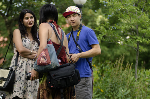
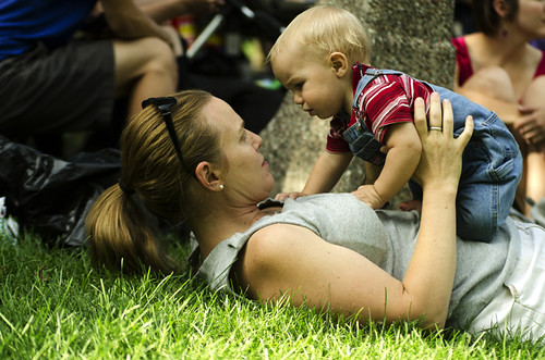
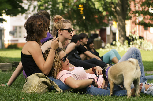
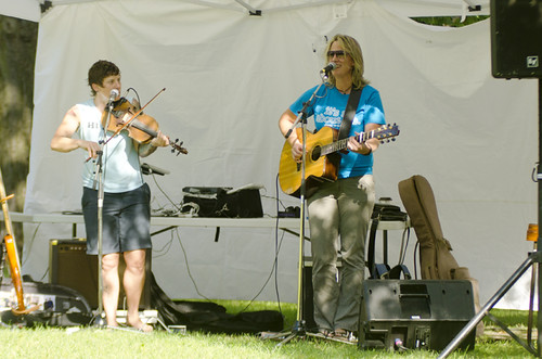
I shot these with a defective 80-200mm f/2.8. I think they turned out fantastic.
 
Well, I don't see any marching, but I am pretty sure I see a lot of dykes, unless you meant water containment structures, or Dick Van, in which case I am thoroughly confused.

Images are ok I guess. Compositions aren't the best, lighting isn't the greatest. 7 would probably be the best if it was framed a little different with less clutter in the background. #3 is decent too although I would have framed a little wider. Not much else to say about them I don't think.
 
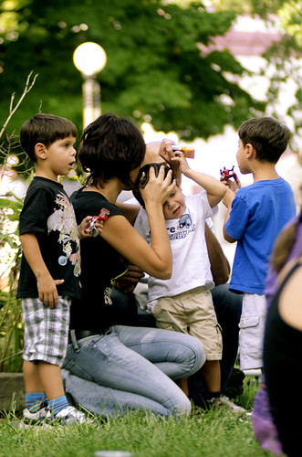
What are you talking?! Look at the little guy in #5 march!
 
Ahhhh, but you just helped illustrate my point about the compositions. There is no relevance as to what that little boy is doing. He could be standing with his mommy (or "daddy" ?? ) and watching the festivities. Not really sure. ( and also....you clipped his hand. ;) )
 
Yeah, he was a little close for the 80mm. He walked right by me. And FYI, there were plenty of straight people there... including his parents.
 
Because one of the lens elements inside is shifted and it tends to defocus near the edges of the frame. You can kinda see it in the first image, on the right side.
 
Sounds like it's time for a new lens.

As far as the pictures go, are you actually looking for constructive comments, or are you just posting to show them... I have some comments but I don't know if you want to hear them (they are not nasty or negative, just some thoughts).
 
I just got it :P, sixty bucks.

I don't have another 800 to spend on a 80-200mm f/2.8.

I'm always up for criticism.
 
My comment is that you should look at the pictures before you post them, try to figure out obvious problems and correct them before posting.
 
Image one: crop out all the stuff on the right hand side that is a waste of space. As composed, would work best as a square.

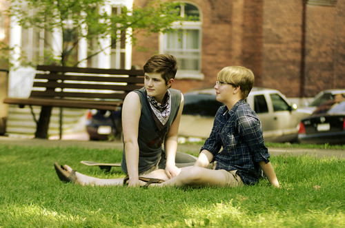
Image two: crop to 4x5 ratio, cropping out the wasted space to the left hand side, and a bit of the grass

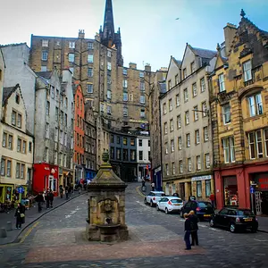
Image three: OK

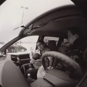
Image four: crop to a 4x5 ratio, getting rid of the stuff on the left and right hand sides

Image five: should be a vertical shot showing the entire kid plus some of the taller person's hand.

Image six: crop to a 4x5 ratio cropping out the wasted space at the top and the really bad looking back at the right of the picture.

Image seven: your best shot, but... A) it's crooked, leaning to the right. B) it's not cropped nearly tight enough. C) you have an f/2.8 lens, so use it at f/2.8 when you have a distracting background to get rid of stuff like the cars.

 
My comment is that you should look at the pictures before you post them, try to figure out obvious problems and correct them before posting.

Hmmm... interesting, I thought I did okay with these. I started another thread a few days ago with stuff I shot on my way to work. I didn't think those were spectacular but apparently these are worse?

I paid attention to the rule of thirds, except for the last one since I thought cropping everyone a little off-center every single time would get boring. I made sure there was some negative space, so I didn't crop too tightly. In number 6, I made sure to leave some sky above. In number one I made sure that there was some emptiness to the right. I tried always to get the best bokeh I could by setting the keeping the aperture pretty open. I kept the bench in the last picture to give it a sense of depth, but apparently it is distracting. I thought the bokeh knocked it out enough.
 
Image one: crop out all the stuff on the right hand side that is a waste of space. As composed, would work best as a square.

Image two: crop to 4x5 ratio, cropping out the wasted space to the left hand side, and a bit of the grass

Image three: OK

Image four: crop to a 4x5 ratio, getting rid of the stuff on the left and right hand sides

Image five: should be a vertical shot showing the entire kid plus some of the taller person's hand.

Image six: crop to a 4x5 ratio cropping out the wasted space at the top and the really bad looking back at the right of the picture.

Image seven: your best shot, but... A) it's crooked, leaning to the right. B) it's not cropped nearly tight enough. C) you have an f/2.8 lens, so use it at f/2.8 when you have a distracting background to get rid of stuff like the cars.

Okay, I guess my graphic design sensibilities don't translate well into photography. I always try to have some negative space in an image so that it doesn't look like it is being crammed into the frame. To me, it's not wasted space; it's breathing room, it gives context to where the subject is. At least that's how I was taught design; how to please the eye.
 
Last edited:
Mind if I edit a couple and show you what I mean here?
 
Yeah, go ahead.
 

Create an account or login to comment

You must be a member in order to leave a comment

Create account

Create an account on our community. It's easy!

Log in

Already have an account? Log in here.

Back
Top Bottom