What's new

"Empty space"

Annaa

TPF Noob!
Joined
Sep 13, 2013
Messages
42
Reaction score
20
Location
Sweden
Can others edit my Photos
Photos NOT OK to edit
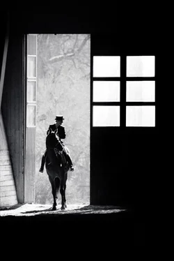
This is a really old shot of mine, back from 2007 when I had just started to get into photography.

I'd love to hear your thoughts on it!

$Emptyspace.webp
 
what would happen if you removed the window?
 
For me, the window is part of what really makes this photo. If I cropped anything, it'd be to take a little off the left side, leaving just a bit to the left of the door frame, in an attempt to get rid of the brighter wood thing next to the door.

Regardless, cropped or not, I quite like it.

 
I agree that the windows help make the shot, however I feel that they're a little too bright. The picture's subject is clearly the left side of the image. I'd crop from the right so that the black space equals the window's vertical divider, then darken the windows to a suitable gray so they don't outshine the scene through the open door. On the whole, I really like this image.
 
yeah, the window is bright, should be seeing some traces of trees like behind the rider, I think that would help; ihmo.
 
I like the composition. The framing of the horse and rider works quite nicely. The windows are very blown out and compete for attention though. This effect is enhanced by the dark black of the door.
I was able to pull some detail from the glass that made the white squares actually look like windows again. This also softened the stark whiteness by adding grey details to the glass.
I think the windows balance the image and removing them would hurt more than help. They help form an arrow pointing to the left which is enhanced by the lean of the horse.
The rider and horse looking to the right balances this and creates a pleasant sense of visual tension.

Nice capture.
 
This is a really old shot of mine, back from 2007 when I had just started to get into photography.
Luck of a beginner ?:lol: Well, everyone with camera needs luck to be in the right place at the right time. This shot is great, you connected abstract elements with life in very harmonious way. The only thing I would ask you to try is to "burn" (funny word in digital photography) the bright area between the door and the edge quite a bit so the light in your picture is not "spilling" outside the frame. That will bring the center of the composition, well, back to the center. Otherwise :thumbup::thumbup:
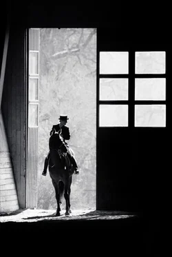
 
Thanks a lot guys! As I sad, a really old shot (taken with a D50 w/ a 70-300/4-5.6 @ 300mm), so the quality of the original image isn't that great, which makes it a bit difficult to work with. I definitely agree on the brightness of the windows. I wouldn't crop it on the left side I think, simply because I really like the diagonal lines of the wooden walls - in my opinion they bring dimension to the shot.

Is this better? The windows are slightly toned down (I tried adding some texture to match the background outside the door) and I cropped it from the right.

$Emptyspace2.webp
 
I did a quick PS and removed the window, and it was bad. but I think dimming the window even further will help.
 
I managed to save some of the details I thought were lost in the windows. What do you think about this version? Too much?

View attachment 55668
 
The last edit is an improvement in my opinion.
 
yeah, now the horse and rider appear as the subject, not the window.
 
I'd still tone down the wall to keep the focus on the horse and rider.
 

Create an account or login to comment

You must be a member in order to leave a comment

Create account

Create an account on our community. It's easy!

Log in

Already have an account? Log in here.

New Topics

Back
Top Bottom