Engagement Style shoot

NoelNTexas

TPF Noob!
Joined
Mar 24, 2007
Messages
269
Reaction score
70
Location
Tyler,Texas
Can others edit my Photos
Photos OK to edit
IMG_8098.jpg

2
IMG_7780.jpg

3
IMG_7787.jpg

4
IMG_7877.jpg

5
IMG_8044.jpg

6
IMG_8178.jpg
 
beautifully done shots! The pose the gal is striking in #1 makes her look a little uncomfortable, BUT the location and the sky are just amazing so it makes me still LOVE the photo!

The others are breathtaking! Great job on lighting and the textures you've used are great!!

Good Job!
 
Looks like hes kissing a manikin in the first, I hate the texture stuff I always think the tog is trying to disguise a bad shot, the rest are good imo. H
 
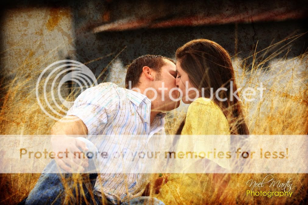
1: Good shot, although the kiss seems a bit faked. Nice background, and the leg going up is a nice touch. However, she seems uninterested since she's not touching him back.

2: Already 2 shots in and I'm sick of kissing, LOL. Of course, these are for THEM, so they probably like seeing themselves in action. The texturing is a bit cheesy, but I'll say that the customer probably likes that too? If they weren't actually IN that field, I give you credit for that since I liked the setting.

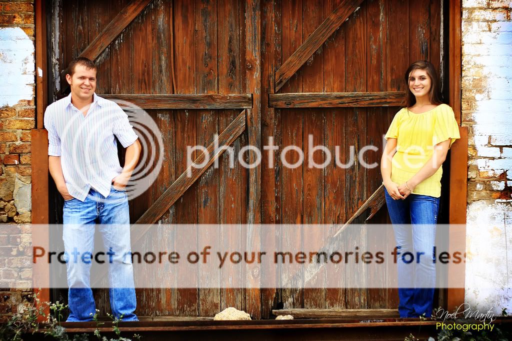
3: Least favorite of the series. They aren't connecting at all, and the blown highlights are unnattractive. Some nice framing going on here, but for engangement style shots, I would expect to connect them somehow.

4: What probably might have been the BEST shot of the series is ruined by the texturing, which takes precedent over the seemingly natural posing, the backlighting and love between the two subjects. I'd like to see this without the texturing.

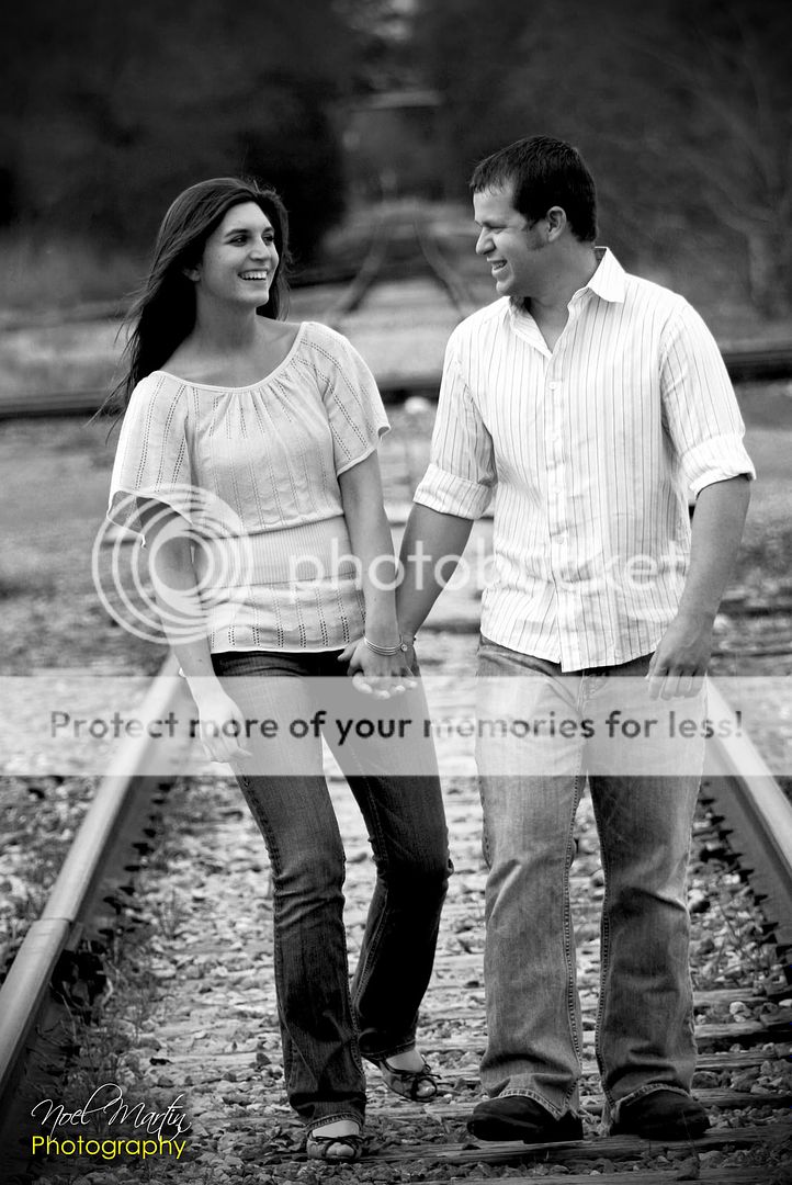
5: The BEST shot, with the noted exception above, because the two are engaging each other, happy, and seemingly in love. The railroad tracks are a tired cliche', but there is some symbolism there; starting a new life = going down the right track, etc etc. Nice job.

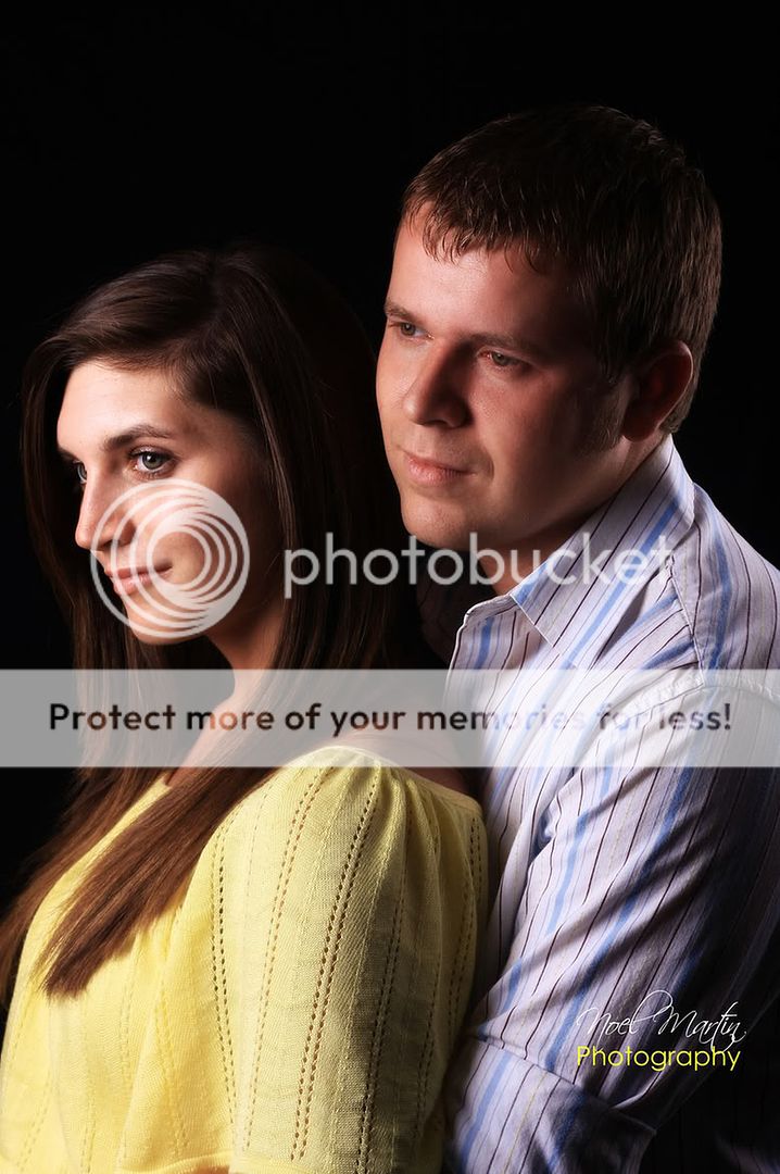
6: Again, I just am not feeling this one. They are looking in different directions, and they look uncomofortable. They are close, but still not connecting like in #5. Looks like an overdone maternity shot without the big stomach!

Overall great coloring and captures, and nice lighting!
 
#1: nice idea, but I don't like his position. He's quite stiff, not so natural. Another thing that I don't like is the bottom of the photo, where her feet is very next to be cut, while over the head there's space. May be a simmetrical division of the space was better, in my opinion.

#2: this effect is very nice, but still I don't like a position, the girl's one. It seems to me that she's receiving and not giving this kiss. Seems like a forced kiss by him. Her chin is too much "retracted".

#3: nice picture! Someone took their feet away :shock: :mrgreen::mrgreen:

#4: once more it seems to me that she's receving the kiss, without giving. Her hands are in a defensive position, while his are quite daring. I think they are in an opposite menaing, to be a kiss. The effect is once more very nice. Did you think about a vertical shot or a diagonal one?

#5: very very nice. Their smile looks really natural and the B/W conversion is a good idea! Does it slightly lean on the left?

#6: very beautiful colors, but why they don't look at the same thing? His eyes are looking ahead, her are looking in another direction (I mean different from the boy)

Don't think that I don't like your pictures, because they are very nice and the colors are very beautiful as well as the effects you decided to introduce. I only told you what I saw, but are details. Your pictures are a fantastica starting point! :thumbup:
I'm sure they were enthusiastic!
 
The post processing seems a bit over the top, but in general I like the shots and the poses and such. The one with them on other sides of the door is cute, but what kind of statement is that? I like the one in the grass.

All nice. Again, post processing too much for me, but still nice.
 
I really like the photos. And, I like the texture on #4. I think it would have made a world of difference if she had put her hand on his hand in picture 1. He may need to not be "into" the kiss quite as much, but that is hard to direct. Either they look good doing it, or not. The idea is great.

#3 (the barn door shot) is a great shot. Nice lighting. They look like siblings though, instead of a couple.

The last shot is great if it is for her or his mom. It high lights him more. She has beautiful eyes. If this is their engagement shot, I would want to see more of her as the center point. So, it depends on your audience so to speak. I'm betting his mom loved that shot. : )
 

Most reactions

New Topics

Back
Top