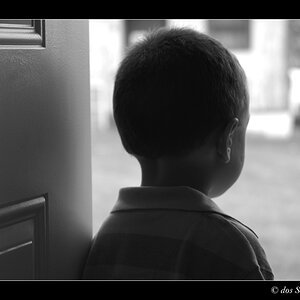
That is a gorgeous door! Nice find
I don't see the title fitting it yet. It looks too "sunny " but I think it might still be in the picture. Perhaps some more contrast to really bring the shadows out.
I think if a reshoot is possible it has great potential for a night shoot, that would fit your title even better
RM, i too had the same feeling regarding the title; but now a days i have a feeling that you are sensitive to comments (not because of what you said, but because what you did not tell)
RM, i too had the same feeling regarding the title; but now a days i have a feeling that you are sensitive to comments (not because of what you said, but because what you did not tell)


")
 . I can see what you're saying. What would be a more suitable title?


![[No title]](/data/xfmg/thumbnail/35/35597-714b74cc48992e5353856abfe325df68.jpg?1619737065)

![[No title]](/data/xfmg/thumbnail/39/39438-1eb8b5f82b59d9d0c72ae9025778ed4c.jpg?1619739032)