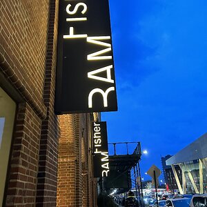
1. The sign is cut (doesn't help the composition)
2. The bottom under the sign is overexposed which is a bit distracting.
other than that it's a really nice pic, I like it.
1. The sign is cut (doesn't help the composition)
2. The bottom under the sign is overexposed which is a bit distracting.
other than that it's a really nice pic, I like it.



![[No title]](/data/xfmg/thumbnail/38/38262-10a9668da9a2b36a92cddde57caf87bc.jpg?1734172150)
![[No title]](/data/xfmg/thumbnail/38/38720-f0f83c1b09a42065eefec8923841d54d.jpg?1734172597)
![[No title]](/data/xfmg/thumbnail/37/37602-1ef8dbb1c2d0e4ff347ee65d328c3603.jpg?1734170730)