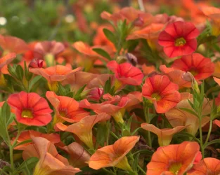
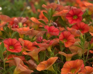
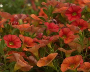
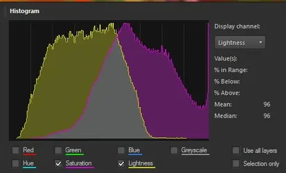
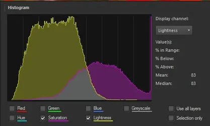
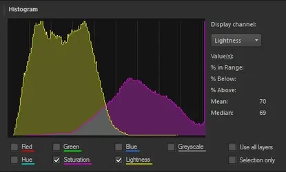
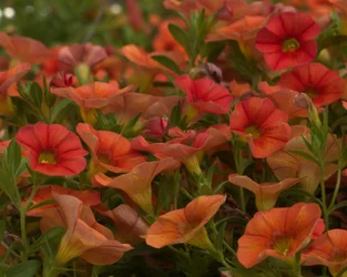
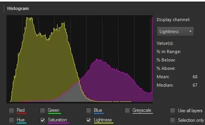
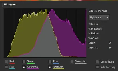
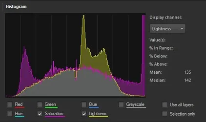
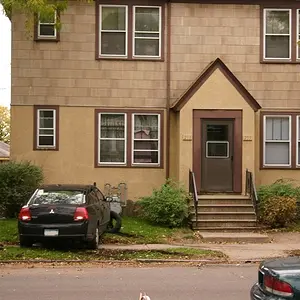
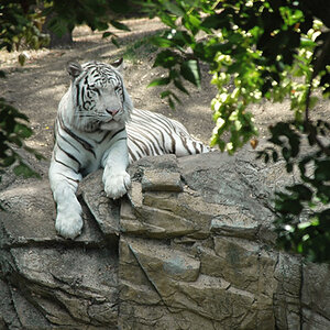
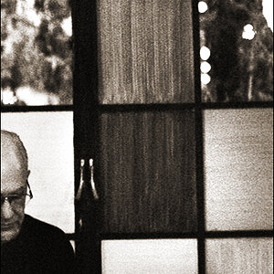
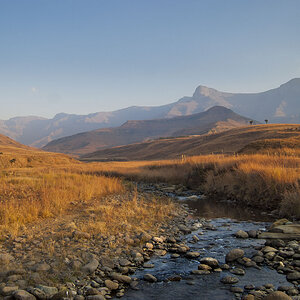
I don't think that any of them look balanced. I find them all far too red/yellow. I don't agree that the colours are over-saturated, but they (reds mainly) are over-bright.
I do agree with
@Ysarex that it is a software conversion issue not really an exposure issue. This is not an great exposure test shot in RGB. If we take yellow for example, fully saturated yellow is light which consists of yellow wavelengths only, it contains no wavelengths of other colours. This is what you see in a rainbow or when you split natural light with a prism. On your RGB screen however there is no yellow, it is
always represented as a combination of red/green. And because it is
always represented as a combination of wavelengths you can never display a fully saturated yellow on your computer screen (light of yellow wavelengths only). In fact you can't display any fully saturated colour on a computer screen because they are always represented as a combination of RGB.
This is not normally a problem as fully saturated colour is very rare in nature. However when you shoot red/green subjects with the WB a little too far to the red then you can find that some of the reds are just outside the RGB colour (too red for the screen) and so the software turns the red channel up to "maximum volume" for these colours. This is not over-saturation but the
brightness of the red turned up to max.
I think it needs the blue to be restored a little for better balance.