What's new

Fall Impression for C&C

Desi

No longer a newbie, moving up!
Joined
Sep 28, 2011
Messages
832
Reaction score
378
Location
Los Angeles
Can others edit my Photos
Photos OK to edit

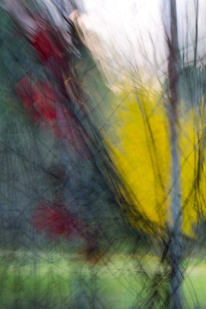
Fall Impression by Javier Descalzi, on Flickr

Your thoughts?

the upper part of the image bothers me. I don't think I can get rid of the brights sky without killing the overall composition.

Am I going off the deep end?

Desi
 
Actually I think that the sky that you mentioned actually balances the image enough that if cut out in a crop would kill the composition as you mentioned. As it stands this is a good abstract and one I actually like.. this coming from a person that is not that fond of abstracts in art of photography.
I would give it a little more saturation to make the colors pop a little more.. that might help balance it a little more??
Nice shot and thanks for posting :)
 
The sky doesn't bother me. It does have a way of balancing out the scene. The little piece of orange string bothered me so I made it go away. As to the rest of the image, while the colors are a bit more vibrant, I did not touch any HSB or other color slider. I only did an adjustment to the gray values, increasing both the brightness (slightly 6%) and contrast (by about 17%) and gave it a tad of additional structure (I used SEP2 but could have just as easily done this as a B&W layer). I also did a slight high pass sharpen but only at 60%.

There is a wonderful pastel quality to this image and even as little as I did, I wonder if it too isn't too much. The string though, it had to go. :wink:

$8358065102_a4a72d3982_o.webp
 
The sky doesn't bother me that much, but you could try darkening and/or coloring it to see how you like it. In any case, ceeboy's edit without the orange bit is good.
 
Very nice, Desi! Great color... and I love the shapes, and "texture"!
 
Thanks, Nikmal and kenC. I feel better about the sky now, glad it doesn't but you.

Ceeboy.....Thanks for taking the time to work on my image. I like your edit. I'm not sure how I feel about the increased contrast, seems to give the twigs more emphasis, which draws my eye away from the red leaves (I'm seeing it on my work computer). I definitely prefer it without the orange string.


Charlie: thanks, glad you liked it. I'm really enjoying these "impressions"

Desi
 
Very nice. Like Charlie, I love the colors and the texture that it has.

I guess this is a place where my vision problems are almost a plus because, for the life of me, I *cannot* find this orange string you speak of! :lmao:
 
I like everything about this except the top part of the image, not only because of the bright sky but especially because of the "nervousness" of the movement and the "spikes". When the top is taken away, happiness ensues (that rings a bell ;)).
 

Create an account or login to comment

You must be a member in order to leave a comment

Create account

Create an account on our community. It's easy!

Log in

Already have an account? Log in here.

Back
Top Bottom