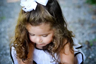
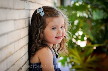
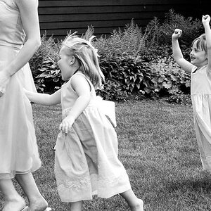
Not very fond of #1; she's a cute little girl, but we really can't see much of her, and the composition makes her arms look like she's a double-amputee.
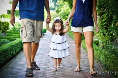
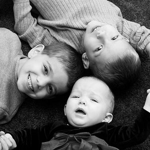
#2 is nice, albeit cliche. There seems to be a vignette which is (1) unnecessary, and (2) just distinct enough to be annoying, but not distinct enough to add anything to the image. I like the clothing coordination; that works well.
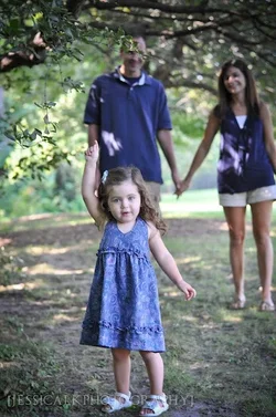
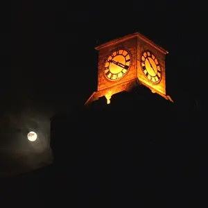
#3 would have been great but for the branch over Dad's face. Irrespective of your statement on the child being hte focus, this is, IMO, a compositional error which relegates an otherwise nice image to the circular file.
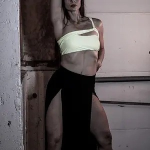
#4 Good expression, but the exposure needs some 'fine tuning' in the pixel room. Why did you choose to shoot this one in landscape vice portrait orientation? Have yesterday's railroad tracks becoem today's brick walls?
Overall, they're a nice set, but lighting and WB need work in all of them, as does composition. Keep at it!
Just my $00.02 worth - your mileage may vary.
~John




![[No title]](/data/xfmg/thumbnail/42/42270-4394b4f41a4b5d16152d8471f79ec2e4.jpg?1734176668)


![[No title]](/data/xfmg/thumbnail/36/36675-f6965e1e6c1fa2be4ff0460e9657fe99.jpg?1734169174)