For C&Cs you should keep the number of images low - like 1-5 max. You'll have a better chance of someone actually taking the time to write a response. Nobody wants to critique a stranger's family reunion album. Most of these pictures are interesting to nobody except family and possibly friends. That being said:
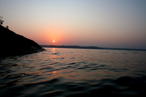
#1 sunrise: horizon is crooked. There could be some more interest in the landscape and/or horizon. Other than that I like it.
#2 group: Lighting is inconsistent. Girl in back center is slightly overexposed and rest of group is underexposed. Snapshot - not interesting.
#3 baby: harsh lighting. Composition is leading my eye to an armpit. Model is drooling.
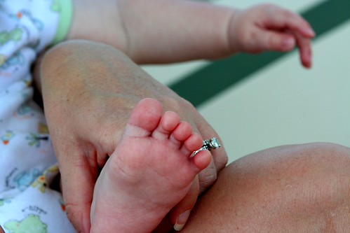
#4 baby: foot is cut off. Green diagonal stripe is distracting. Other than that, could have possibly had some potential.
#5 baby: Focus is on (assuming) Mom's headband and hair. Baby is partially cut off.
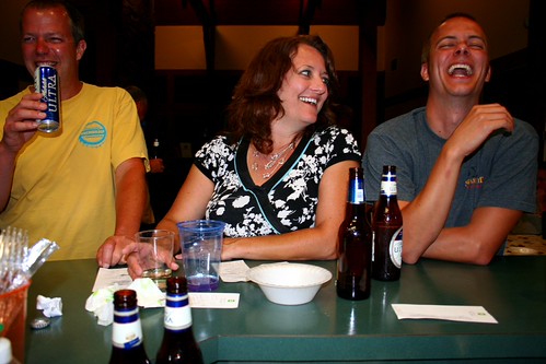
#6 late night: snapshot. Uninteresting except to family. Too much distracting stuff on counter. Flash hot spot - lighting a little inconsistent. Girl in center is exposed pretty well, but outside guys too dark. Guy on left is cut off. Don't enjoy looking up nostrils or down throat of guy on right.
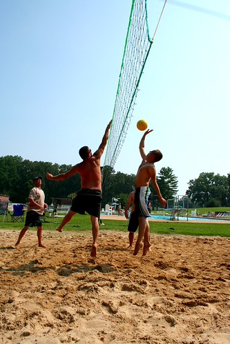
#7 v-ball: I like it. But then again I play volleyball.
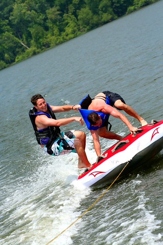
#8 tubing: good exposure. Cut off tube. Boat must have hit a wave because horizon is way off level. J/K but I don't like diagonal shots anyway - that's just a personal preference. This shot had potential possibly if the plot had unraveled a little more.
#9 man down: Just isn't doing anything for me. Too much white space. I can see the 2 guys are looking at something. My eye keeps taking me to the fat coming out of the bathing suit, but I'm sure that's not what they're looking at because of your title.











![[No title]](/data/xfmg/thumbnail/31/31048-f39974e8ef7d33d3e635eed5b44e603b.jpg?1734159155)



![[No title]](/data/xfmg/thumbnail/34/34344-0b42e0e92ad436e6710a1b9c4585d6df.jpg?1734164877)