I'll give it a shot.
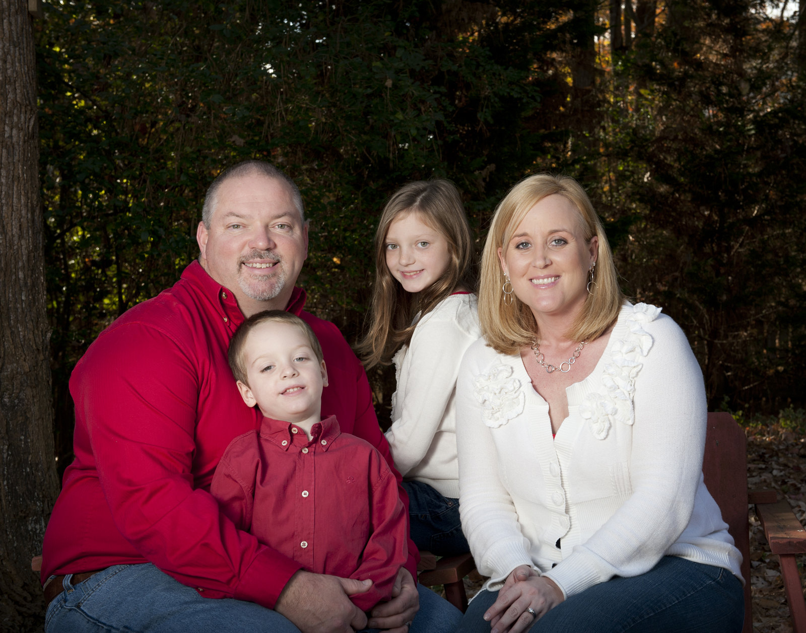
#1 - The first thing that I notice is the extra space at the top while cutting off fingers of Mom and Dad. The lighting looks good okay to me. The two red shirts seem to clash to me. A possible solution would be to put the boy by mom and the girl by dad to keep the colors apart. (Or photoshop them to the same color red.)
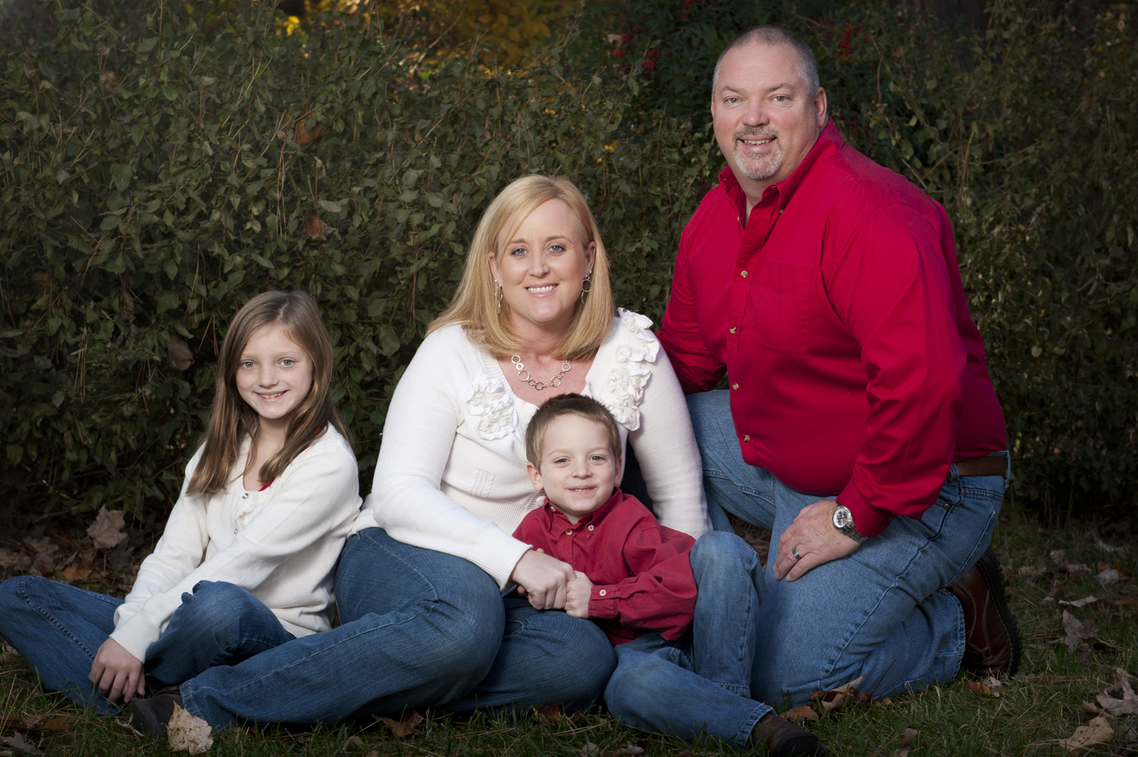
#2 - I like this one a lot better than one. Note again you have room behind dad and cut off the girls knee.
#3 - Pose seems uncomfortable for him and again chopped off her toes.
#4 - I would consider cropping a little tighter, to give it that I meant to be this close look. (chopped bodies)
#5 - Straighten the pillar in the background and I believe this is the best of the set.


 3
3