Well, Macs are calibrated.
iPhones, idk.
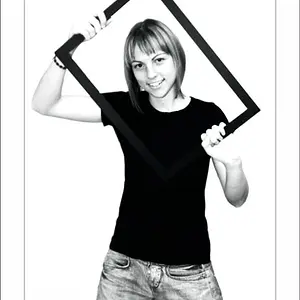
#1: I would have included more leg, less tree. The skin tone is fine on my monitor, I like the tan color on her cheekbones, but her arm is very awkward! It looks weird and not very graceful/beautiful like the rest of the photo.
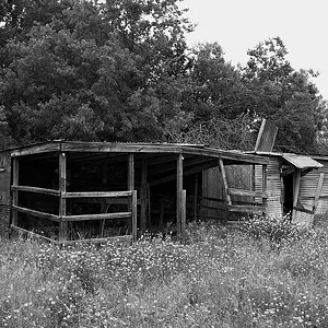
#2: I enjoy the reflection but being a fashion shot, it doesn't radiate much 'fashion'. I assume it's about the dress, so again, I would have brought the camera down and included more of the dress and maybe played with the angles more, because this is a pretty boring shot.
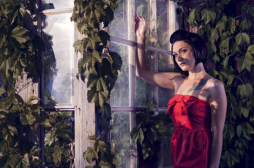
#3: Okay, so this is one of the better shots, I love the light and shadow going on here. Amazing composition, great placement of the subject, and a good pose. I agree w/ shmne, this could have been also very strong in B&W, but I think as a fashion shot it's stronger in color. It is a
little too dark around the shadows of the dress, if you could dodge them a bit, I think it'll be an even more exceptional image.

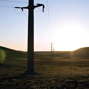
#4: Another weak one, it just feels so off. The background has so much black to the left, that no detail was salvaged. It's super super posed and she looks very stiff, and although sometimes not making eye contact works, I don't think it works here. I actually think even with eye contact, it would not have worked either. This whole photo just bothers me a lot. It just doesn't match up to the level of #3 & #5.
#5: Really wonderful lighting again! The biggest hot spots that bother me is the one right on the chest of her dress (see the blown out red?), and the slit on her elbow. I like the purplish tones in the lighting on the window, but I don't like it on the whole of her left arm, but it's something I can get past. Overall, I really like this photo!






![[No title]](/data/xfmg/thumbnail/39/39446-903cfeac143cee6330a51546ecfdda92.jpg?1734173536)

![[No title]](/data/xfmg/thumbnail/32/32719-7d42e7d7077540fabb3fa0275a99899a.jpg?1734162364)