What's new

feedback please

haynie90

TPF Noob!
Joined
Feb 18, 2012
Messages
92
Reaction score
3
Location
Moses lake, WA
Can others edit my Photos
Photos OK to edit
i just started photography about 6 mos ago i have a 200mm 3.5/5.6 18-50mm 3.5/5.6 and a 35mm 1.8 and a nikon d5100 just wanted to share some of my shots for some critique be as harsh as you see fit i have tough skin

$WM001.webp$WM002.webp$bench hyrogliphics - Copy.webp$DSC_0071 (2) - Copy.webp
 
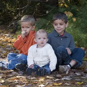
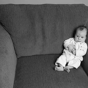
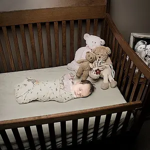
1. Toss this one. There are too many issues with it. The black and white is grayscale. Black and white is very hard and should be black, white and everything in between. Never place your subject directly on top of a background like that. The harsh shadows it creates is pretty bad. Using your on-board flash directly for a portrait is never going to produce a flattering image.
Baby bump images need to show the bump, not the broad side of mom making her look just wide. Be very aware of how the body is posed and profiles are usually your best bet.
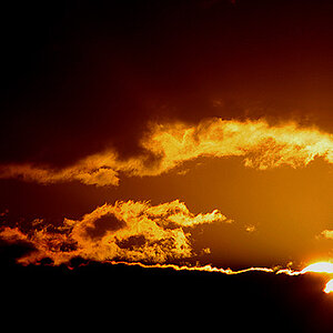
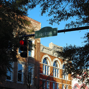
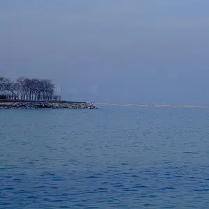
2 is a lovely silhouette. She's well placed in the composition.
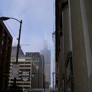
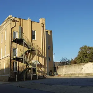
3. I am kind of lost, but the leading lines are nice!
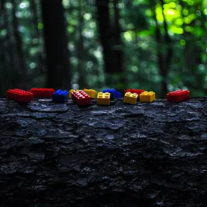
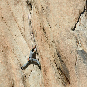
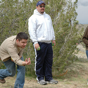
4.You have a nice exposure, you've stopped the action, but you've got some major composition issues there.

 
These are just snapshots. Each have a different aspect that you have accomplished. Getting something more interesting for the viewer will take a bit of practice and a bit of thought on your part.
 
thanks alot #3 was a bench i was sitting on in kansas that people had carved all sorts of stuff in that i thought was interesting and yes #4 is just a snapshot with no thought to composition just practicing and playing with different things

as far as the black and white goes what do you suggest i do to get more interesting black and white other than the placement and watching the shadows
the silhouette i was very pleased with im glad you agree
i just started shooting raw instead of JPG but i am shooting both until i get the processing of the raw down
any tips and feedback is greatly appreciated and as far as them just being snapshots what do you suggest to bring interest to the photos?
thanks alot guys
 
also as far as exposure ive read tons of books on how to achieve correct exposure but none of them have explained what i look for in photos to assure correct exposure im assuming detail is the main key here?
 
Correct exposure is when the image you created matches what you envision. Pretty sucky explanation, eh? But it's true.
On a typical photo like the basketball shot, yes. More or less it's what your eye tells you is correct or true to life.
The problem being you may be creating an image like your silhouette. That COULD be bad exposure or it could be a silhouette.
OR you could be shooting in the dark and want a dark feel, or you could be shooting in the sun and want a washed out feel...
Exposure is what is correct for that particular image.
Black and white is best achieved by using the color sliders to create contrast in the areas that it is wanted. It's not easy to create a good black and white image. In your main subject you should have black, white and every shade in between. Yours is too dark to begin with. You have black and gray. You need those skin tones to come up to nearly white
 
1. No
2. Too much dead space....thirds, not fourths would be better for this one. Just a little more toward the center!!
3. Close...I like this art photo. Good use of patterns and textures. you shoulda hit that shot straight on...your perspective is a tad awkward.
4. Nope

Sorry for the brief comments...gotta run!!
 
The black and white would look a lot better with more contrast, don't be afraid to loose a few details in the shadows and a few in the highlights, just work with the levels!

Here's a resource i found useful in making black and white images
7 Black and White Photoshop Conversion Techniques

I do agree there are other problems with that image as already detialed, but can still be used to make a better black and white image. :)
 
Thanks for the tips guys i will adjust and repost. I may need some help with the black and white so i will continue to adjust that image until i get it right, feel free to edit yourself and show me what could be done with them i just ask that you explain what was done to produce the final results.
 
$take 2.webpAny better?
 

Attachments

  • $WM001.webp
    $WM001.webp
    521.4 KB · Views: 98
You went a little over the top. Her face is REALLY high key glowing white now. It's not a good image to begin with. Start with a better image first.
 
I like #2 quite well.

#4 is interesting to me, I'm not sure what you were going for, but it's some sort of weird combination of the "banal suburban scenery" material (which I just recently learned is at least part of what "New Topographics" is about) and casual sports. I don't *like* it, but it has some interest. If you had a series of this sort of thing - similar photographs of, I dunno, let's say "distinctly american leisure activities" against similar kinds of banal suburban backgrounds, you might really have something. Some sort of cultural commentary, or record, or both. I assume that the word 'banal' is not something that was at the front of your mind when you shot it, though ;)

#1's posture, facial expression, unflattering pose and so on make it unsalvageable to my eye. I would not try.

#2 isn't my cup of tea at all and I don't think you succeeded at anything, there's strong lines in it that lead to nowhere, no clear subject, and not a very interesting texture. What you saw was interesting to the eye, but it's quite hard to photograph that kind of thing, the sort of "spread out mess of crap with no clear graphical center" business looks great but only to the eye.
 
Thanks for the feedback that's a good idea for #4 i may go for something like that as a project/challenge.
 

Create an account or login to comment

You must be a member in order to leave a comment

Create account

Create an account on our community. It's easy!

Log in

Already have an account? Log in here.

Back
Top Bottom