Thanks Maria! Yeah, it's a pretty bright shirt! This is without any adjustment to the saturation slider. I'll go back in next time I'm editing and pull down the red-magenta spectrum a bit to see if that helps.
I think there is a conflict between the happy, brightness of the little girl's hair/clothing and the fence and potential 'meaning.'
The impressions given don't match.
Her expression is downcast but her clothing seems upbeat.
Now the dress doesn't attract attention and her expression supports the 'fence' concept.
I agree with the shirt being a bit too upbeat. However, I'm not a fan of the noisy black & white version. I think just toning down the shirt a little in PP would do wonders! Just my two pennies!
That's funny, I actually have a BW version though it's decidedly less "dark" than Lew's version. I initially thought that the soft colors helped provide separation but it sounds like they're just too distracting. Let me track it down and post that version.
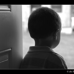
Ok, here was the BW version I had originally made. (Actually don't think it's the exact same pic, but close enough). I think I need to pull a little more contrast because it looks a little muddy to me. Maybe that's why I originally gravitated towards the colors.




![[No title]](/data/xfmg/thumbnail/41/41920-c7de4d93604fb89eb48454f9e5dba8a0.jpg?1734176282)
![[No title]](/data/xfmg/thumbnail/31/31743-3b294ee78fc71e7bfc025b01eafb0c2d.jpg?1734160458)
![[No title]](/data/xfmg/thumbnail/31/31742-596f6bbc60b2ba7fed2cd25f5aacf41c.jpg?1734160458)