What's new

Film Posters C&C

JOSHardson

No longer a newbie, moving up!
Joined
Aug 13, 2009
Messages
176
Reaction score
26
Location
Memphis, TN
Can others edit my Photos
Photos OK to edit
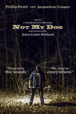
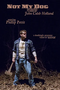
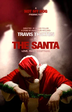
I'm trying my hand at film posters. Number one is for a spoof of The Wrestler that me and some friends shot with my 7D. The second and third are from an upcoming short film of ours. The title is missing from them on purpose. I'll take any critiques you guys might have.

1
$TheSantaPosterFinal.webp

2
$TheRaccoon3smaller.webp

3
$TheRaccoonSmaller.webp
 
The Santa one is cool. While the photography on the other two is good, they look like they're entitled "Not My Dog"; leaving out titles on purpose doesn't work because you gave emphasis to the production company. Also, on the last one, you have the lines too close together.
 
After the short is released I plan on adding the title in. It just ruins the gag if the viewer knows ahead of time. Thanks for taking the time to comment.
 
All of them look so professional. Great work!
 
What do you charge for a film poster? I know it is a vague question as it depends on the level of production, but what are the basics?
 
Santa one is kick ass. There is something about the font in number two and three that bothers me.
 
What do you charge for a film poster? I know it is a vague question as it depends on the level of production, but what are the basics?
There was a two hour photo session and about three hours of editing on each one. I'd probably charge about $100 for something similar.

Santa one is kick ass. There is something about the font in number two and three that bothers me.
I'm trying to use a font that feels out of date. Something that would be on a cheap horror film from the 70's, kind of a pulpy vibe. Thanks for the comment.
 
Here's is the short film that the Santa poster was created for if anyone is interested. It was all shot with my 7D so it's double relevant to this post. : )

 
Last edited by a moderator:
Any typography suggestions from fellow graphic designers would be cool too.
 
Hi!
I like the photography in the posters.Perhaps for the typography in the second and third, if you are set on the typefaces, you should start with adding a little space between each line to let the words breathe. Second, I would question the scale of "Not My Dog" in the third poster as it takes up the majority of the poster and is competing with the figure in the photo. lastly, are you squishing the type? meaning scaling it out of its original proportion? This is pretty much always a no-no in typography.

Hope that helps a bit :D The Santa one is working quite well though.
 
(spam reported)
 
#1 looks great! #'s 2 and 3 are good but not quite as good as #1. In #1 you presented the maker of the film and the title in a good way so it didn't take away from it in any way so why not do the same thing with the others? Doing it the way you did makes it look like you're just trying to make the makers of the film the subject as if you're trying to sell them instead. Lastly, horror films require blood to be horrific and that guy looks too clean to pass as horrifying. As is he just looks like he's pissed that he couldn't find a good Christmas tree to chop down. Needs blood on him and ax. :fangs:
 
Not my dog No. 1 gives me creeps..
no 2 gives it an ambiguous aspect.

The Santa just spews spoof!

Good work!
 
Seven year-old thread.
 

Create an account or login to comment

You must be a member in order to leave a comment

Create account

Create an account on our community. It's easy!

Log in

Already have an account? Log in here.

Back
Top Bottom