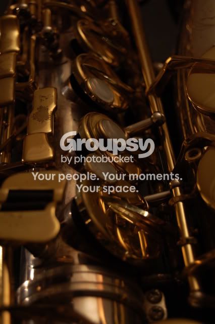
The first picture is pretty decent, I like the brass tones, but it's hard on the eye, IMO. I had a hard time focusing on something; I eventually recognized the piece you focused on, but the other parts were not blurred out enough, and since they are all the same tone, it was a little odd. But still a fair pic! =]
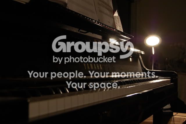
On the second pic, I would really like it if you would focus on keys closer to the lense, and bring in more depth of field. Atleast that's how I would prefer it. =]
I myself haven't ever really worked with lighting, I take all outdoor shots, but I'd like to see some more experiments! =D



![[No title]](/data/xfmg/thumbnail/37/37111-64f64f2c8371420041bf39244ff12117.jpg?1734169830)
![[No title]](/data/xfmg/thumbnail/37/37112-9474bbad05f760cbef79df3379b23509.jpg?1734169831)
![[No title]](/data/xfmg/thumbnail/37/37536-3578b4f283f738d862be62d896fa52d5.jpg?1734170692)
![[No title]](/data/xfmg/thumbnail/39/39469-3f2d242112dec8dc3e7b2836cc85afec.jpg?1734173560)
![[No title]](/data/xfmg/thumbnail/37/37540-73002ccb910b97978bc38658622a34d3.jpg?1734170695)