FondestBianca
TPF Noob!
- Joined
- Feb 17, 2009
- Messages
- 21
- Reaction score
- 0
- Location
- Eastern Washington
- Can others edit my Photos
- Photos NOT OK to edit
photos are currently uncropped
sony a100
used 1.4/50
manual, 80, 4.5, iso 200
natural light only
plopped my little guy down on a blanket on the living room floor and opened up the curtain on my one and only living room window. I have such terrible light in my house.
 This was an unplanned little shoot so no fancy outfits or staging. Just tried to snap a few before the light went away.
I'm untrained in both photography and PS so c&c on any aspect is appreciated!
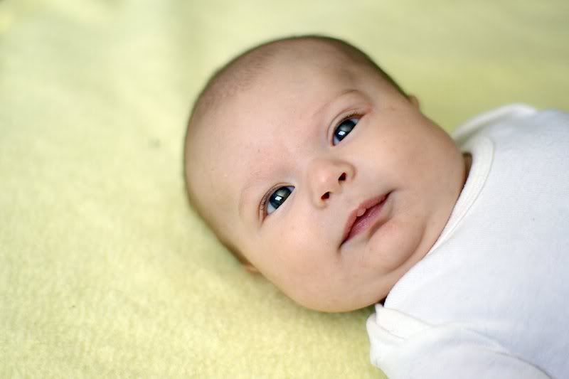
I'm not sure I'm overly pleased with the comp weight in this shot. Too heavy on the right to be center balanced but not heavy enough on the right to be right blanced. hmmmm. Would have prefered an up angle with the negitive space diagonal but, wanted his face more straight on so I settled. I still need to edit out the little fuzzy above his head.
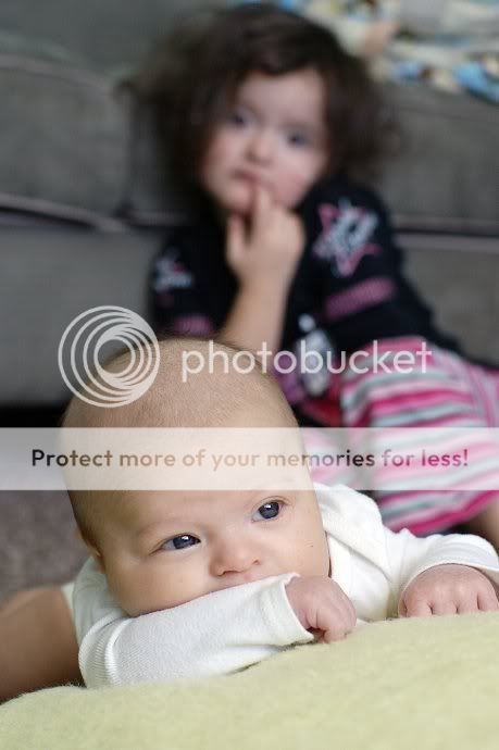
big sis' clothes are less distracting in b&w conversion IMO but I think the b&w is less appealing overall so I'm sticking with color. Tried to get them both in the frame to tell a story of sibling interaction & relationship but wish I had more space at the top & bottom... darn squirmy kids! Thirds not so well excuted here.
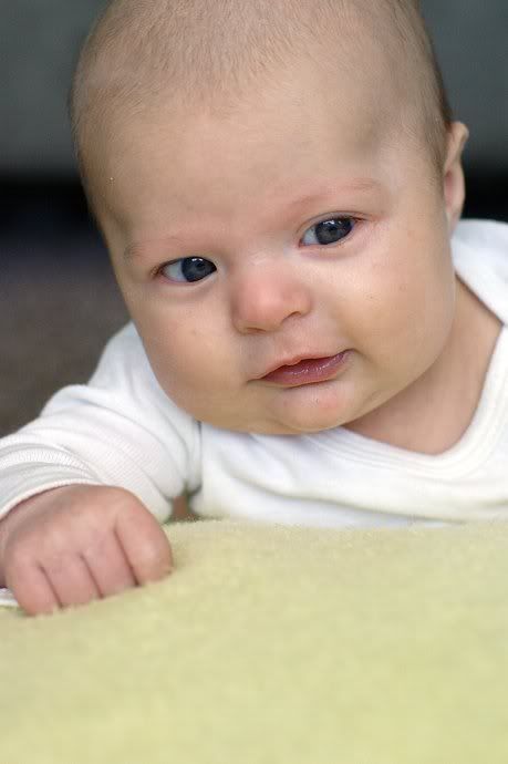
A bit heavy at the top but, debating if a tighter crop at the bottom would be an improvment or if the excess negitive space adds something to the shot.
thanks in advance!
sony a100
used 1.4/50
manual, 80, 4.5, iso 200
natural light only
plopped my little guy down on a blanket on the living room floor and opened up the curtain on my one and only living room window. I have such terrible light in my house.
I'm untrained in both photography and PS so c&c on any aspect is appreciated!
I'm not sure I'm overly pleased with the comp weight in this shot. Too heavy on the right to be center balanced but not heavy enough on the right to be right blanced. hmmmm. Would have prefered an up angle with the negitive space diagonal but, wanted his face more straight on so I settled. I still need to edit out the little fuzzy above his head.
big sis' clothes are less distracting in b&w conversion IMO but I think the b&w is less appealing overall so I'm sticking with color. Tried to get them both in the frame to tell a story of sibling interaction & relationship but wish I had more space at the top & bottom... darn squirmy kids! Thirds not so well excuted here.
A bit heavy at the top but, debating if a tighter crop at the bottom would be an improvment or if the excess negitive space adds something to the shot.
thanks in advance!


![[No title]](/data/xfmg/thumbnail/40/40287-4f839095000f74d779b90ed75df9dc62.jpg?1734174702)

