ElNico
TPF Noob!
- Joined
- Aug 10, 2017
- Messages
- 109
- Reaction score
- 8
- Can others edit my Photos
- Photos OK to edit
Form disclaimer - I'm a hobbyist. I do photography for fun, not to make money or make a career out of it. I've been told to mention this up front. It's also in my signature.
Two photos from this shoot with issues that I'm attempting to tackle now that I have Photoshop.
For #1, the issue was various objects cluttering up the frame, both in the foreground and reflected in the window. I've tried to get rid of them using the patch tool. (Obviously it would have been better if the curtains were closed; I'm trying to make what I can of this image as I like how the pose came out.) For #2, I liked the pose and the framing, but felt that the model's hair was blending too much with the black sky behind her - her head looked kind of like it was fading into the background - so I've enhanced the brightness and the contrast of her hair using a mask in order to make it stand out more. I've included the unedited version of #2 for comparison.
#1 was originally shot at f/2.8, 1/20s, and ISO-100; #2 at f/2.8, 1/30s, and ISO-160. Camera model is in my sig.
In addition to general feedback on the pose and the shot, I'm interested in the following lines of thought (this may sound like a lot of questions; but these are mainly things that I imagine you would notice yourselves if they were problems, so I'm more trying to show what thought I've already put into these images, and where I'm uncertain):
-Generally, how did the edits come out? How did my attempts to make things disappear in #1 come out? Should I be trying to hide the remnants further, perhaps using stamp/clone? In #2, how does the hair look?
-I haven't edited these photos other than as mentioned; does either need the brightness, saturation etc adjusted?
-Does #1 warrant further elimination of things reflected in the window, such as the table and the doorway? Should I be more drastically trying to "black out" the window altogether, eliminating the reflection of the white walls of the room?
-In #2, I enhanced all of the hair by the same amount, except where the hair itself was thinner; but as her hair seems to be dyed less (or not at all) nearer the roots than nearer the ends, I'm wondering if I ought to be enhancing the upper part more (or enhancing the rest less); since the point is to increase the contrast between the edges of her head and the sky, and I'm unsure whether the lower parts of her hair look TOO bright and saturated as is. What do you think?
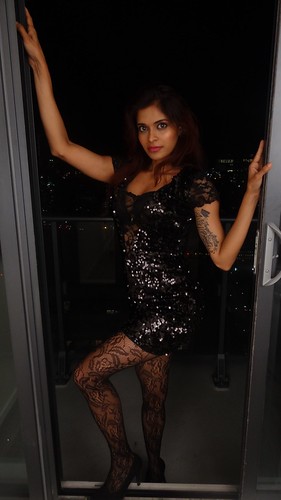
-Would a different crop have been better for #2? I wanted to focus on the model's torso and face framed in the doorway, so I cropped out the bottom half; but this left her left arm taking up too much of the frame, so I then cropped the top and the left side. Does the result look good?
Thanks everyone.")
#1

#2

#2 unedited:

#2 uncropped:
Two photos from this shoot with issues that I'm attempting to tackle now that I have Photoshop.
For #1, the issue was various objects cluttering up the frame, both in the foreground and reflected in the window. I've tried to get rid of them using the patch tool. (Obviously it would have been better if the curtains were closed; I'm trying to make what I can of this image as I like how the pose came out.) For #2, I liked the pose and the framing, but felt that the model's hair was blending too much with the black sky behind her - her head looked kind of like it was fading into the background - so I've enhanced the brightness and the contrast of her hair using a mask in order to make it stand out more. I've included the unedited version of #2 for comparison.
#1 was originally shot at f/2.8, 1/20s, and ISO-100; #2 at f/2.8, 1/30s, and ISO-160. Camera model is in my sig.
In addition to general feedback on the pose and the shot, I'm interested in the following lines of thought (this may sound like a lot of questions; but these are mainly things that I imagine you would notice yourselves if they were problems, so I'm more trying to show what thought I've already put into these images, and where I'm uncertain):
-Generally, how did the edits come out? How did my attempts to make things disappear in #1 come out? Should I be trying to hide the remnants further, perhaps using stamp/clone? In #2, how does the hair look?
-I haven't edited these photos other than as mentioned; does either need the brightness, saturation etc adjusted?
-Does #1 warrant further elimination of things reflected in the window, such as the table and the doorway? Should I be more drastically trying to "black out" the window altogether, eliminating the reflection of the white walls of the room?
-In #2, I enhanced all of the hair by the same amount, except where the hair itself was thinner; but as her hair seems to be dyed less (or not at all) nearer the roots than nearer the ends, I'm wondering if I ought to be enhancing the upper part more (or enhancing the rest less); since the point is to increase the contrast between the edges of her head and the sky, and I'm unsure whether the lower parts of her hair look TOO bright and saturated as is. What do you think?
-Would a different crop have been better for #2? I wanted to focus on the model's torso and face framed in the doorway, so I cropped out the bottom half; but this left her left arm taking up too much of the frame, so I then cropped the top and the left side. Does the result look good?
Thanks everyone.
#1
#2
#2 unedited:
#2 uncropped:
Last edited:
![[No title]](/data/xfmg/thumbnail/31/31509-b8abaec96e6e375688e269bc89f47652.jpg?1619734858)

![[No title]](/data/xfmg/thumbnail/32/32158-8de1a90710a58144b47a0cee83a6c820.jpg?1619735234)