What's new

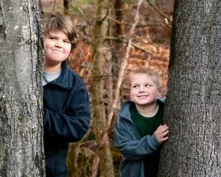
First portriat attempt c+c

ayen75

TPF Noob!
Joined
Apr 2, 2012
Messages
19
Reaction score
0
$image-579774451.webp
 
Well I see you have had 62 looks so far and no comments so I'll throw in my 2cents worth.

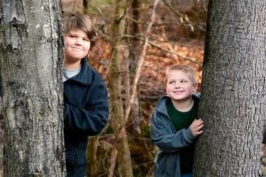
I think it's cute but I dont know I feel like its kind of snapshotish. I dont know why tho and its bugging me that I dont know why. With every picture you want to portray a message. What are you trying to say in this picture?

This def isn't a bad photo but it could be better ya know :)

Keep shooting!!
 
It's a nice picture but you might wanna watch the halo effect. I can see it around their sweaters. There might be too much tree too, that's the first thing my eyes went to in this pic. Not bad at all though
 
C&C per req:

Not a bad shot at all. A couple of thoughts for possible improvement: (1) Next time, ensure the subjects wear more appropriately coloured clothing. The choices here are a bit dark and seem to blend in. Have a look at a colour wheel and the theory of complimentary colours and consider that when choosing a background and recommending clothing to clients. (2) For this image, I would crop some of each tree away to reduce the amount of "wasted" space at the sides.

Just my $00.02 worth - your mileage may vary.

~John
 
Cute shot, pretty well-exposed and sharp, but the execution of the PPing could be improved a bit.
From the halos, it looks like you PSed the background; that selection and blurring needs to be done better.
You might also consider moving them closer together; there is quite a large gap right now tha hurts the picture, imo.
I also darkened the tree trunks so they don't compete with the faces for brightness.

$image-5797333333333333.webp
 
Last edited:
Not bad pictures. I agree with the other posters on their points for the first shot--too much tree, trees too bright, a bit snapshot-ish. For your second shot, I would bump up the exposure a bit. The picture is overall fairly dark. I would have also moved the subject slightly so the background would've been a more uniform green. The tree and other object (another tree?) distract my eye from the face. I like the depth of field. I would've had the subject bring her chin down a bit--the slight lean back of her head seems a bit awkward to me. Overall not too shabby for just starting out. Keep shooting!
-Sarah Whitwell
www.sarahwhitwellphotography.com
 
warm up the 2nd pic, bump the exposure and change the orientation. There isn't any point to the empty space on the left. Overall not bad
 
On the second.
No, a thousand times, no.
Having a woman body square to the camera arms at her side makes her look bulky and is generally unflattering unless she's 18, 5'8 and 110 lbs.
Look here for a start.
All the reflections in her glasses shouldn't be there.

 
On the second.
No, a thousand times, no.
Having a woman body square to the camera arms at her side makes her look bulky and is generally unflattering unless she's 18, 5'8 and 110 lbs.
Look here for a start.
All the reflections in her glasses shouldn't be there.
Nice link! Thanks. This will come in handy.
 

Create an account or login to comment

You must be a member in order to leave a comment

Create account

Create an account on our community. It's easy!

Log in

Already have an account? Log in here.

Back
Top Bottom