Backgrounds in most of them are a major distraction. #1 is okay if the leaves were cropped, but it's still just a flag and doesn't interest me. Angle in #2 is just ... strange. Why did you choose that angle?
1) background is distracting...trees behind flag and top.
2) not bad...i like how u lined up the stair railings with the top of the subject. don't know if you did that on purpose? could use some fill light on subject.
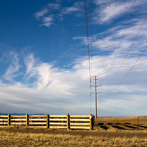
3) grass is distracting in the foreground...
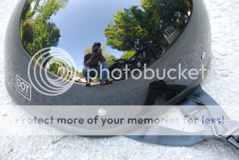
4) i like the reflection/mirror idea..although i think you should clone out the reflection of the straps
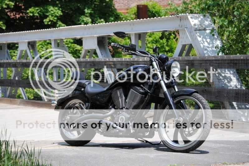
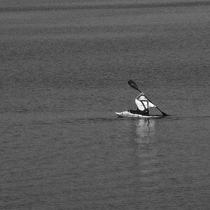
5) don't center subject...


![[No title]](/data/xfmg/thumbnail/37/37123-508270c4d14bcf3f293bd90dfd8ba6b4.jpg?1619737883)
![[No title]](/data/xfmg/thumbnail/32/32717-74f4cee577117aa4476c9eb68fec51c7.jpg?1619735622)
![[No title]](/data/xfmg/thumbnail/37/37127-bf1c0cde30f216dbd2804a0e700d6433.jpg?1619737884)

![[No title]](/data/xfmg/thumbnail/38/38723-12789924db409b40399a402700ac823c.jpg?1619738702)