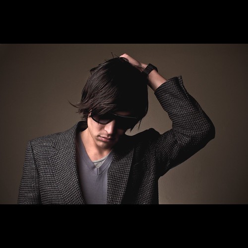
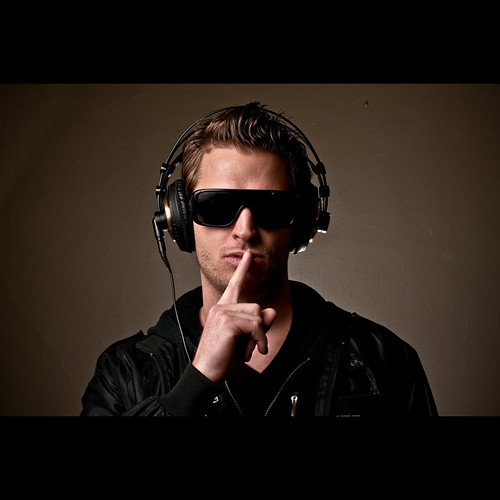
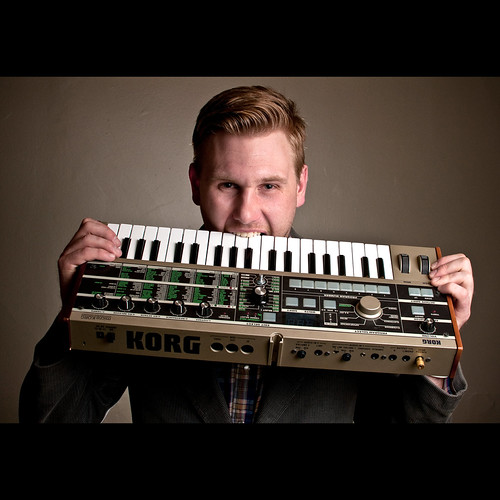
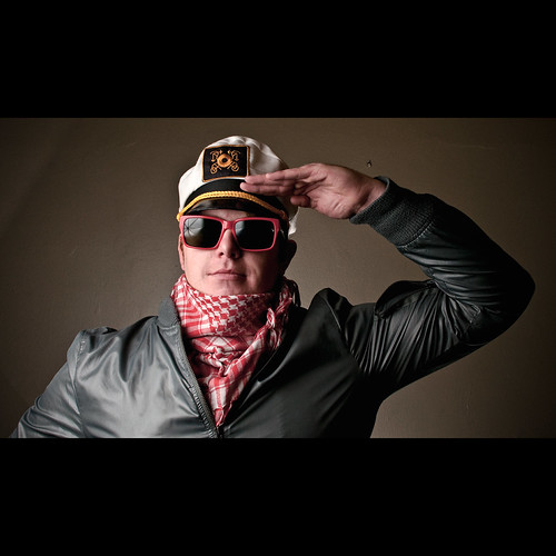
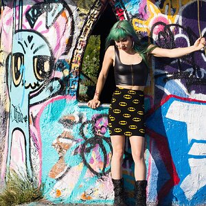
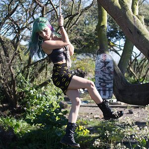
I like the drama created by the high lighting ratio; the first two shots have an "edgy" quality about them, the second are a bit less edgy. I think one thing that is not as good as it could be is that the position of the background light is showing a lot of texture in the wall. If the wall were more out of focus by being more outside of the depth of field band, I think it would look better. I like shots 1 and 2 the most, since they have the least amount of bounce-back lighting or "wrap" from the backlight hitting the wall or being distributed by the diffuser toward the subject.
When you position your backlight, if it strafes across a wall or seamless or a muslin at a shallow angle, the shadows created by the backlight will draw a lot of attention to the background--often subliminally pulling the eye away from the main, foreground subject. Exactly how the backlight spreads its light or how it is aimed will determine if it hits the backdrop head-on, or it it strafes across the surface, and a diffused backlight is harder to control than one that does not have a diffuser, since the diffuser can, depending on its style, spread the light around a 180 degree radius.
Still, I do like the cool, edgy,dark look of the first two shots; in shot 2, of the guy with the sunglasses and headphones, I like the way the glasses are clean, while in the last shot, the umbrella and its ribs show,and I do not like that look much.





![[No title]](/data/xfmg/thumbnail/34/34115-73b827c6a6db1413dcead11e4caaae69.jpg?1734164571)
![[No title]](/data/xfmg/thumbnail/42/42486-757c2978c4ecfb0e9dbfca10a0e2d240.jpg?1734177008)
![[No title]](/data/xfmg/thumbnail/42/42487-e35b2848c41aeeb5a93f21809f036a1d.jpg?1734177009)