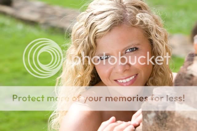
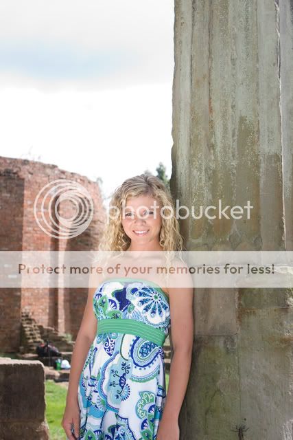
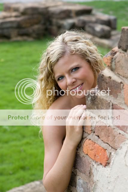
1) Alright but she is super super super green in the face. I hope you shot in RAW. The brick is a little distracting as well
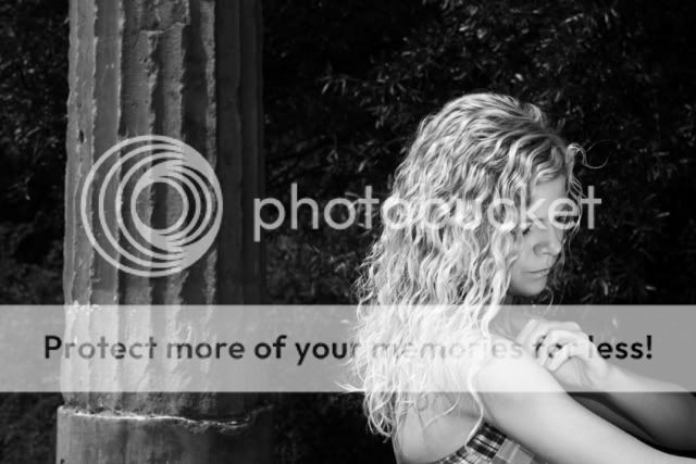
2) Definately not a favorite of mine. Looks a little bit underexposed in the background and that pillar is very distracting for me. It was the FIRST thing I noticed, not the beautiful senior!
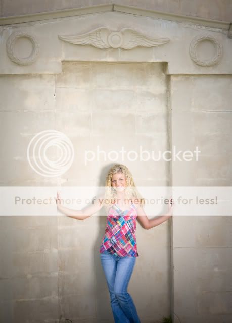
3) Wide shots like this with so much other stuff in the back (the wall basically) are hard to get right. I think the reflector did a little bit of overkill on it. She's not evenly lit - almost like there is a spotlight on her
4) Interesting shot maybe for those fun shots but did she get a print of this?
5) Alright but the DOF should be more. What apereture was this shot at? It would have been nice to not have that bright (and distracting) brick wall in the background. I like the pose though. For me, her left arm should have either been shown or the right one cut off like the left one is and you come in a little closer. That bug..........is um........well it's definately there.
6) Decent shot. She is still really bright in the face. Those reflectors really work well
")
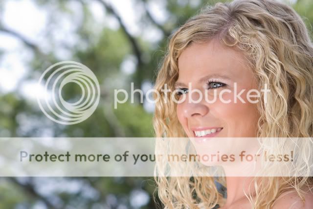
I'm not a big fan of this pose (the model looking off into the distance)
7) Nice pose but once again, that Depth of Field need to be much much more shallow. Would have been nice with your 70-200 f/4 or even your 50 prime.
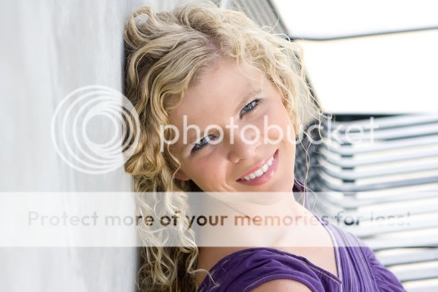
8) Nice. Probably my favorite. Just remember next time to look for things being cut off. In this case, her chin. I personally like and think it's alright that the top of her head was cut off a little bit, but not the chin. I want to see her face.....her WHOLE face. Make sure to remember stay hairs. Those on the left shouldn't be that big of a problem to photoshot or edit out.
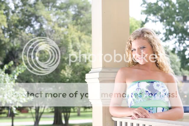
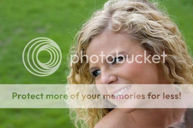
9) Nice pose again I think. Could use a little more contrast to make that dress pop a little more.
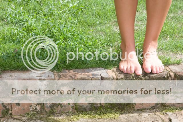
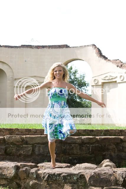
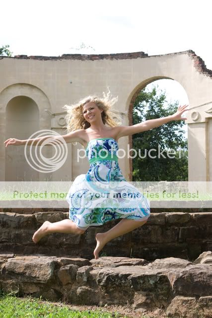
10) Way too centered and I'm REALLY not liking the foot up. It looks like it has been amputated?
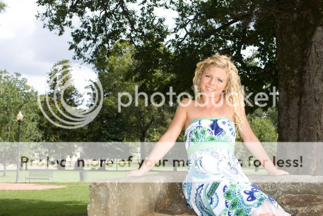
11) Nice composition wise but she is too centered. Could have come to the left (move your camera that is) and have less of the wall. Good shot though.
12) You still haven't changed my mind about the looking in the distance with this shot. I would also crop out the brick in the bottom right corner if she orders prints.
13) For such an unlucky number, I like this. Actually, this one is my favorite. What's that in the background though.
14) Nice pose again, but that background is.......well I don't like it. If it has significance (sp?) then alright but I would create a guassian (sp?) blur and make that less noticable. She has a beautiful smile and even more gorgeous face. Also, after looking at it again, for future shots for a girl, just be sure to include a little more bust. I mean not for viewing pleasure, just there is not enough body there.
15) What can I say, I love a girl in a hat but I don't like an Olger or the Incredible Hulk either. She's green man. Once again, hope you shot in RAW so this can be corrected.
Overall you have the idea and I like them all for the most part except for what I have just said.
~Michael~


![[No title]](/data/xfmg/thumbnail/31/31088-b509581dfd5e8b6b36c83266751654fc.jpg?1734159214)
![[No title]](/data/xfmg/thumbnail/34/34694-c8f837b622c45caaa51c5507b8835376.jpg?1734165701)


![[No title]](/data/xfmg/thumbnail/31/31087-2287670c7bc11f26914352b7d9404588.jpg?1734159210)

![[No title]](/data/xfmg/thumbnail/34/34693-68d7ff80dc154cec1604c718d5434ecd.jpg?1734165700)