Austin Greene
Been spending a lot of time on here!
- Joined
- Jan 6, 2012
- Messages
- 1,472
- Reaction score
- 855
- Location
- Mountain View, California
- Website
- www.austingreenephotography.com
- Can others edit my Photos
- Photos NOT OK to edit
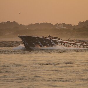
I was recently awarded a fellowship grant here at UC Davis to conduct some field research on an organism I've been studying/working on for about the past year. The grant will, among other things, cover the cost of my driving to the coast about every other weekend from now through April in order to collect my data. Needless to say, there will be plenty of photos taken during my periodic breaks :mrgreen: I've recently aquired a nifty graduated ND filter set, so I'm having quite a bit of fun experimenting with it.
Here's the first attempts, I had just finished a day of water sample collection, and sunset had all but passed, but got to take a few minutes to mess with a couple compositions. Second is my favorite, but I appreciate the "foggy" feel to the first.
Times like these I'm thankful that the University of paying for me to do my research here. I could never afford the gas otherwise.
1. Flow

Flow by TogaLive, on Flickr
2. Flood Tide

Flood Tide by TogaLive, on Flickr
Hope you enjoyed them! I'll of course post more over the coming trips.
Here's the first attempts, I had just finished a day of water sample collection, and sunset had all but passed, but got to take a few minutes to mess with a couple compositions. Second is my favorite, but I appreciate the "foggy" feel to the first.
Times like these I'm thankful that the University of paying for me to do my research here. I could never afford the gas otherwise.
1. Flow
Flow by TogaLive, on Flickr
2. Flood Tide
Flood Tide by TogaLive, on Flickr
Hope you enjoyed them! I'll of course post more over the coming trips.


![[No title]](/data/xfmg/thumbnail/37/37121-fda7b1957cb0d0be7bab1ddd3ec87847.jpg?1619737883)