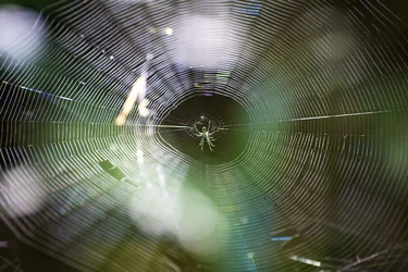
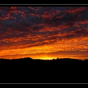
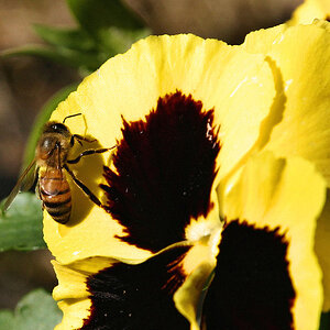
The first would be a lot better if there wasn't that distracting glare in the foreground, And maybe if you tightend the comp around the spider so you could see it better and so it stood out more.
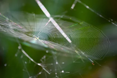
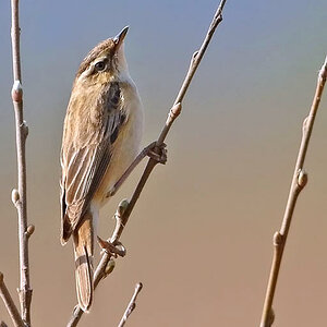
As for the second, I don't really like that one.. It looks really messy, IMO