Flower, C&C appreciated

RichardsTPF

TPF Noob!
Joined
Jul 19, 2011
Messages
445
Reaction score
14
Location
Houston, TX
Can others edit my Photos
Photos OK to edit
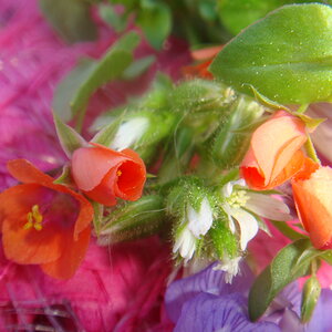
Take a shot at this flower.
50mm f1.4G, SB700 with a dome diffuser 11 oclock to the subject bounce to celling at TTL mode
iso 400, 1/200s, f11, Flash WB.

I am satisfied with the composition, lighting and exposure.
WB is off. Too bad I don't have a gray card, so I made two shots at auto WB and Flash WB. Adjust the WB in CS5 camera raw. This image is shot at Flash WB.
It would be better if the flower is not so close to the wall.

7318901410_0e5ddf38d8_b.jpg
[/URL] DSC_0511 by RichardsFlik, on Flickr[/IMG]

C&C is appreciated.
 
very very nice. It almost looks cartoony. lol
Only thing is i would play with the exposure. I feel like its a tad bit underexposed.
 
To my eye:

Underexposed.

Background too close to subject, needs better separation, and not crazy about the color and tone of it in relation to the subject because they blend a bit too well - maybe consider a dark background, like black velvet.

Composition seems unbalanced because of negative space above and to the right of the subject, but somewhat crowded on left.

Green leaf in lower left corner detracts from subject, and incomplete flower top left as well.

Use of light and shadow is pedestrian and could use more thought put into it for a more dynamic and interesting overall photo. The water droplets could maybe use a bit of specular highlight to help with that.

Color could use a bit of punch, especially the yellows to show the interesting bits inside the flower facing us.

I'm thinking something more like this, but shot this way, and with a bit more dramatic light and shadow control:

Flower_PPd.jpg
 
Buckster, Thank you for your very constructive criticism. And fantastic edit.

Background too close to subject, needs better separation, and not crazy about the color and tone of it in relation to the subject because they blend a bit too well - maybe consider a dark background, like black velvet.

Composition seems unbalanced because of negative space above and to the right of the subject, but somewhat crowded on left.

Green leaf in lower left corner detracts from subject, and incomplete flower top left as well.
I will pay attention to these details.


Use of light and shadow is pedestrian and could use more thought put into it for a more dynamic and interesting overall photo. The water droplets could maybe use a bit of specular highlight to help with that.
This is the hardest part. I only have a SB700 and dome diffuser. All I can think is bounce light from ceiling or wall. I can try different light angle and reshoot. Any suggestion and idea?

Do you mind telling me your post process?
 
Sorry, will help when able. Being admitted to hospital.

Hope everythings okay! But im guessing its not that bad because you were on TPF. haha
but forreal, i envy you. Your work is so great. Your very talented, not that you needed me to tell you that.
 
The original had the lack of contrast of the color of flower and background; more over the grey color never adds up to the happy color and mood the flower instills; further the texture of the background is tangible which also distracts a bit...But the image has the potential to be worked out :thumbsup: ....and what to say about the edit of Buckster's!!!! i hope he is all soon well and in full activity soon; meanwhile, as Haya has pointed out things cannot be that bad even now, i suppose

Regards to Richards and Buckster and all others :D
 
Buckster, Thank you for your very constructive criticism. And fantastic edit.
You're very welcome.

Buckster said:
Use of light and shadow is pedestrian and could use more thought put into it for a more dynamic and interesting overall photo. The water droplets could maybe use a bit of specular highlight to help with that.
This is the hardest part. I only have a SB700 and dome diffuser. All I can think is bounce light from ceiling or wall. I can try different light angle and reshoot. Any suggestion and idea?
Get yourself a sheet of white foam-core poster board at Walmart (or more than 1 - even better) and use that as a reflector. You can also cover it with tin foil to make it a punchier reflector and experiment with that.

If at all possible, you're going to want to get that light off the camera, if you haven't already. That may take either a cable or radio trigger - I'm not familiar enough with your gear to be able to tell you if it communicates without that stuff.

As for how to position them, that is largely experimental, and the greatest teacher so that you will begin to build your knowledge of such things going forward. A great place to start learning though is: Strobist: Lighting 101

You can actually do quite a lot with a single light and some reflectors, gobos, and so forth, introducing many levels and directions of light, shadow and specular highlights by manipulating them. Dean Collins was a master at this, and I aspired to try to squeeze more out of a small light setup because of what I learned from reading his books and watching his videos some time back, learning a lot in the process.

While you're at Walmart, get that piece of black velvet I mentioned above for future shoots - very handy stuff, especially for these flower type things. I also keep some large chunks of black felt around to use for backgrounds and for flocking purposes.

Do you mind telling me your post process?
Not at all. Here's what I did:

1. Masked out the flower area I wanted to keep in Photoshop using the Topaz Remask filter (you could do this 10 different ways without the Topaz filter, but the Topaz filter makes it a breeze, and I do a lot of masking type work with my portraiture, so that's what I use).

2. Cropped the whole thing to position the flower in the frame by eye the way I thought looked best, with fairly even amounts between furthest edge of plant and border. This required extending the left border a bit because it seemed a little crowded to me. No problem with the crop tool.

3. Made a new layer under the masked layer created in step 1 and paint-bucketed it black.

4. Used the clone tool to extend the stems out to the left edge of the composition.

5. Made a new levels adjustment on top of the layers stack, and pulled the right side slider (the highlight input level) of each of the Red, Green and Blue color channels from the far right edge over to where their respective histograms ended. That completed, I went back to the RGB channel of the dialogue box and pulled it a bit from the far right as well - to 239 actually, just brightening the whole thing to taste by eye (on a color and brightness calibrated monitor, btw - that's important if you're going to be doing this sort of thing).

6. I still wanted to bring the inside of the flower with the yellow out some more, so I created a Brightness/Contrast adjustment layer on top of the stack, and adjusted the brightness slider to the right (turned out to be 77) so that the part I was interested in enhancing looked good to my eye, while ignoring what it was doing to the rest of the image. Then I paint-bucketed the whole mask with black, then painted white in just the flower area I wanted that brightness to affect.

7. I wanted more saturation overall, and even more on the yellow bits, so I created a Hue/Saturation adjustment level on top of all, and make a master saturation increase to +9, then a selective increase to the yellows only up to +37.

8. My final step was to resize the entire image to 800 px tall, then Smart Sharpen to taste, with my common starting point for an image that size intended for screen at Amount: 100% and Radius: 0.3 px.

That's it. Hope you find that helpful to you!
 

Most reactions

New Topics

Back
Top