Flower C&C for an artshow!

murph1

TPF Noob!
Joined
Apr 21, 2009
Messages
24
Reaction score
0
Can others edit my Photos
Photos NOT OK to edit
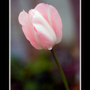
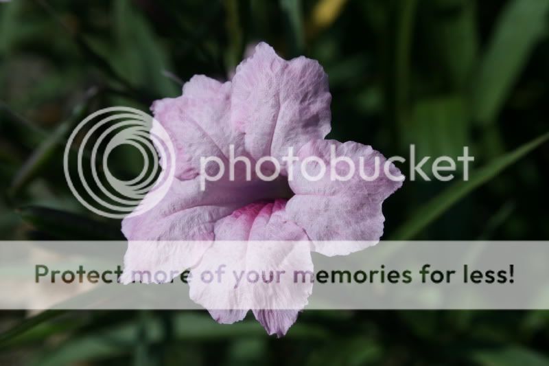
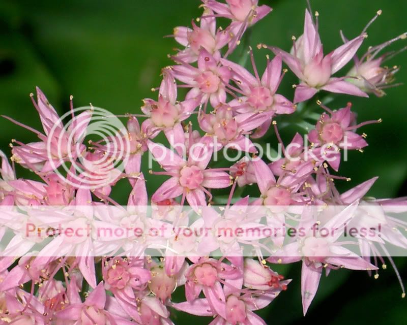
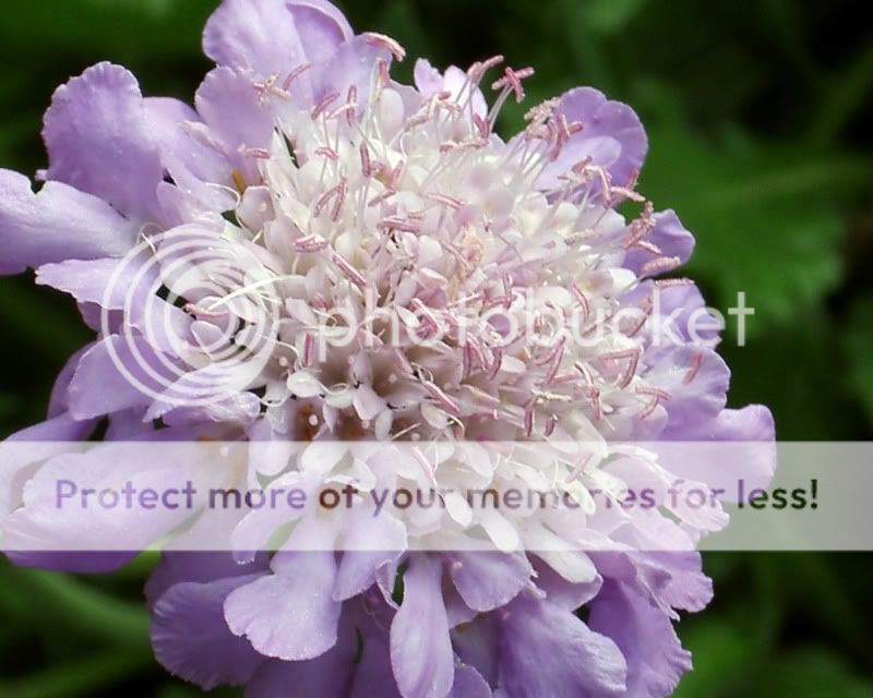
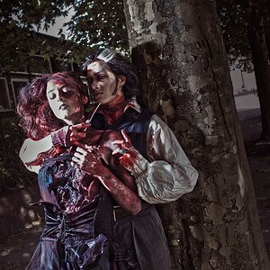
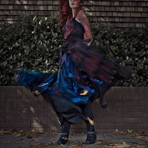
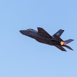
I have an art show (my first one!!) coming up this weekend. I have lots of architecture, landscape already but thought I might throw in some flowers as well. Since I have never done an art show before - I really don't know what draws interest. Any advice on any of these that I should/shouldn't bring?

lkippenbrock
#1
IMG_1704.jpg

#2
092007316.jpg

#3

092007006.jpg

#4

PICT0788x.jpg

#5
PICT0777x.jpg

#6
PICT0841x.jpg

lkippenbrock
 
First off, Flowers are like sunsets, everyone has seen countless "amazing" photos of each and, unless you are doing something really unique, they aren't going to stand out from everyone else's "amazing" flower and sunset pics. But depending on the crowd you are expecting, it might not hurt (if your showing to an artist/pro crowd, don't bother, but if your showing to more of a country fair crowd, throw some in).

As for your pics, don't use #2 and something just kind of bothers me about #3 (if you know Georgia O'Keefe's paintings you'll understand where I'm coming from). 1, 4, 5, and 6 kind of work, but it feels like I've seen them before.

If you decide to shoot more flowers, make sure the flowers are in good shape (no wear and tear, no brown spots, and no dead leaves), watch what is in the background, and carry around a little misting spray bottle to give the flowers a "dew fresh" look.
 
I definitely agree about the countless flower photos, which is why I hadn't planned on bringing them. But it is a country fair type crowd, so I thought I would.

I also agree on #3, I don't really like it either. If you don't mind me asking, is there something particular about #2?

Thank you!!
 
The photo it self is fine, but the flower doesn't look as "lively" as a flower in a flower pic should look.

I found what bothered me about #3:

STARTREKMONSTER.jpg
 
I think they are all decent photographs. For me the ones I would probably choose are 3, 4, & 5. All appear to have nice lighting, but specifically I like the composition on #5 due to that it's not centered on the frame; allows the eye to wander a bit, same for #4. Although theres no single element in 4, it still works for me. On the other hand, #3 works as centered because the blurred background and the leaves give it a real 3 dimensional look as if this flower is popping out of the picture. I agree that they aren't outstandingly amazing that a pro critic would look at it and be amazed, but they are definitely nice pictures and I think worth putting in the show. Good luck!!
 
The photo it self is fine, but the flower doesn't look as "lively" as a flower in a flower pic should look.

I found what bothered me about #3:

STARTREKMONSTER.jpg

Re: #2 - that makes sense. Thank you for the C&C!

And that is creepy and I definitely agree about #3 now!!!
 

Most reactions

New Topics

Back
Top