What's new

Flower Child

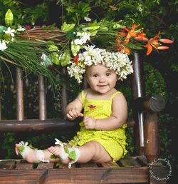
Very nice. Some day I'll figure out how to take nice portraits like this. Was the chair level, seems to be leaning to the left a little.

I don't know much, but I would think a straight child trumps a straight bench.

It's just me. I'm a home Improvement Contractor and out of level jumps out me. I'm one of those people who straightens pictures on other peoples walls when I visit.

View attachment 77785

thank you for the leveling...yes it was hard to level this this was taken in my backyard, uneven ground
 
You got some pretty good assignments....I really envy you...and misses my first grandchild so much ....... Lovely child...

Yep I must say I am blessed. I take monthly pictures of her and of course when I babysit....HAH added bonus
 
Yes, beautiful shot! I cannot wait for a lighting kit to emulate you!

What did you order snerd?

Oh, nothing yet! Just doing research and window-shopping. Had some great input from Derrel too! But, I'll probably wait for my wife's next trip to order anything LOL!!
 
Beautiful child, love the expression, skin tones, clarity.
Don't like the shine on the wood to the right.
Wonderful keeper overall. Ed

C&C, as requested via PM: Yeah, the shine on the wood immediately caught my eye. But wow, what a GREAT, animated expression on the baby. Her gesture, and eye contact, and expression are outstanding. I like her costume a lot, but the flower arrangement above her head seems a bit distracting to me, and I might be very tempted to CLONE OUT that one far right-most orange flower OR maybe go to selective color and just reduce the orange-ness of it. I simply love her headband, and the rest of her costume is simply adorable. I think the floral arrangement along the top of the bench was a case of gilding the lily a bit ;-) and it's just a little bit "over-propped" to me, as a disinterested third party who has no association with such a sweet baby girl or her mama. The fact that she's clutching a lovely,small,single flower is almost lost due to the visual pull of the floral overload above her head.

If there's any advice on these kind of shoots, it is to start with the simplest of essentials: the kid in costume and her bench/chair/washtub,whatever, and then to add props verrrrry judiciously, and make sure the props do not actually impinge too much upon the personal space or portrayal of the baby or toddler. But finishing on the high points: GREAT gesture, posture, expression and eye contact on the baby!!!!! Equally good though is the way the face is lighted--great catchlights, a little under-chin shadow to add dimensional clues, and nice soft light...but paint-down the long diffuse highlight on the chair-back. KEEP THIS LIGHTING SETUP burned in your mind...great catchlight placement, and very rich, lovely color. The lighting is not too diffuse, not to specular for human skin. Lighting looks fab. Kid is adorable. Costume is super-cute.
 
Okay, first of all... this set as a whole is super cute... and I don't even generally enjoy looking at photos of babies. :lol:

But seriously. Adorbs.

Do you mind if I give you a little CC?

If you're upset by this, please let me know ASAP and I'll delete it, but...

You're use of the light in this first one is great. The placement is really good and your composition is really nice... HOWEVER... I would have allowed my available light to flash ratio to have been a little bit more on the available light side. (Does that make sense? Words are hard).

For example... Keep your flash set exactly how it is... it's perfect... but then maybe slow down your shutter speed a little to allow more natural light in to act as a "fill" of sorts.

Your black are really black in that first photo.

I pulled the image into photoshop and played with curves and selective exposure really quickly to give you an idea of what it might've looked like had you let in a little more ambient light into the exposure:

$14310775830_715584c1ae_b copy.webp

That's a super quick edit with some rough selections, but you get the idea. :sillysmi:

here's Bria @ 6 months...I only have one for now. Will post more later on for CC, which is always very helpful

1

_DSC2206_copy[1] by rosy1816, on Flickr
 
Beautiful child, love the expression, skin tones, clarity.
Don't like the shine on the wood to the right.
Wonderful keeper overall. Ed

C&C, as requested via PM: Yeah, the shine on the wood immediately caught my eye. But wow, what a GREAT, animated expression on the baby. Her gesture, and eye contact, and expression are outstanding. I like her costume a lot, but the flower arrangement above her head seems a bit distracting to me, and I might be very tempted to CLONE OUT that one far right-most orange flower OR maybe go to selective color and just reduce the orange-ness of it. I simply love her headband, and the rest of her costume is simply adorable. I think the floral arrangement along the top of the bench was a case of gilding the lily a bit ;-) and it's just a little bit "over-propped" to me, as a disinterested third party who has no association with such a sweet baby girl or her mama. The fact that she's clutching a lovely,small,single flower is almost lost due to the visual pull of the floral overload above her head.

If there's any advice on these kind of shoots, it is to start with the simplest of essentials: the kid in costume and her bench/chair/washtub,whatever, and then to add props verrrrry judiciously, and make sure the props do not actually impinge too much upon the personal space or portrayal of the baby or toddler. But finishing on the high points: GREAT gesture, posture, expression and eye contact on the baby!!!!! Equally good though is the way the face is lighted--great catchlights, a little under-chin shadow to add dimensional clues, and nice soft light...but paint-down the long diffuse highlight on the chair-back. KEEP THIS LIGHTING SETUP burned in your mind...great catchlight placement, and very rich, lovely color. The lighting is not too diffuse, not to specular for human skin. Lighting looks fab. Kid is adorable. Costume is super-cute.


Agree here with Derrel. My only nitpick is also the issue of the large flower arrangement over her head. Until Derrel mentioned it, I thought I was the only one noticing it! :blushing: It seems a bit heavy-handed, almost on the verge of making the image out of balance. But of course, as has already been pointed out, her adorable expression, posture, the lighting - all combine to make a lovely image. And it's not an issue in your other shots.

I'm sure Mom was thrilled with your work! :)
 
Okay, first of all... this set as a whole is super cute... and I don't even generally enjoy looking at photos of babies. :lol:

But seriously. Adorbs.

Do you mind if I give you a little CC?

If you're upset by this, please let me know ASAP and I'll delete it, but...

You're use of the light in this first one is great. The placement is really good and your composition is really nice... HOWEVER... I would have allowed my available light to flash ratio to have been a little bit more on the available light side. (Does that make sense? Words are hard).

For example... Keep your flash set exactly how it is... it's perfect... but then maybe slow down your shutter speed a little to allow more natural light in to act as a "fill" of sorts.

Your black are really black in that first photo.

I pulled the image into photoshop and played with curves and selective exposure really quickly to give you an idea of what it might've looked like had you let in a little more ambient light into the exposure:

<img src="http://www.thephotoforum.com/forum/attachment.php?attachmentid=77815"/>

That's a super quick edit with some rough selections, but you get the idea. :sillysmi:

Please please always associate my name with
"She can take and wants CC"
Thank you for your time and for the visual explanation. I Like yours a whole lot better. If I can think back the shutter was at 250 maybe a tad less
This is my yard so I'll definitely keep these notes engraved in my head
Thanks again
 
Agree here with Derrel. My only nitpick is also the issue of the large flower arrangement over her head. Until Derrel mentioned it, I thought I was the only one noticing it! :blushing: It seems a bit heavy-handed, almost on the verge of making the image out of balance. But of course, as has already been pointed out, her adorable expression, posture, the lighting - all combine to make a lovely image. And it's not an issue in your other shots.

I'm sure Mom was thrilled with your work! :)

Hey Terri
Yep mom is thrilled (my daughter in law) cause she made the props
BUT I will tone it down since I'll be using this setup for other shoots
Thanks again
 
C&C, as requested via PM: Yeah, the shine on the wood immediately caught my eye. But wow, what a GREAT, animated expression on the baby. Her gesture, and eye contact, and expression are outstanding. I like her costume a lot, but the flower arrangement above her head seems a bit distracting to me, and I might be very tempted to CLONE OUT that one far right-most orange flower OR maybe go to selective color and just reduce the orange-ness of it. I simply love her headband, and the rest of her costume is simply adorable. I think the floral arrangement along the top of the bench was a case of gilding the lily a bit ;-) and it's just a little bit "over-propped" to me, as a disinterested third party who has no association with such a sweet baby girl or her mama. The fact that she's clutching a lovely,small,single flower is almost lost due to the visual pull of the floral overload above her head.

If there's any advice on these kind of shoots, it is to start with the simplest of essentials: the kid in costume and her bench/chair/washtub,whatever, and then to add props verrrrry judiciously, and make sure the props do not actually impinge too much upon the personal space or portrayal of the baby or toddler. But finishing on the high points: GREAT gesture, posture, expression and eye contact on the baby!!!!! Equally good though is the way the face is lighted--great catchlights, a little under-chin shadow to add dimensional clues, and nice soft light...but paint-down the long diffuse highlight on the chair-back. KEEP THIS LIGHTING SETUP burned in your mind...great catchlight placement, and very rich, lovely color. The lighting is not too diffuse, not to specular for human skin. Lighting looks fab. Kid is adorable. Costume is super-cute.
Thank you Derrel makes perfect sense.
I think I got away with the over propping on this shoot cause mom made the props and loves the over the top..but it's a false sense going forward
I'll definitely tone it down and start simple
I'm tempted to do some cloning cause her holding that little flower is priceless
Thank you again for your time
 
Okay, first of all... this set as a whole is super cute... and I don't even generally enjoy looking at photos of babies. :lol:

But seriously. Adorbs.

Do you mind if I give you a little CC?

If you're upset by this, please let me know ASAP and I'll delete it, but...

You're use of the light in this first one is great. The placement is really good and your composition is really nice... HOWEVER... I would have allowed my available light to flash ratio to have been a little bit more on the available light side. (Does that make sense? Words are hard).

For example... Keep your flash set exactly how it is... it's perfect... but then maybe slow down your shutter speed a little to allow more natural light in to act as a "fill" of sorts.

Your black are really black in that first photo.

I pulled the image into photoshop and played with curves and selective exposure really quickly to give you an idea of what it might've looked like had you let in a little more ambient light into the exposure:

<img src="http://www.thephotoforum.com/forum/attachments/people-photography/77815-flower-child-14310775830_715584c1ae_b-copy.jpg"/>

That's a super quick edit with some rough selections, but you get the idea. :sillysmi:

Please please always associate my name with
"She can take and wants CC"
Thank you for your time and for the visual explanation. I Like yours a whole lot better. If I can think back the shutter was at 250 maybe a tad less
This is my yard so I'll definitely keep these notes engraved in my head
Thanks again

Yeah, you can definitely get away with dropping the shutter speed a bit.

Make sure you remember that changing the shutter speed will not change your flash exposure at all. Only the ambient light.

So if you have your flash exposed properly and you want more ambient light, leave the ISO and the aperture where they're at, and only change the shutter speed, or you'll change the flash exposure as well.

If you *can't* change the shutter speed for whatever reason, then go ahead and change your ISO or aperture, but make sure to dial down the light in the opposite direction the same amount, to keep everything balanced. :sillsmi:
 

Create an account or login to comment

You must be a member in order to leave a comment

Create account

Create an account on our community. It's easy!

Log in

Already have an account? Log in here.

Back
Top Bottom