C&C per req:
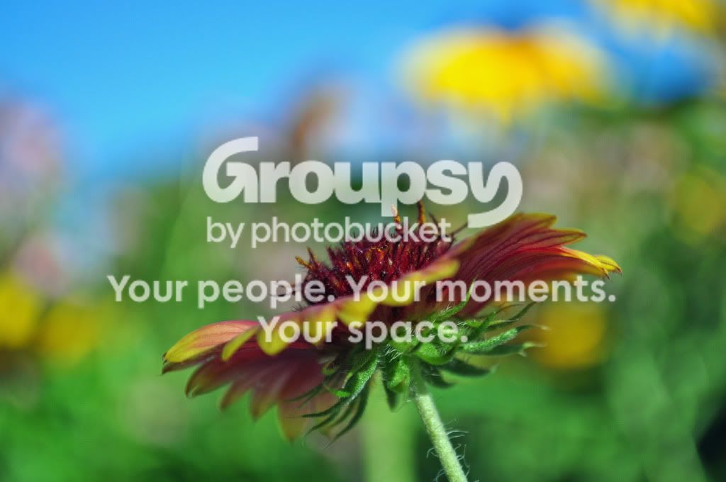
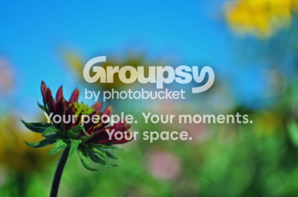
1,2: As mentioned these have a rather abstract feel to them, but I'm afraid I'm not getting a lot from them. I would prefer to see them shot looking down on the bloom, vice at the side of it. As well, your background despite selective focusing is still very distracting.
3. Nicely done, could stand to be slightly brighter though. With respect to composition, this might have been even stronger if formed so that the leaf formed a full diagonal.
4. Nice, but as per 1 & 2, it's a sill a little too much of a profile for my taste and the background is really hurting the image.
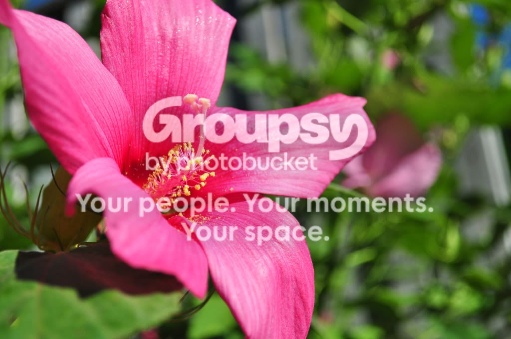
5. Very nice. I'd make this one just a little brighter and perhaps crop the RH side to eliminate that angled line. A bit more DoF so that the whole image was sharp would have taken it from good to great.
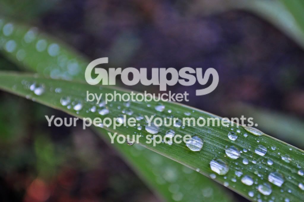
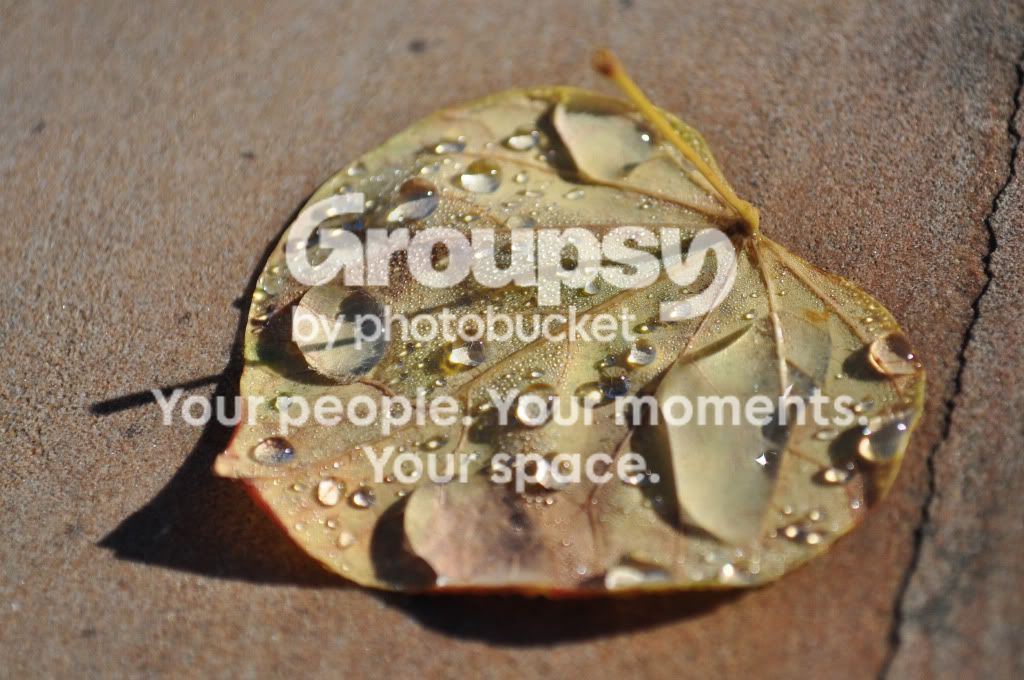
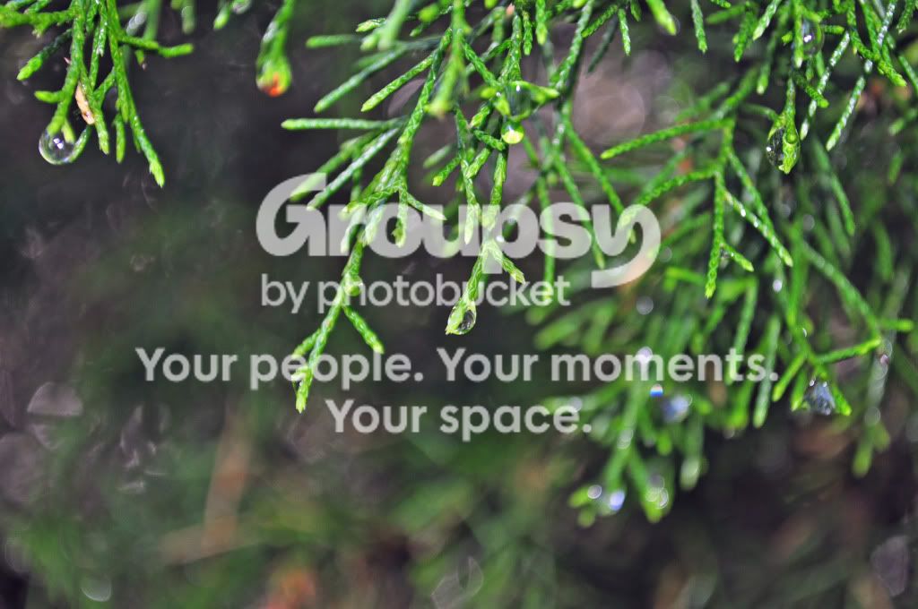
6. Not getting much from this image; the water drops are [I think} supposed to be the main subject, but they're not prominent enough for my taste.
Just my $00.02 worth - your mileage may vary.
~John







![[No title]](/data/xfmg/thumbnail/33/33362-84aacb865117bf8cba89104b89e9b36c.jpg?1734163304)
![[No title]](/data/xfmg/thumbnail/33/33874-2ac673051e59157729970fcb9b637b43.jpg?1734164219)