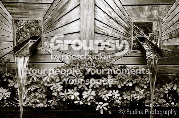
Thanks for the comments. I wanted to focus on the lines, patterns, and symmetry so that's why I chose black and white. Then again I don't have a color to compare it to. I also have a version without the toning that I think I like a little better. Can I ask what in the pp looks overdone? Other than basic exposure, I mostly worked with the tone curve/contrast and toning. I had just gotten LR so maybe I got a little photo-edit happy playing with this one!




![[No title]](/data/xfmg/thumbnail/1/1592-cfae4a7ea791f96c6e2d03484be2e454.jpg?1734142210)

![[No title]](/data/xfmg/thumbnail/34/34691-2fa9779b0e77f698b193a633b9242553.jpg?1734165697)
![[No title]](/data/xfmg/thumbnail/34/34689-7546fa5b2c817c48b60563925693cd53.jpg?1734165695)