From beginner to intermediate. Looking for feedback.

gsm275

TPF Noob!
Joined
Mar 24, 2010
Messages
108
Reaction score
4
Location
Vancouver, BC
Can others edit my Photos
Photos OK to edit
Just passed my 2 year mark in photography and looking for some feedback on some of my recent photos from the past few months. Would love some specific critiques on how i'm doing and suggestions for improvement. Would really appreciate feedback towards vision, creativity, and how interesting it is.

1
5838764104_6b85856b0b_b.jpg


2
6238990254_45940e38b5_b.jpg


3
6199524651_e1445da2d3_b.jpg


4

5973616376_6ef08f16d7_b.jpg


5
5841229201_9329ff57b9_b.jpg


6
6199525177_9ea375f5db_b.jpg
 
I would recommend the book by George Barr, Take Your Photography to the Next Level. It covers a lot of artistic end of things without being too overbearing. He kind of gets a bit guru-ish, and a tad bit pretentious in places, but the advice is nonetheless pretty solid.

Figure out who your favorite photographers are, look at a very wide selection of photographers from a variety of eras. REALLY look, try to appreciate all of them. Often times the most inspiration can come from the photographers who make images that are sort of hard to appreciate, don't get sucked into eye candy, try to understand why these photographers are held in such high regard, especially if you don't immediately understand why. It's easy to appreciate Ansel Adams, but there is a subtly to Elliot Porter that is a bit harder to see.

From here it's vital you don't end up an idolizer. You don't want to get into just into just making cheap copies of your favorite photographer's work, create images that represent your world view. Immediately forget your favorite photographers and make your own images, focusing on themes that are important to you.

Analyze your own work, try to understand what you saw and why you saw it. From this intentions are formed which are taken back out with you and solidify into a theme. But do this only after you've completed the image. While you're out, shoot intuitively, listen for those cues that tell you that an image is nearby, and look very, very carefully for what you subconsciously know is there. Go over every inch of the area. It's like playing "hot or cold", try to feel the image out, rather than trying to force something great.

Listen to the "pros" but understand they're mostly talentless hacks, they have good advice - especially regarding the technical end, but for the most part these guys are glory hounds that will shoot only to appeal to aesthetic titillation, they know what sells and that's all they tend to be about. Still, though, to accomplish this they require a solid understanding of the technical end of things, so don't discredit them entirely. Of course, if you want to be a professional photographer understanding all these aspects is vital to being successful. If you're on the starving artist program, take what they say with a grain of salt.

Then again, maybe you don't want to listen to me at all. People seem to think my stuff sucks.
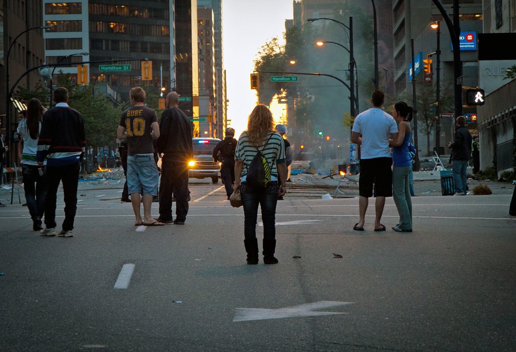
 
You're interested in a lot of different photographic styles, which is good. All of the images are pretty well done, so you probably will enjoy experimenting further with all of these styles. For specific critique, #5 looks way too yellow on my work monitor, which I know is not that accurate, but I suspect there really is at least a bit of a cast there. I don't like the cut-off shadow in #2, which is otherwise a very nice image. #1 is intriguing - very difficult to pull off a backlit image like this, but it seems to work. I like the way the pavement markings and some of the background lights frame the central figure. I might crop a little on the right; the "walk" sign and the red circle on the sign above it are distracting, imo. Keep shooting, and follow unpopular's good advice!
 
Hey Unpopular...I like what you had to say. It doesn't make any difference if anyone agrees or disagrees. We're talking about art where the rules are at best, vague. Can you direct us to a website where we can see some of your photos?
 
I haven't been out much at all, I don't like mid summer light, around here it tends to be really harsh and I haven't figured out how to deal with that in digital yet. I've been working on music a lot more as I have some new gear to learn. I've only uploaded a couple new images to my Flickr.

These are totally unedited, and pretty much everything that passes through my workflow ends up there. So, not all of it is exactly portfolio material. I'm interested in context and relationships, and the world in which objects exist and the interactions between forms. I like to think of inanimate subjects as if they are animate, as if they have a presence outside of our experience. I'm interested in symbols which have very specific meaning, but become ambiguous in their context or lack of context. Starting around Page 9 is really earlier stuff before I had my intent nailed down real well.

Some of the stuff between the newest and earliest is better, just because I've edited some stuff out. They were also taken in my childhood home, so I was more comfortable with my surroundings, plus my wife was way less busy and was able to watch the kiddo more; I had more opportunity to get out.

Anyway, enough excuses...

Flickr: ion_nine's Photostream
 
Last edited:
Terrific photos unpopular! It's very obvoius it's been taken from an artisitic eye. Great advice too, really appreciate it!
 
1) I’m really interested why everyone is standing in the street so carelessly. Then the chick in the center caught my attention. It was the stripes she’s wearing and the yellow on her bag. She stabilizes an otherwise scattered and therefore, incoherent picture.
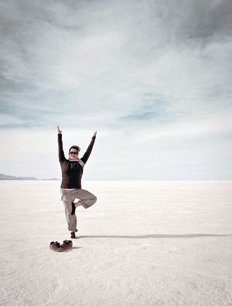
2) It looks a bit overexposed, but just slightly. Unless that was the look you were looking for. Your subject being off center gives it a bit of interest. And so do the contrasting colors.
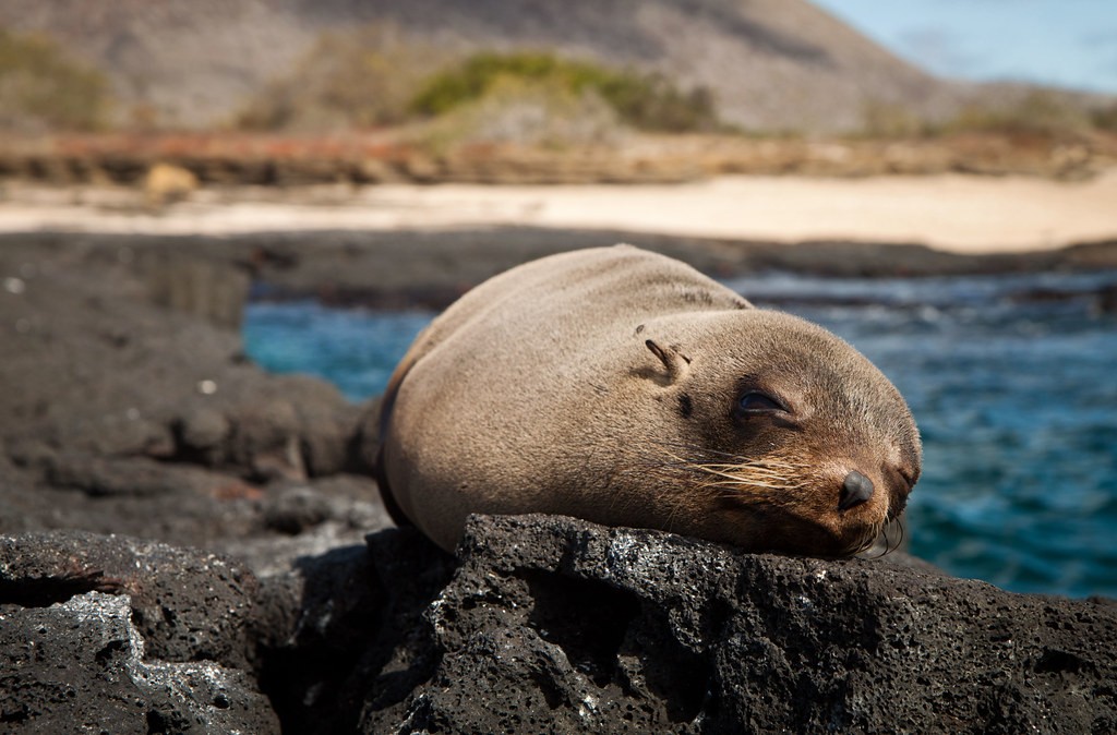
3) For me, it doesn’t really convey anything. It looks more like a passing photo somewhere. Not really worth more than one look. Maybe it the seal wasn’t so front and center.
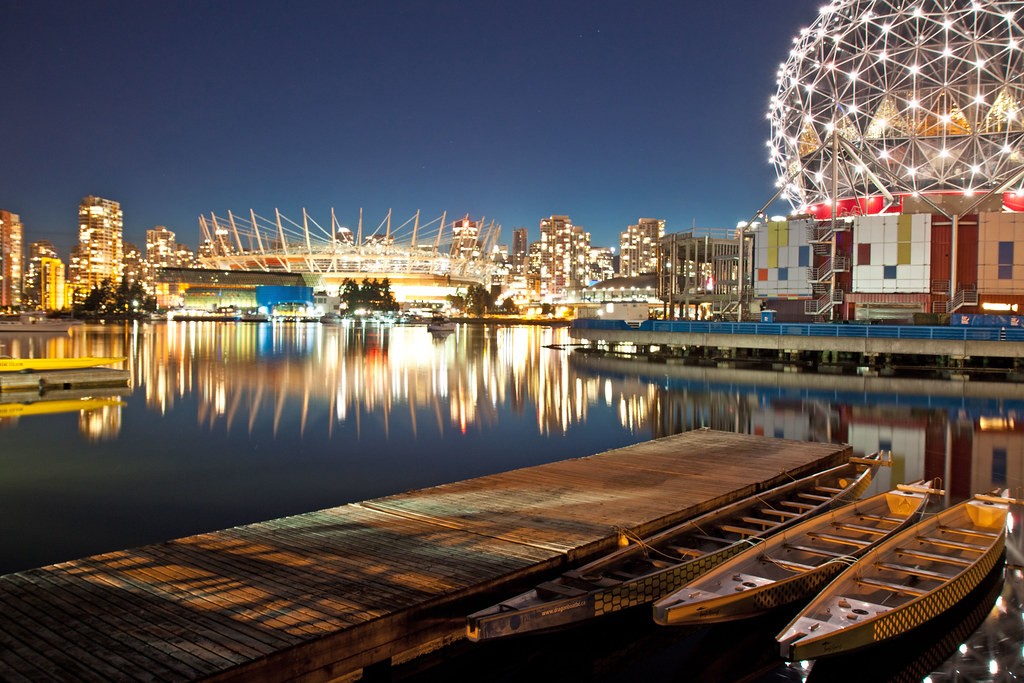
4) I’m loving this one. The pier drew my eye to the boats, then to structure on the right. This then leads to the background and all of the lights of the cityscape. And they reflect brilliantly of the water. Really nicely composed.
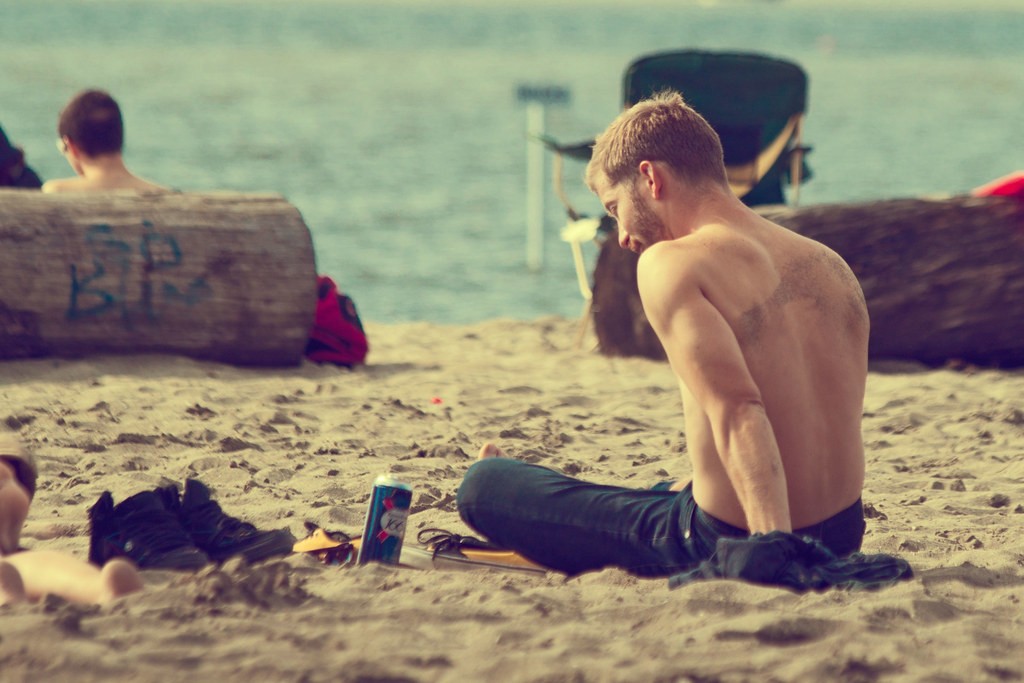
5) The photo is a little pointless and some things are out of focus. That being said, this has a very laid back quality to it. It’s still a pretty good photo. Maybe if he had another person to make it either romantic or friendly.
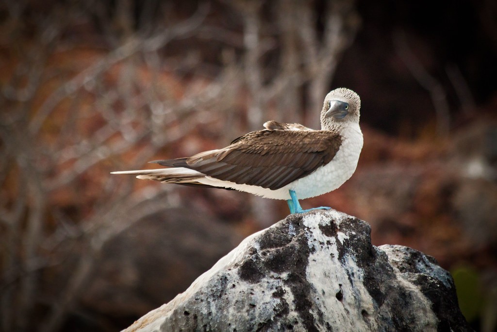
6) The bird seems to be contemplating something. Maybe even how to pose for your photo. Good depth of field and composition.

Keep Shooting!!! And when I finally post some photos, I would really like for you to comment on mine as well.
Take care
 
1 Makes me ask why? What is the purpose? the exposure on the people is a bit on the dark side.
2 I absolutely love. I don't know if you added the slight vignette or if it's lens vignetting, but I'd fix that.
3 is really dark on the face of the seal and the background being bright is drawing my eye a bit harder. The eye should be more evident rather than looking like a black hole. Nice.
4 very beautiful. HDR? It's done very nicely and doesn't look like the total crap we often see at all. REALLY like this one.
5 I am not feeling the love on this one. It looks like some blur was added at the bottom/foreground and that keeps pulling my eye pretty hard. The distractions all around him take from the "story" of the guy relaxing on the beach with his beer. Focus seems to be sharpest at his foot. Like the vintagey feel to the edit. Doesn't really fit the image perfectly, but it's not too bad.
6 beautiful. I think your focus feel just a hair short. The rock seems sharp, but the head and eyes aren't as sharp. Lovely shot overall
 
The first twenty or thirty years is 'the beginning'.

Just passed my 2 year mark in photography and looking for some feedback on some of my recent photos from the past few months. Would love some specific critiques on how i'm doing and suggestions for improvement. Would really appreciate feedback towards vision, creativity, and how interesting it is.
 
#1 is kinda boring but i find the others to be pretty interesting and better captures. keep it up.
 
I really like the first one, it's probably my favorite. At first I kind of looked over it, which I think is a mistake. There is a kind of haunting ambiguity about it. You looks a little closer and it becomes obvious something significant is happening. It's a bit dark, but, idk, it's not under exposed really. Look closer, and there is a real sense of tension, which the arrows add nicely to. The woman in the center of the frame really makes the image what it's about.

Don't pay any attention to comments like "it's boring". These are not critiques at all, obviously you thought it was interesting enough to capture, and if that's all the audience has to say then it's not about the image itself, but about their own sensibilities and expectations. Simple one liners, either negative or positive are never about what you're doing, but rather about what the viewer is expecting.
 
Last edited:
1- Has lots of details but still a very nice shot.
2- I like it so much!
3- Maybe you should've placed it more in the third of the image rather than its center?
6- Sharp and nicely focused.

Good luck!
 

Most reactions

Back
Top