Full Model Portfolio- Marty (image heavy)

DanOstergren

TPF Supporters
Supporting Member
Joined
Jun 2, 2013
Messages
4,493
Reaction score
4,141
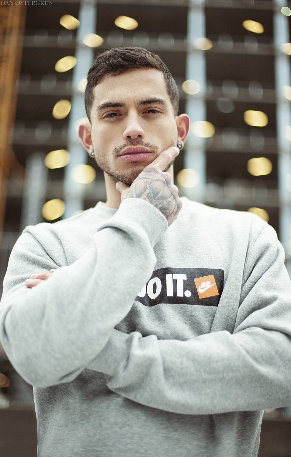
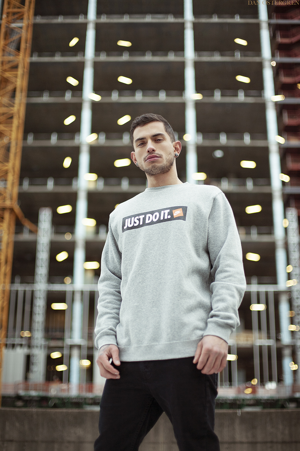
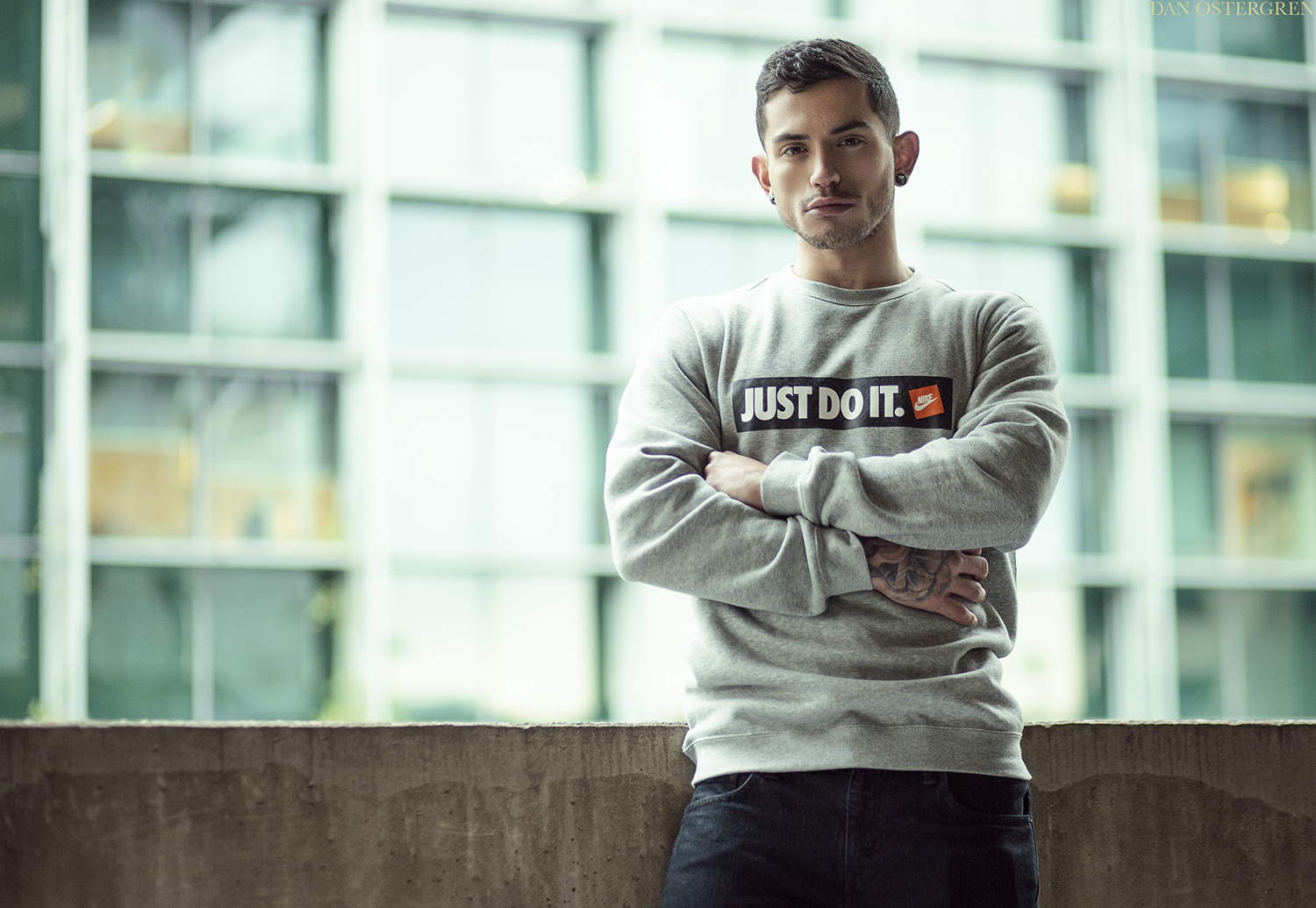
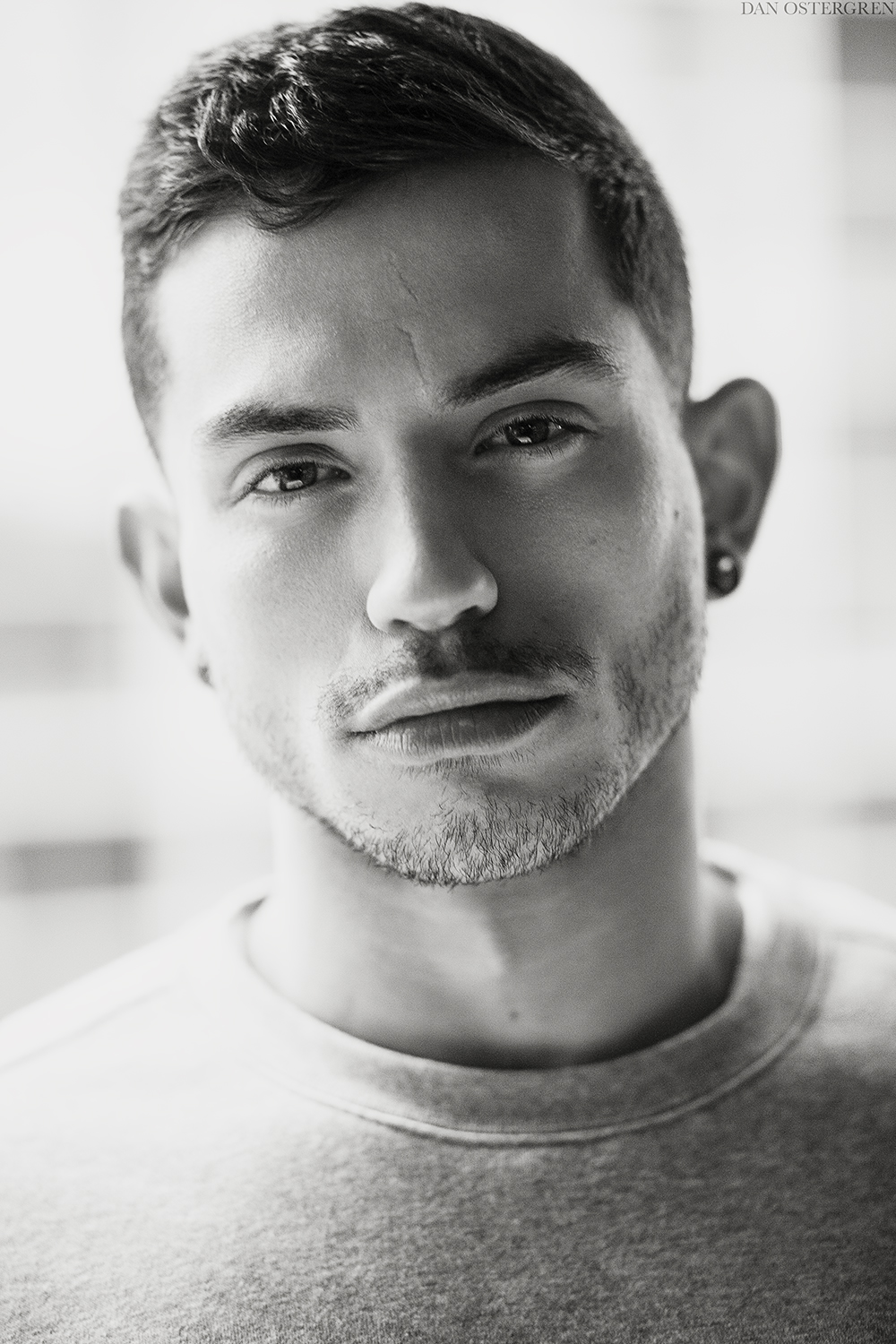
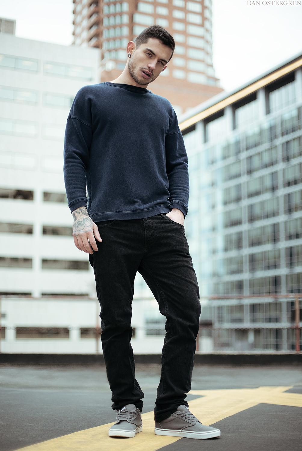
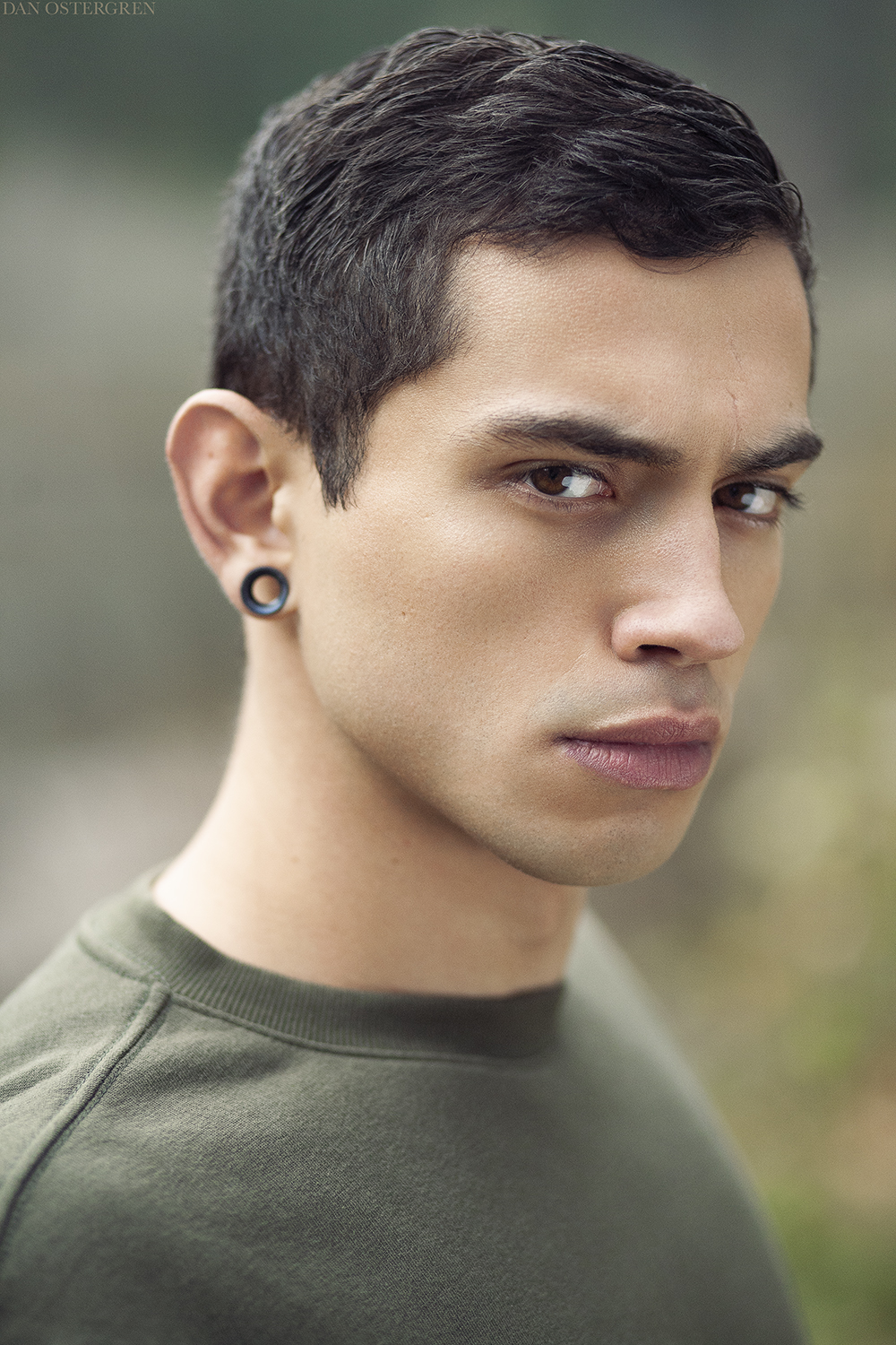
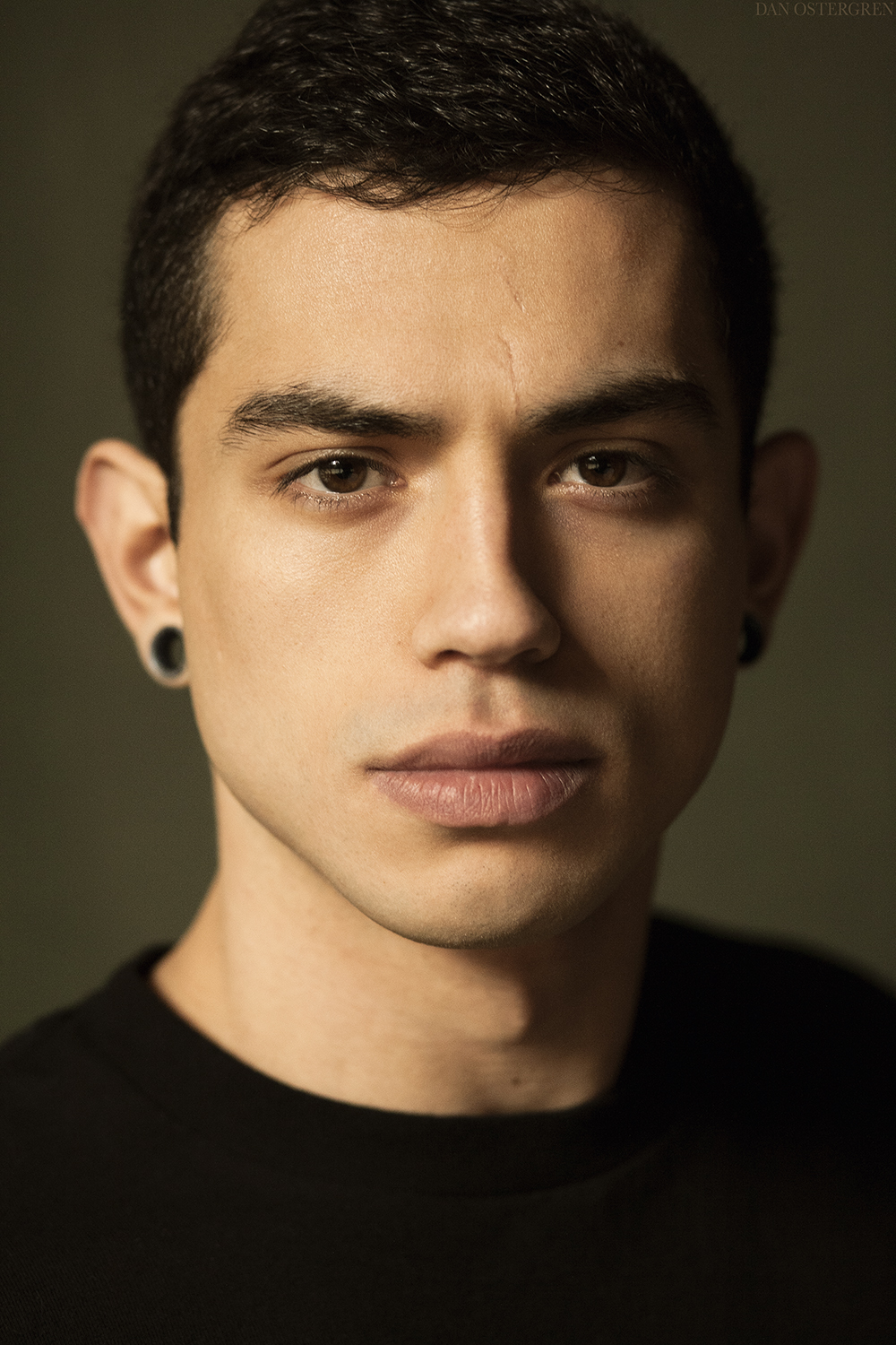
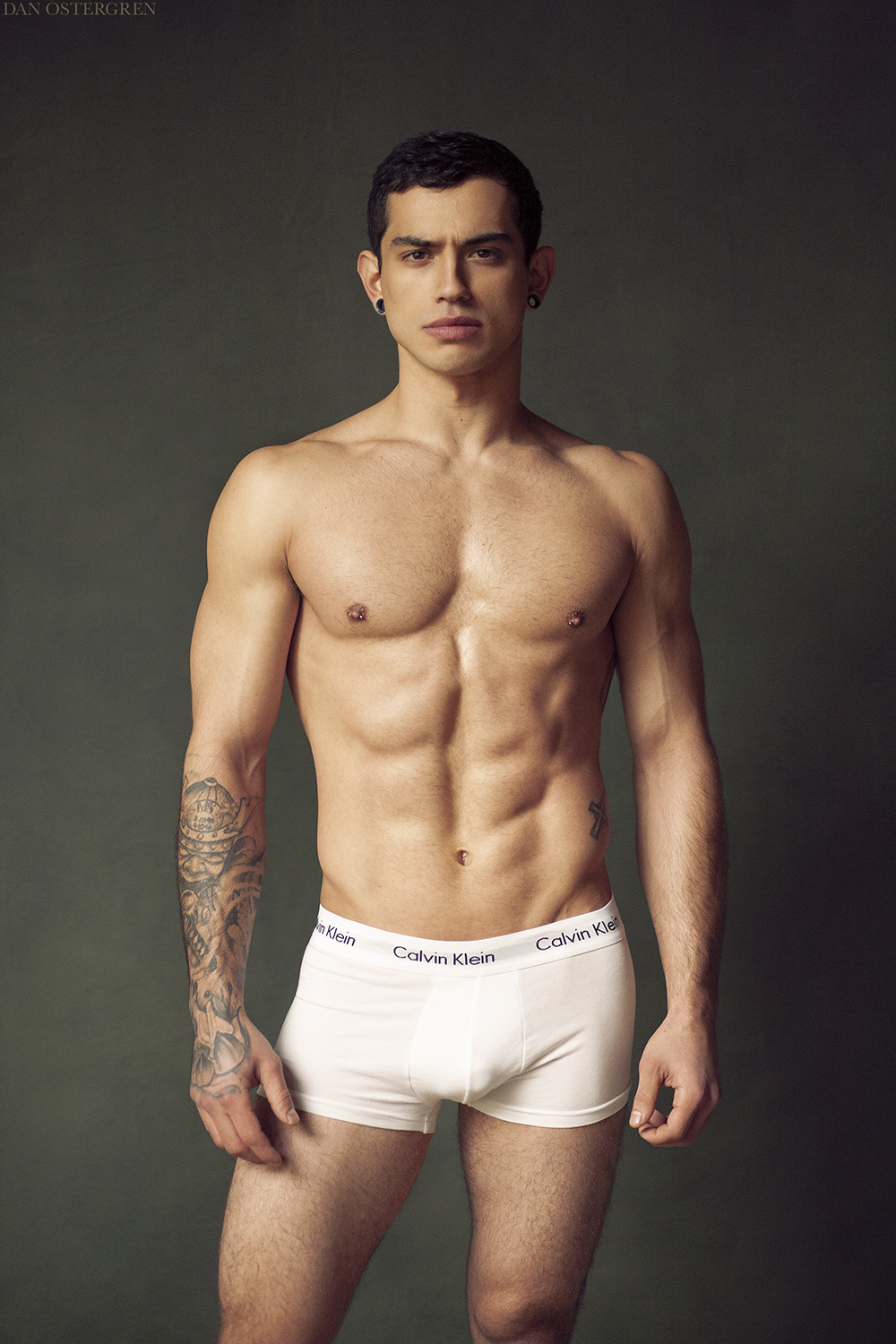
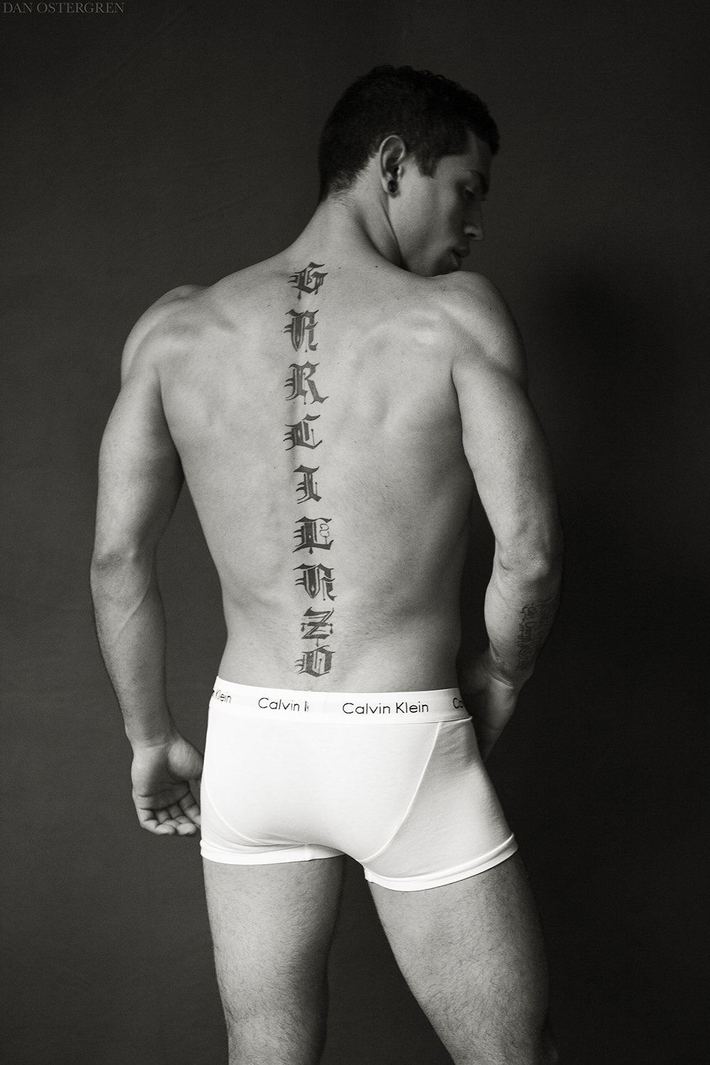
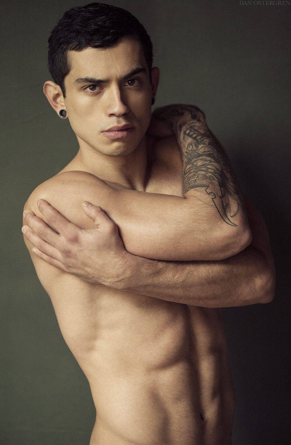
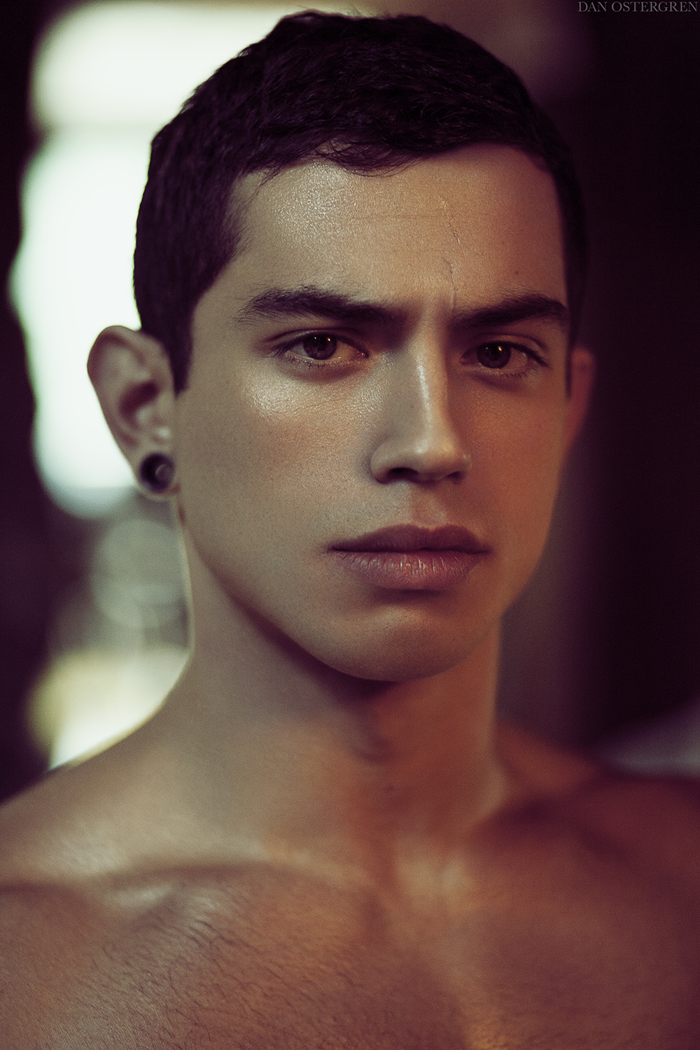
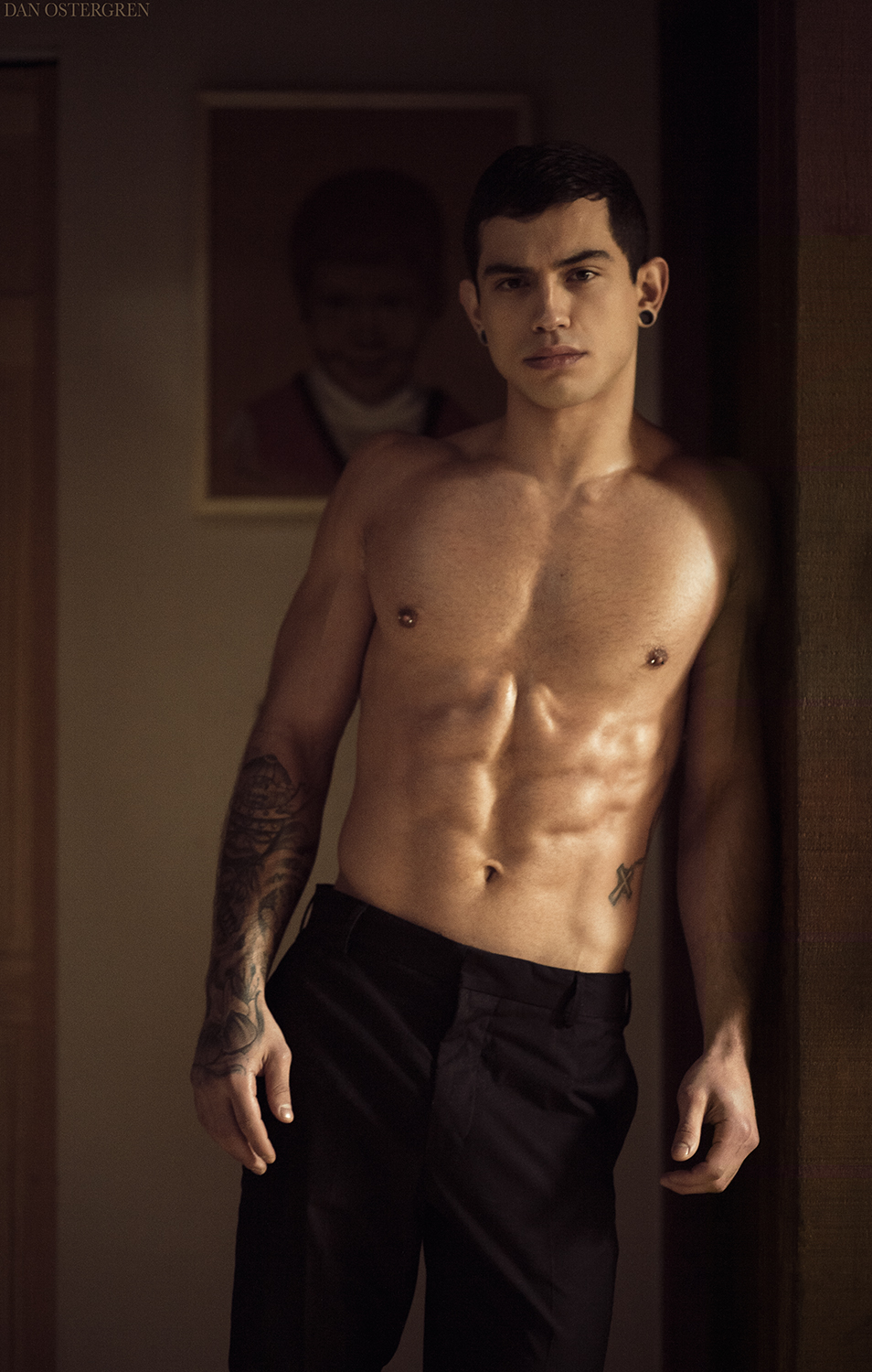
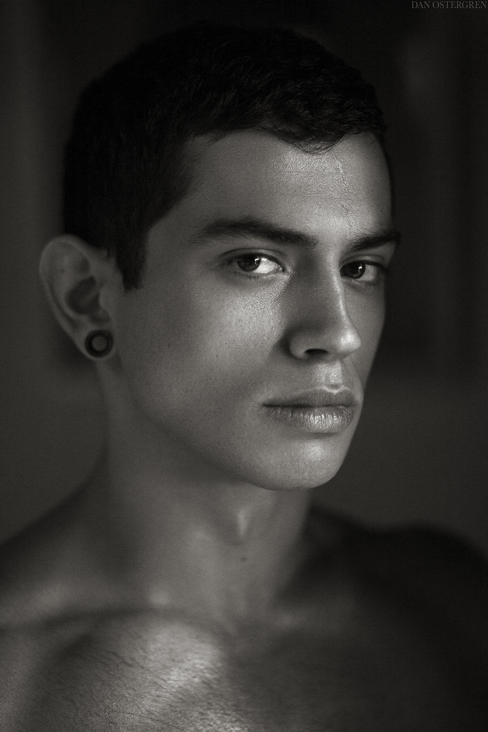
Marty is new to modeling, and hired me to shoot his portfolio after being scouted by an agency. We really hit it off as friends during the first shoot, so we ended up doing a second shoot a few days after the first one. This kid has been through a lot and had a very hard life, and I really hope to see him succeed as a model.

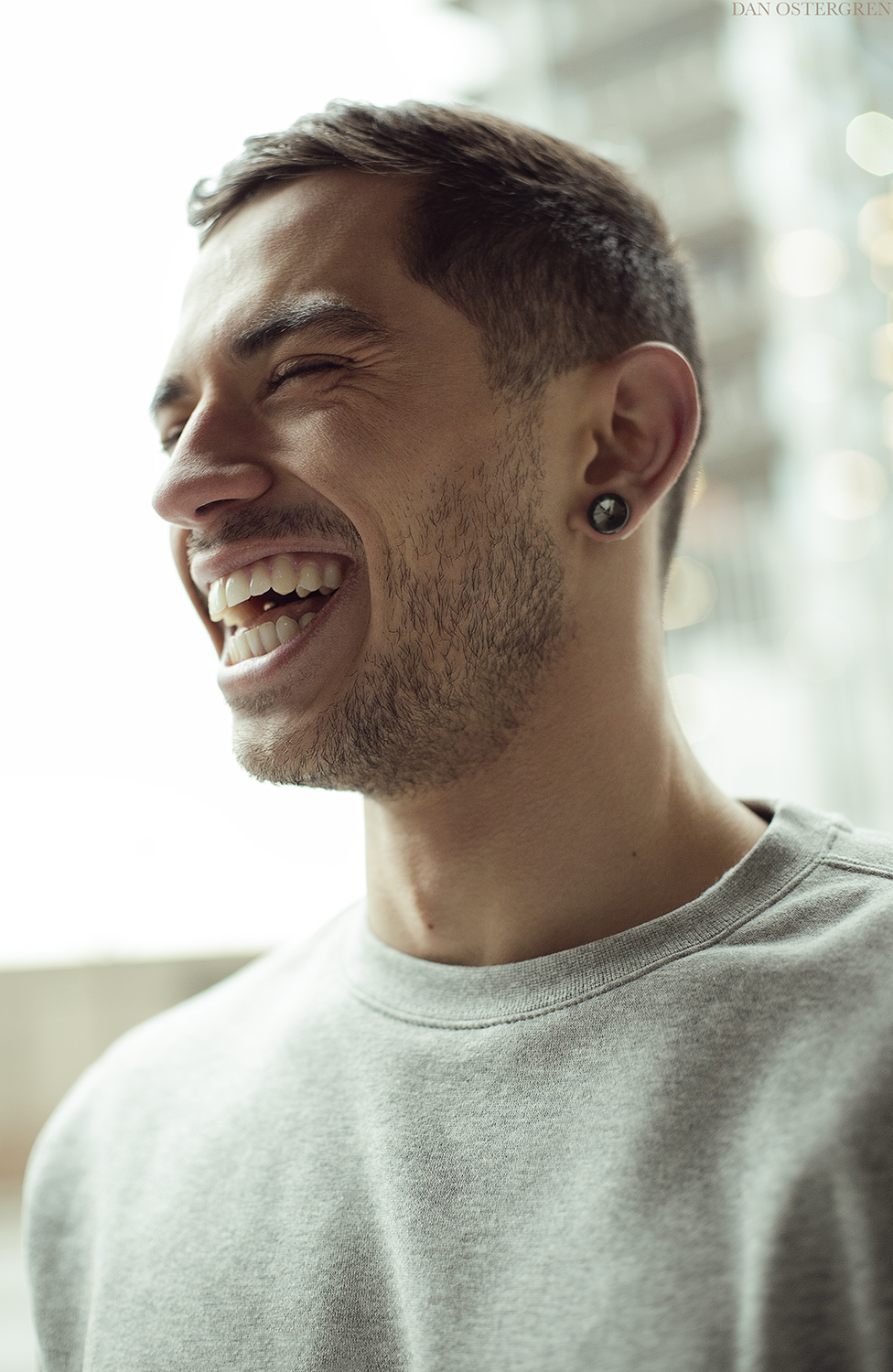
Anyways, as usual all of these were shot using natural light with a white reflector, with the exception of one photo that is a mixture of natural light coming through a window and a household tungsten bulb. The "studio" shots were lit with a giant North Facing window on an overcast day, with a big white reflector for fill. All were shot using a Canon 5D Classic, while switching between a Canon 85mm f/1.8 lens and a Canon 50mm f/1.4 lens that I recently purchased. The 50mm is a very welcome addition to my gearbag, as the only lens I've owned for the past 2.5 years is the 85 f/1.8, and I was really needing something with a little wider perspective.

Normally I don't share so many photos from one shoot, and to be honest I'm rarely so inspired by a model in order to be able to finish so many photos of them. I'm quite inspired by Marty, but additionally I was recently accepted into an artist collective in Portland, so now I have a downtown workspace to do my editing out of while being surrounded by a group of exceedingly talented and inspiring artists. I haven't been this productive or inspired in years.

Feel free to tear them to pieces.
dcu1qy4-37142e66-1910-4a38-9e0e-156110379acc.jpg


dcu1qq8-8deb37b0-c711-4c26-b0bc-d01de8133418.jpg


dcu28p9-d4b5d0be-c04d-48d6-9768-0ac1a3f950bf.jpg


dcu1r74-c979bcfd-917e-4a95-986b-3d345cfdbfa8.jpg


dcu1r2d-3c0cb315-ed22-4d23-bead-0d06f18f794c.jpg


dcu1quw-6e73903d-ac25-4201-97dd-3e3d974e7a92.jpg


dcu1q4d-ff71162a-b22d-4645-a72e-051b939b592b.jpg


dct8lre-b525889b-173a-4e76-84d7-5ec782fe2855.jpg


dctxixg-95cf70a3-d888-435f-bea5-c8fa8da8bb37.jpg


I missed the focus on this one, but I liked it enough to keep anyways. Unfortunately the soft focus gives the appearance of too much retouching on the face.
dcu1pbr-885d40ae-e63e-4907-aeb3-747242fe9177.jpg


dcu1qcc-5528531e-25e6-4492-aeca-a0ad32e03149.jpg


dcu1qjc-401ce30f-3cf0-491e-8dff-75b56eb992d2.jpg


dcu1pnx-7f956780-e4f0-4f49-b1a4-5035345fe3c2.jpg


dcu1pw4-d8813d6a-4383-4def-90a8-d849cbfc173f.jpg


dct8lrp-49ea2c26-3ebd-4d56-867e-17526cfdcd18.jpg
 
Last edited:
another amazing set.
 
Great set. I really like the 7th one. ( green shirt, face turned slightly away but eyes looking direct.
 
That's such an incredibly nice set. I don't see any need for anything but to say, print 'em. Any of them in a portfolio ought to be able to get him some modeling work.

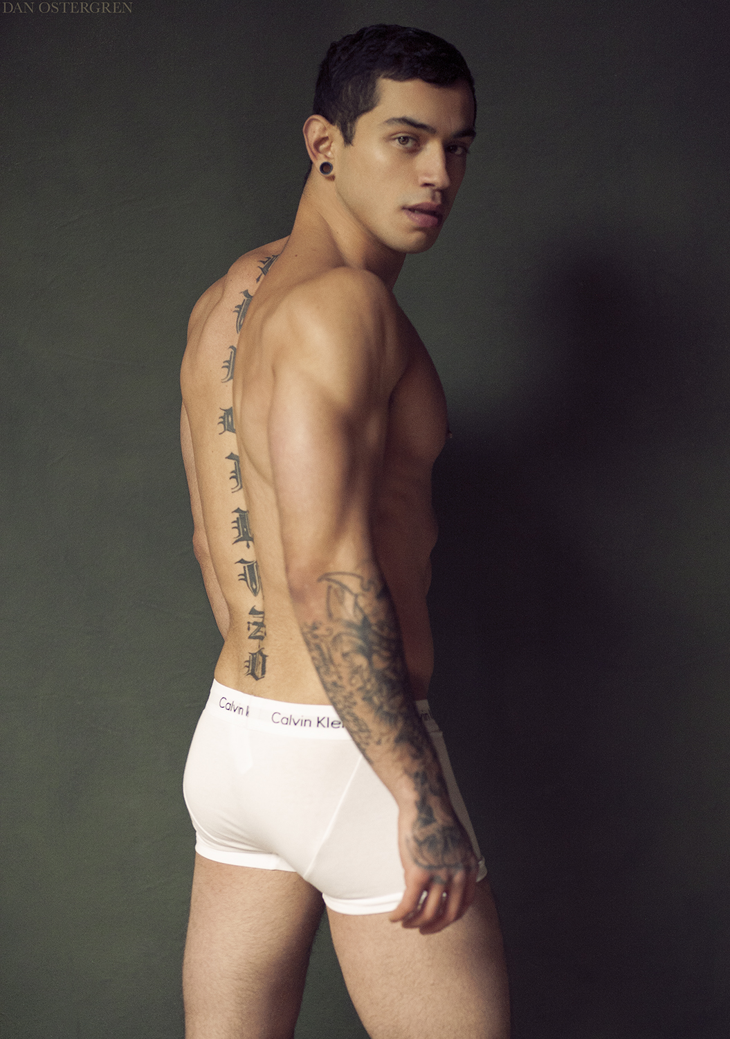
(Although I wonder if a logo is usable in a portfolio? Would it get him in an ad for CK?? or get him a call from a lawyer for CK or the Swoosh?)

I also like the way you chose backgrounds and where you placed him in relation to the patterns and lines/shapes.
Thank you so much!

Branding is very important, and it gives models an advantage to show that they can represent a brand well, which could potentially land them a big job (me as well hopefully). In Portland it's especially strategic to use Nike, as they are largely based out of here and hire local talent for campaigns. I'd be very happy if both the model and I were noticed by them, as they are one of the highest paying brands to work with in Portland.
 
All are so good. I like #13 ;)
Do you do anything to them? Like D&B? Or just clean em up?
I'm just asking cause the look so clean and sharp.. just look awesome. What is your work flow like with an image?
The two post of yours really has me thinking and wanting to try new things. Every time I go out and shoot. I have to bring out a big soft box, lights the whole shabang. I love the look of OCF but these look amazing. Thanks, it's inspiring and your very talented. Makes me want to get out and practice!!
 
Last edited:
All are so good. I like #13 ;)
Do you do anything to them? Like D&B? Or just clean em up?
I'm just asking cause the look so clean and sharp.. just look awesome. What is your work flow like with an image?
The two post of yours really has me thinking and wanting to try new things. Every time I go out and shoot. I have to bring out a big soft box, lights the whole shabang. I love the look of OCF but these look amazing. Thanks, it's inspiring and your very talented. Makes me want to get out and practice!!
Thank you.

When it comes to lighting, it's all about how you use it to shape and sculpt your subject's features. My general rule of thumb is to loosely follow the concept of Contouring and Highlighting, which is a makeup technique meant to mimic flattering lighting. The light source itself doesn't necessarily matter unless you specifically want high contrast light or soft light, and I'm not opposed to either kind.

Yes I do a little bit of dodging and burning to clear up skin tones, but I try to keep it subtle. Another trick I use when photographing someone in little to no clothing is to coat their skin with spray-on sunblock (spray it mostly to their body and only a light mist on the face. Make sure they shut their eyes otherwise it will irritate the eyes and turn them red). Walgreens brand has the best applicator. Don't use a bronzer. The sunblock will give their skin a nice and subtle "glow", as opposed to other things that tend to make skin look greasy.

I use ACR to get the exposure exact and to make sure color tones are accurate. I use Photoshop for everything else, which consists of a selection of adjustment layers (curves and selective color for contrast and color toning), as well as various adjustment layers with inverted masks for selective corrections and dodging/burning. I've intended to make some short video tutorials, however my iMac simply doesn't handle screen recording very well.
I would love to see these videos! Well, you definitely have the coloring down and they look amazing. I been playing with color and seeing what works. I think color is what separates and gives you a style. But there is more to it than one would think. I was looking at a tool called NBP Plugins for Photoshop
To help.
I mean do you say... Im going to add this color to highlights and this to Shadow when you edit?
 
Last edited:
All are so good. I like #13 ;)
Do you do anything to them? Like D&B? Or just clean em up?
I'm just asking cause the look so clean and sharp.. just look awesome. What is your work flow like with an image?
The two post of yours really has me thinking and wanting to try new things. Every time I go out and shoot. I have to bring out a big soft box, lights the whole shabang. I love the look of OCF but these look amazing. Thanks, it's inspiring and your very talented. Makes me want to get out and practice!!
Thank you.

When it comes to lighting, it's all about how you use it to shape and sculpt your subject's features. My general rule of thumb is to loosely follow the concept of Contouring and Highlighting, which is a makeup technique meant to mimic flattering lighting. The light source itself doesn't necessarily matter unless you specifically want high contrast light or soft light, and I'm not opposed to either kind.

Yes I do a little bit of dodging and burning to clear up skin tones, but I try to keep it subtle. Another trick I use when photographing someone in little to no clothing is to coat their skin with spray-on sunblock (spray it mostly to their body and only a light mist on the face. Make sure they shut their eyes otherwise it will irritate the eyes and turn them red). Walgreens brand has the best applicator. Don't use a bronzer. The sunblock will give their skin a nice and subtle "glow", as opposed to other things that tend to make skin look greasy.

I use ACR to get the exposure exact and to make sure color tones are accurate. I use Photoshop for everything else, which consists of a selection of adjustment layers (curves and selective color for contrast and color toning), as well as various adjustment layers with inverted masks for selective corrections and dodging/burning. I've intended to make some short video tutorials, however my iMac simply doesn't handle screen recording very well.
I would love to see these videos! Well, you definitely have the coloring down and they look amazing. I been playing with color and seeing what works. I think color is what separates and gives you a style. But there is more to it than one would think. I was looking at a tool called NBP Plugins for Photoshop
To help.
I mean do you say... Im going to add this color to highlights and this to Shadow when you edit?
It's more than just color. It's planning, lighting, styling, mood, vision, how I use my camera and lens, and experience. Color is something I take into account when I'm choosing what the model will wear and where I decide on a location. Sometimes I do zero color toning in addition to "corrections" because color has already been figured out at the moment of the exposure. Focus on the craft itself, and then everything else will begin to become secondary to your vision as a photographer, and you will eliminate the need for excessive editing. Editing should be a small part of the overall process.
Yeah, well I ha e definitely derailed and got them switched. Thanks for taking the time to help. You are very talented.
I forgot to answer your question though, so to answer your question, yes there is some decision making about color when it comes to editing, and it's closely tied in with the process of taking the photograph. You can use the Selective Color adjustment layer in photoshop in order to manipulate colors to better harmonize with each other. It's important that you're still thinking about color when you're taking the photo, and then in post production you use the Selective Color adjustment layer to work with the colors a bit. At this point though if you're going to manipulate color and you want harmony, I would take some time to study color theory so you can use color to your advantage. For example, when I made my backdrop, I specifically used a selection of colors that I felt would most compliment any skin tone, in turn reducing the amount of photo editing necessary in order to attain color harmony. This saves me a lot of time and work. It's the same concept when I choose a location, and then in post production I am able to use a minimal amount of color manipulation and toning in order to further harmonize the colors.
 

Most reactions

New Topics

Back
Top