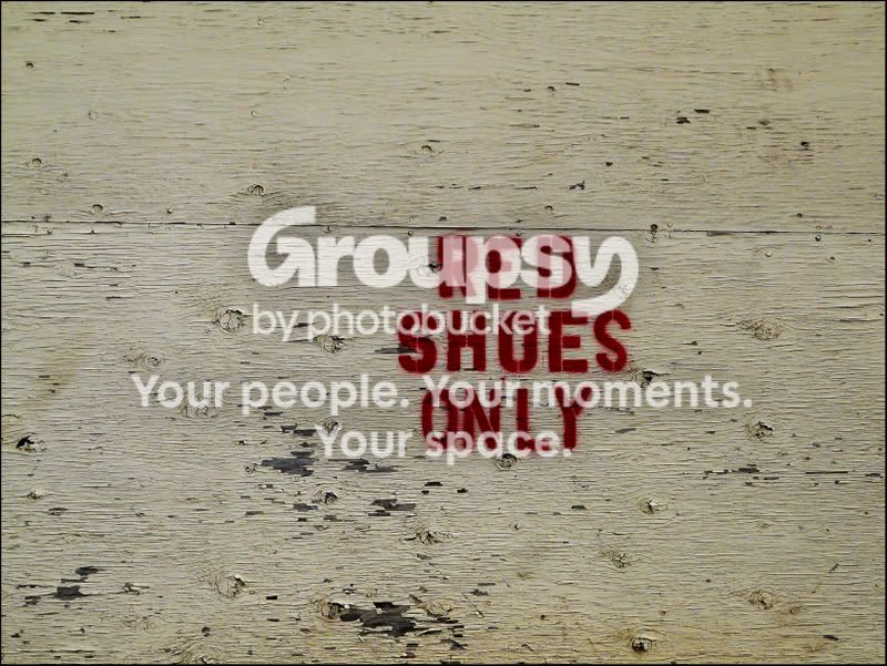
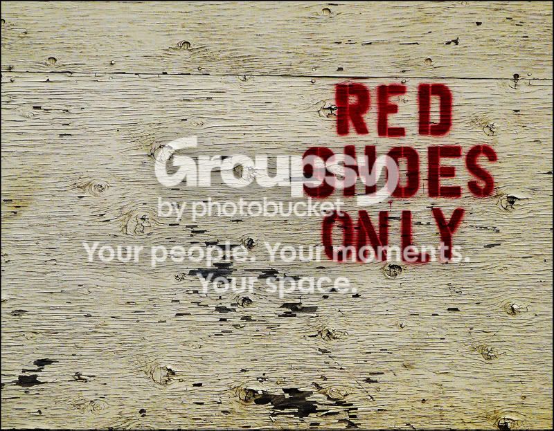
Much improved (in my opinion, at least). All the "action" in the wood is happening on the bottom left quarter, so the new crop really brings that out. Also, it is now easier to see the imperfection of the font (the two letters "S" are different, and the second one looks weird!). But I think it's the texture being rescued from obscurity what breathes new life to this image.
Just my two cents, of course.








![[No title]](/data/xfmg/thumbnail/34/34118-1c18899050bfacc1ed25ac6c1740422b.jpg?1734164585)