Hands and Feet C&C

laynea24

TPF Noob!
Joined
May 5, 2012
Messages
769
Reaction score
72
Location
Oklahoma
Can others edit my Photos
Photos OK to edit
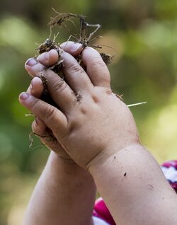
This was cropped in to focus on the hands. I also saved the full version.
$LBB_7270crop.jpg

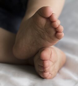
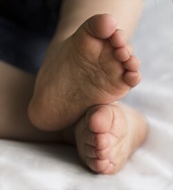
He decided to use my reflector as a bed, so I took a few photos.
$IMG_7304resize.jpg

I would like C&C on composition, lighting, and color balance specifically please! You can also point out anything else. These are just the things I am trying to improve on.

Thanks a ton!
 
By the way, these were taken the same day.. That's why his feet are so dirty! I swear I bathe him.
 
Can you post the full (uncropped) version? I am not really loving the composition, I think we need more context to the image.
 
I think I agree that the cropping of his hands doesn't seem to work, I think the lighting seems ok given the fact that his hands are dirty. As for his feet, maybe a tad more light but the bigger issue is there is too much of the reflector and not enough of his feet. He seems like a typical boy, lol

"As I Wander"
 
whats up with cruddy hands and feet? if thats the point of the pic it may be better to make them REAL dirty for some pop.
 
It is definitely different. I don't know if it goes together but it's different. Did you get the child to hold the dirt? I would assume so. If you didn't that you captured a moment that would have been nicer from a wider pov.
 
It is definitely different. I don't know if it goes together but it's different. Did you get the child to hold the dirt? I would assume so. If you didn't that you captured a moment that would have been nicer from a wider pov.


I didn't make him hold the dirt.. He was just playing. I'm going to post the whole photo.
 
I think I agree that the cropping of his hands doesn't seem to work, I think the lighting seems ok given the fact that his hands are dirty. As for his feet, maybe a tad more light but the bigger issue is there is too much of the reflector and not enough of his feet. He seems like a typical boy, lol

"As I Wander"

I'll try a different crop of the feet. Let me know what you think.
 
Original. I know his far eye is out of focus. That's what led me to the other crop.
$LBB_7270eresize.jpg

Feet Re-crop

$LBB_7304eresize.jpg
 
C&C per request:

Shot 1
- Lighting: Looking at the uncropped version I can see that you (or your camera) did a decent job of finding the middle ground between the bright background and your son. In the cropped version, however, you've left yourself only darker areas of the original (except for a slightly brighter spot at 3 o'clock in the cropped version), so the whole image comes off as underexposed. I think you can brighten up the entire crop to get his skin properly exposed and then burn the background where needed so it's not overly bright.
- Color balance: The color balance is a bit on the cool side. Again, this is not surprising since the remaining subject was originally in the shade of an image with both shady and sunny areas.
- Composition: I actually like the composition. The most interesting portion (the fingers with the dirt sticking out between them) is approximately at a rule-of-thirds point, you've avoided cutting him off at the elbows, and his left (near) arm follows a nice diagonal from lower right to upper left. The only nit pick I have is that this particular angle to the arms, combined with the intertwined fingers, is too reminiscent of praying hands for me (which just doesn't really jive with the dirt).

Shot 2
- Lighting: I think it could use a touch more brightness, but this might be better accomplished by dodging the sole of his left (top) foot rather than universally brightening the image too much. The reflector could use being just a smidge brighter (IMO), as it's coming across a bit gray, but at the same time his right sole and left shin are bright enough that you don't want to over brighten them.
- Color balance: I think the color balance here is pretty good, and I would see how the shot looks after dealing with the brightness before worrying about the overall color balance.
- Composition: Thank you for posting the recrop - that was my first reaction upon seeing the originally posted version of this shot. I like the tighter crop; the extra reflector was doing nothing to add to the image (if anything the wrinkles were detracting from it). The tighter crop works much better. It is pretty well centered horizontally, but because you can see the legs heading out of frame to the left and top the image still has some dynamic feeling to it (unlike a centered image which doesn't break the frame).

Thanks for the feedback! I'll see what I can do about the top foot. Did you mean the cropped version of the hands was underexposed or the uncropped version? Or both?
 
Did you mean the cropped version of the hands was underexposed or the uncropped version? Or both?

I meant that the cropped version was underexposed. The full version seems well exposed to me; you have detail in the shadows and the bright portions of the background aren't blown glaringly white. The overall image is nicely averaged. However, when you crop out the unwanted background you are also cropping out the bright portions, so the average of what remains is darker than the original. Had you exposed for the skin it would have been brighter at the cost of blowing out some of the background - but as you're cropping that background out, who cares?

I like the re-edit of the foot shot. His sole now comes across as dirty rather than shadowed. And you lightened those areas without blowing out anything that was already bright Well done.
 
Studio7Four said:
I meant that the cropped version was underexposed. The full version seems well exposed to me; you have detail in the shadows and the bright portions of the background aren't blown glaringly white. The overall image is nicely averaged. However, when you crop out the unwanted background you are also cropping out the bright portions, so the average of what remains is darker than the original. Had you exposed for the skin it would have been brighter at the cost of blowing out some of the background - but as you're cropping that background out, who cares?

I like the re-edit of the foot shot. His sole now comes across as dirty rather than shadowed. And you lightened those areas without blowing out anything that was already bright Well done.

Okay! That's what I thought you meant. Thanks for all your help. I wouldn't have ever thought to re edit that the way you suggested. I like it a lot better. Thanks again! :)
 

Most reactions

New Topics

Back
Top