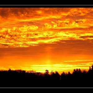
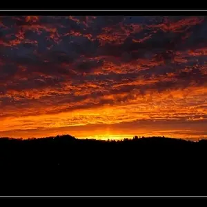
JonMikal, if I were you, I'd be as undecided. The colour version definitely lives by the vibrancy (is that an existing noun?) of the colours, no doubt, and therefore doesn't require as much sky as there is right now.
But the strongly contrasted b+w has a right to exist, too, and the lack of colours is compensated by the contrasts and the very well worked out - and in this case essential - dramatic sky. I wonder how you achieved it... it has a tendency to look fake, though it isn't, I can tell... These two versions make me think a lot, too, and it's hard to tell which one's the better of the two.



 The colors add so much to this shot.





![[No title]](/data/xfmg/thumbnail/37/37606-3c9ffb5906173fa2aa489341967e1468.jpg?1734170733)