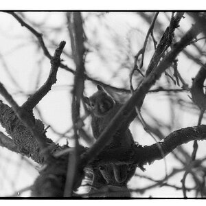
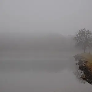
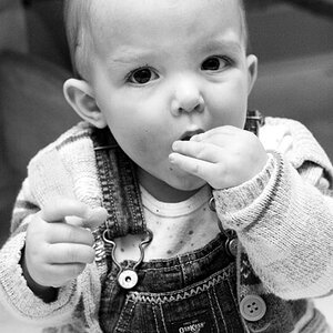
I think the first 2 would make great candidates for a "Touch of Color" where you leave like one or two focal points in color but leave the majority black and white. Sorry if for knowing the technical term but Ive just seen it referred to as TOUCH OF COLOR
I see what your saying. You do/did see it alot but it does SOMETIMES still make for a cool shot. Especially in some situations where the "straight" B&W doesnt quite work as well.
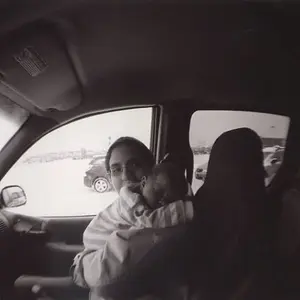
I like 1, but I feel as if 2 is slightly too contrasted and 3 is just plain too busy all together. Some separation of color is definitely needed if you're going to shoot something that leads one's eye over the entire photo (as expressed in 3), Just IMO though...






![[No title]](/data/xfmg/thumbnail/39/39271-04ff6ce1fbcda2b0d41ad7ee08cff91a.jpg?1734173231)
![[No title]](/data/xfmg/thumbnail/32/32929-22e23acc63d6ecb25e5ee941be87121f.jpg?1734162700)
![[No title]](/data/xfmg/thumbnail/30/30994-49c5521f7b5b417f49dcd43891cbec27.jpg?1734159066)
![[No title]](/data/xfmg/thumbnail/42/42451-9e2e4f1caad4c45d0c61e2a856140c36.jpg?1734176992)