
DennyN
No longer a newbie, moving up!
- Joined
- May 5, 2018
- Messages
- 131
- Reaction score
- 206
- Location
- Parma Ohio
- Website
- dennynoll.smugmug.com
- Can others edit my Photos
- Photos OK to edit
Newbie question.....
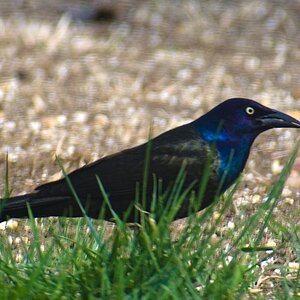
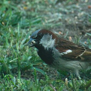
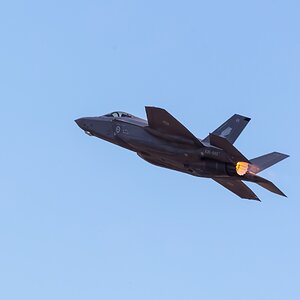
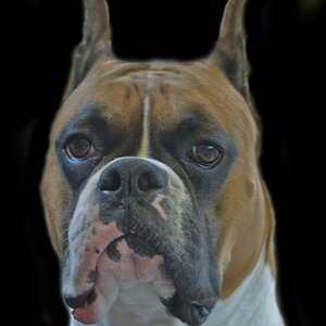
What accounts for the amazing vivid colors I see with photos taken by folks that know what they are doing. My guess is there are many variables but how much of it is post processing and in what way ? My stuff always seems a little bland.
My stuff - Denny Noll
Any input would be appreciated.
What accounts for the amazing vivid colors I see with photos taken by folks that know what they are doing. My guess is there are many variables but how much of it is post processing and in what way ? My stuff always seems a little bland.
My stuff - Denny Noll
Any input would be appreciated.
Last edited:
![[No title]](/data/xfmg/thumbnail/42/42022-b164b48fbcd31e32040c4983ecb8983a.jpg?1619739981)

![[No title]](/data/xfmg/thumbnail/37/37488-1946adf246ec6e047915c668d3dcff15.jpg?1619738111)
![[No title]](/data/xfmg/thumbnail/37/37604-7ad625e983f92f880eb65a264eeef5e4.jpg?1619738148)
![[No title]](/data/xfmg/thumbnail/42/42020-6dbbc2fb244014aa89adfe2ccf067af7.jpg?1619739979)
![[No title]](/data/xfmg/thumbnail/37/37603-739c5d9b541a083a12f2f30e45ca2b7b.jpg?1619738147)
![[No title]](/data/xfmg/thumbnail/42/42026-4f14b406e4eb9c886f454721fb021fba.jpg?1619739982)
![[No title]](/data/xfmg/thumbnail/42/42024-bf0604d67b26c7acb5e4d59254692618.jpg?1619739981)