misstwinklytoes
TPF Noob!
- Joined
- Jun 13, 2010
- Messages
- 2,111
- Reaction score
- 40
- Location
- Texas
- Website
- www.etsy.com
- Can others edit my Photos
- Photos OK to edit
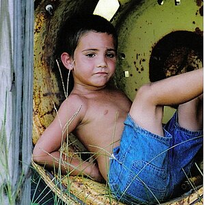
I had fun and it was good practice. Weather was SO crappy.  Oh well, here's one. Edited 2 ways.

Adams Family by jenangeljen, on Flickr

Adams Family by jenangeljen, on Flickr
Oh well, here's one. Edited 2 ways.Adams Family by jenangeljen, on Flickr
Adams Family by jenangeljen, on Flickr
 Thanks for all of your input. I might consider cropping it closer.


![[No title]](/data/xfmg/thumbnail/37/37929-d9f744e40945eb18b68bb10eb79dbbbc.jpg?1619738401)