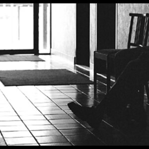
Let say that I am not a big fan of B&W unless it is done very well.
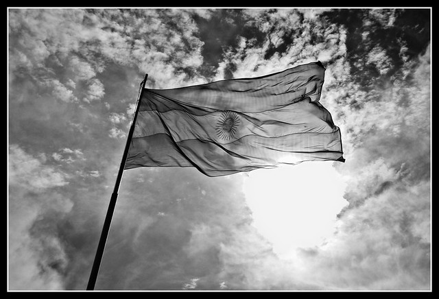
1. I like the idea behind this one. However, with the B&W conversion you did it leaves a lot to be desired. The whole thing is just shades of light grey. There is no real black in it and the huge glare of the sun dead just looks weird. I am not sure what it needs exactly (as I suck at PP) but I think it can be greatly improved over what you currently have. The composition is not bad but the title throws me off. You cannot really tell how high it is. There is no perspective at all. To me it looks like it could be 10' off the ground.
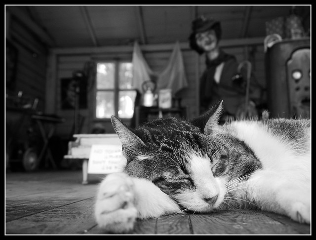
2. This one has a much better B&W conversion I think. To my sorry eye at least. I really like the DOF. However, the background is very busy. I think you actually have two neat pics in this one shot. The one of the sleeping cat and one of the OOF weird clown thing. The busy background distracts from the main focus which is the cat. However, if you really look at the whole photo it tells me a story, though I had to kind of make it up. The cat is sleeping so peacefully amidst the creepy clown, the toy piano and other weird and creepy stuff.
Just my thoughts. Since no one chimed in.



![[No title]](/data/xfmg/thumbnail/37/37532-7a6d436607118989fefaa0b2e7a81169.jpg?1734170689)

![[No title]](/data/xfmg/thumbnail/39/39447-6e7679723d775935851f055bae9712ba.jpg?1734173538)