Hogsback Mountain Adventure

The_Saint

TPF Noob!
Joined
Jan 18, 2008
Messages
223
Reaction score
0
Location
South Africa
Can others edit my Photos
Photos OK to edit
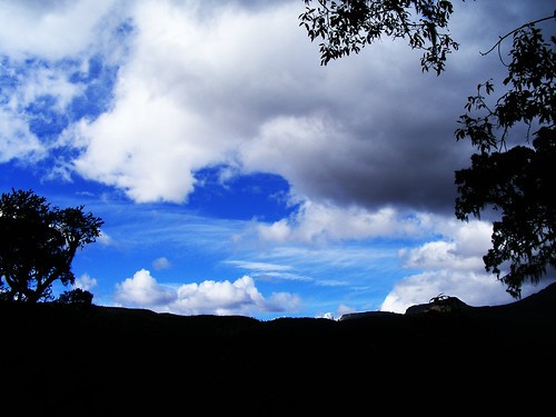
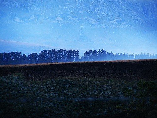
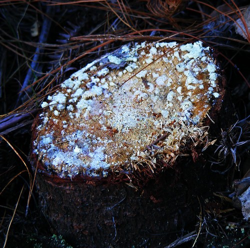
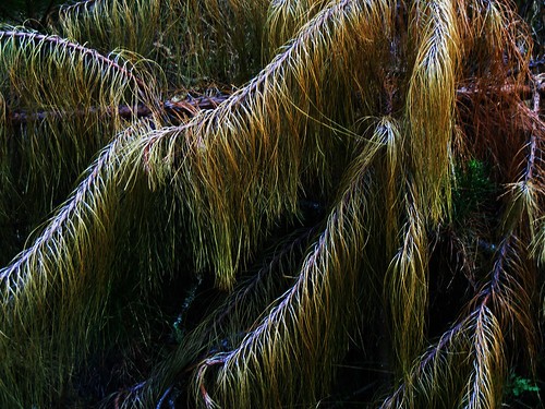
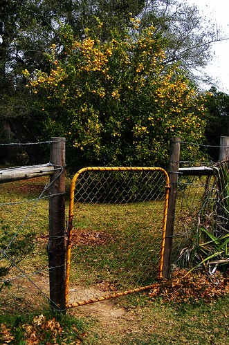
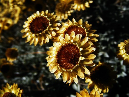
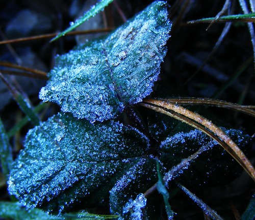
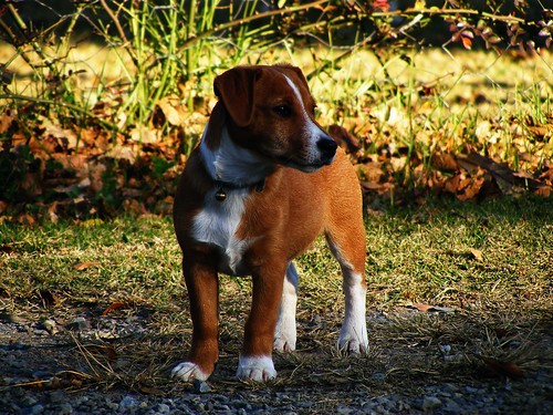
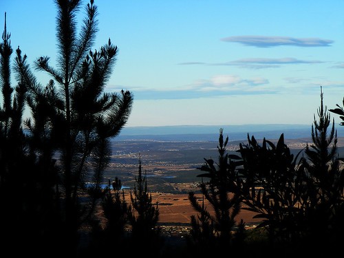
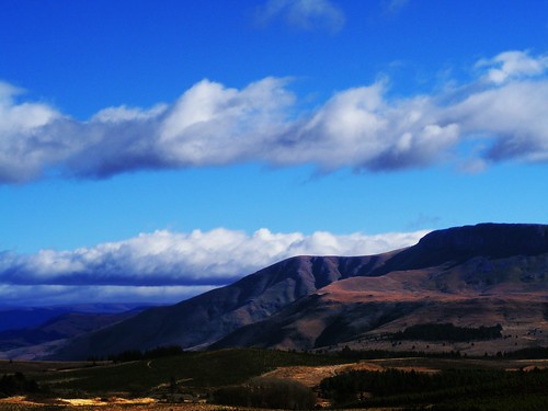
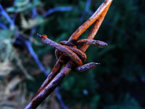
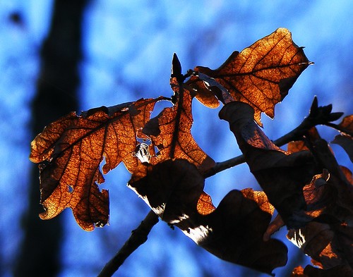
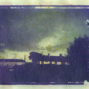
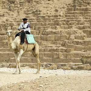
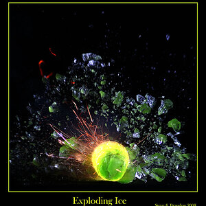
A few shots from my recent trip with my family to hogsback mountains.

C+C please.


1.
2645597464_8ac1f0fc77.jpg


2.
2644764653_2f39d9051d.jpg


3.
2644760503_73fcf6f07e.jpg


4.
2645571684_835305383a.jpg


5.
2645564298_f52c007a50.jpg


6.
2645555972_c45a01e17d.jpg


7.
2644727281_106ffdfd08.jpg


8.
2645537282_b68c27cf19.jpg


9.
2644717455_75025d2059.jpg


10.
2644690647_53ee18feab.jpg


11.
2644693775_2257938966.jpg


12.
2645504632_acebece1b2.jpg


13.
2645450972_0149607f2f.jpg


14.
2645466028_ea4890756b.jpg
 
Many of them are quite "cool" (as in cold colour temperature, i.e. fairly blue, like the ones of the waterfalls, too), and I just want to assume that you thus mean to express that you're in the middle of winter just now and that high up even South African winters can get frosty?

Hence I like Photo 7 with the hoarfrost on the leaves, though it is bordering on "dark" to my mind. But you may very well have wanted to achieve just this effect.

Photo 2 captured me for quite a while, mostly because at first I thought (and for a while even!) "What a funny looking SKY that is, how can clouds be like THAT?" until I realised there is absolutely no sky in the photo AT ALL but mountains rising up in the distance. The mildly diagonal line of the (yellowish) slope is nice, but I'm still debating with myself if I like its position, given that all the foreground is so dark (centre)...? Haven't come to a conclusion as yet.

I also like the crispness of Photo 12.

Surprisingly, the dog and the door in the fence are not as blue ...
 
Number 2:

The foreground is burnt grass, thats why its so dark...


It was veeeery cold up there, 2-6 degrees C, most of the day.
 
C&C per req:

I have the feeling that your camera's WB is set to 'Auto' and it's reacting strangely to certain light conditions. As LaFoto mentioned, some of the images are very cold, (2, 3, 7, 12) and others are quite good.

1, 2, 10, 13, and 14 all have very dark foreground areas which detract significantly from the image. Most of these could have been eliminated by the use of Grad ND filters to even out the dynamic range between groudn and sky.

6. suffers from excessive highlights in the petals and seems a little desaturated to me. I would suggest a closer crop on the three central blooms to eliminate the dark ground area.

9. is a nice image, but would be improved by having less of the foreground. A nice fram of the brush around the perimeter, looking out over the plain area would be ideal.
11. Nice macro, but too dark on the RH side.
12. Again a closer crop to eliminate the very dark shadow areas would result in a much improved image I think.

Just my $00.02 worth - your milage may vary.
 

Most reactions

New Topics

Back
Top