Honest critique?
Hm. I am not the one for that.
What I would like to see is a better assortment of the photos, i.e. I'd prefer them one underneath the other.
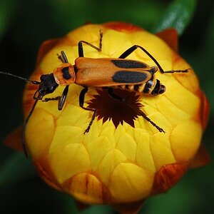
Then the flower photo could become a bit more interesting for the viewer if the flower were less in the centre of the photo. Since it seems to be looking towards the left frame, it is wise to crop the photo on the right. If you want to stay with the custom size of a photo, you will have to carefully crop and see how much you will then have to adept your photo cropping some from the bottom and top. That would move the flower to the right and out of the centre.
I would assume you let the camera automatically use its on-camera flash?
That is something that I try to avoid as much as I can in nature photography. The red of the flower now no longer looks natural (to me) and some petals cast some sharp shadows over the others.
Having said that, I want to underline that this is a very crisp, sharp flower photo with a nice DOF/bokeh even, for I find it aesthetically pleasing that the background is still somewhat recognisable.
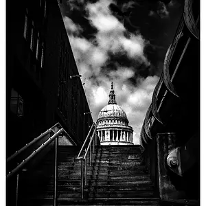
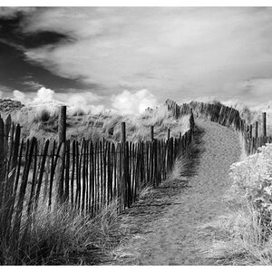
As to the second photo... I find that eerie. Nice play on "vanishing point" elements, but - that is probably a very personal thing - it does not speak to me that much. Maybe, if a person had run through your picture and come out like a blurred "ghost"...