What's new

House in the forest

invisible

Been spending a lot of time on here!
Joined
Mar 10, 2007
Messages
5,213
Reaction score
983
Location
Canada
Can others edit my Photos
Photos NOT OK to edit
p767478143-4.jpg
 
Nice! Lots of interesting lines, especially in the foreground.
Did you try it in B&W too?
 
Did you try it in B&W too?
I did. In fact, I had B&W in mind when I shot this... but I didn't like the results. Colour worked better for me.

Thanks much for the feedback!
 
The lines in the ground in the foreground do a good job of leading your eyes to the house but because the trees on the left are so dominant in the image your eyes kind of get stuck there. Personally I think the house is too small in the frame and is obscured too much by the trees, especially the ones on the left side. As a suggestion, I would crop the image vertically, removing a lot of the trees and center the house along the top horizontal third, leaving enough foreground to lead your eyes right to it. It still leaves some of the trees but brings more attention to the house, which I assume by your title is the main subject. I converted the image to grayscale and upped the contrast a good bit and came up with a very different rendition that accentuates the old abandoned home to much greater advantage, at least I think so. But to each his own.

Since you don't want people to edit your photos, I will leave it up to you to play around with what I described and see if you like it.

 
Last edited:
Yeah, I was actually wondering if the B&W version would be better, not better, or just different.
I like the muted colours, but since I'm generally a B&W kind of girl, I still had to ask :)

Did you try it in B&W too?
I did. In fact, I had B&W in mind when I shot this... but I didn't like the results. Colour worked better for me.

Thanks much for the feedback!
 
You have a good eye for lines leading in and out of the frame and as usual you deliver here as well. I like the composition, it's seeming to lack a little 'pop' is all ;)
 
The lines in the ground in the foreground do a good job of leading your eyes to the house but because the trees on the left are so dominant in the image your eyes kind of get stuck there. Personally I think the house is too small in the frame and is obscured too much by the trees, especially the ones on the left side. As a suggestion, I would crop the image vertically, removing a lot of the trees and center the house along the top horizontal third, leaving enough foreground to lead your eyes right to it. It still leaves some of the trees but brings more attention to the house, which I assume by your title is the main subject. I converted the image to grayscale and upped the contrast a good bit and came up with a very different rendition that accentuates the old abandoned home to much greater advantage, at least I think so. But to each his own.

Since you don't want people to edit your photos, I will leave it up to you to play around with what I described and see if you like it.
Thanks much for the feedback. I think I understand exactly what you have in mind, but please feel free to post your edit here. (I have the "no edits" sign to avoid unnecessary destruction of my images. But whenever someone suggests a reasonable re-work, I'm more than happy to see it.)

I like the composition, it's seeming to lack a little 'pop' is all ;)
I agree. Not only I'm going through some sort of "desaturated phase" but also the uncooperative sky made the processing of this one a bit of a challenge. Plus, I'm a post-processing liability.)

Thanks all for the candid feedback, I appreciate it.
 
My take on this is that the trees on the left help frame the house, so I wouldn't remove all of them, but I would remove most of the ones that lean away from the house, i.e., crop about 15-20% on the left and also a bit on the right just to eliminate that other house/outbuilding along the frame edge. I'd also be tempted to darken the sky or brighten the house just a little.
 
but I would remove most of the ones that lean away from the house, i.e., crop about 15-20% on the left and also a bit on the right just to eliminate that other house/outbuilding along the frame edge.

I agree....
 
Basically, a very strong image. I keep on straining to see more of that house, which translates into cropping about 1/3 or so from all those trees to the left of the house. Love the low angle looking up the hill, as it adds just that much more to the mystique of the house.
 
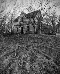
Here is my take on your photo. I think it brings the old abandoned house much more to the center stage without totally losing its sense of place. Now the image is all about the house. The grayscale and increased contrast also lend more of a surreal or spooky atmosphere. Certainly a very different interpretation of the scene than yours.


$house.webp
 
STM, I really like your edit, but I would have preferred it in color rather then B&W.
 
STM, I really like your edit, but I would have preferred it in color rather then B&W.

One of the things I like most about B&W is that is has an uncanny ability to reduce things to their graphical and abstract content much better than color, especially in a situation such as this image. But different strokes for different folks!
 
Thanks everybody for your comments – I agree with most of them and I appreciate your guys taking the time. STM, thanks much for the edit, it looks great (although it's a whole different image altogether). I'm with you about B&W. That being said, my original image represents my vision for this scene. It looks fantastic printed big, but I can see how much of the impact is lost when viewed at 800x600 on a monitor.
 

Create an account or login to comment

You must be a member in order to leave a comment

Create account

Create an account on our community. It's easy!

Log in

Already have an account? Log in here.

Back
Top Bottom