- Joined
- Jul 16, 2015
- Messages
- 4,040
- Reaction score
- 4,659
- Location
- Oklahoma
- Can others edit my Photos
- Photos OK to edit
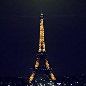
Took a milky way image few months ago.
Here is the original.
1.

Most obvious issues: tower is perfectly vertical, but horizon is way out of whack; dew condensation spots all over the lens; glow on the horizon. Next
2.

Cloned out most of the spots, straightened the horizon. I'd like give the sky some 'pop', so I went ahead and pressed on- too much?
3.

Is that too much? Have looked at it so long that I've lost perspective.
Here is the original.
1.
Most obvious issues: tower is perfectly vertical, but horizon is way out of whack; dew condensation spots all over the lens; glow on the horizon. Next
2.
Cloned out most of the spots, straightened the horizon. I'd like give the sky some 'pop', so I went ahead and pressed on- too much?
3.
Is that too much? Have looked at it so long that I've lost perspective.
![[No title]](/data/xfmg/thumbnail/36/36299-468f060314a0ac2bf5e37da1c33149d2.jpg?1619737493)
![[No title]](/data/xfmg/thumbnail/31/31751-fb2f68cca32f9eec468dbde7d649840f.jpg?1619734990)
![[No title]](/data/xfmg/thumbnail/30/30871-c87f97bf2d9d493b4c08ba6482680038.jpg?1619734488)
![[No title]](/data/xfmg/thumbnail/31/31753-281132967af6a422c89bcc0d6f16499a.jpg?1619734991)
![[No title]](/data/xfmg/thumbnail/41/41862-7cc80b10f9effd079847b9dd210dbe2a.jpg?1619739925)