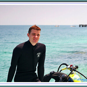
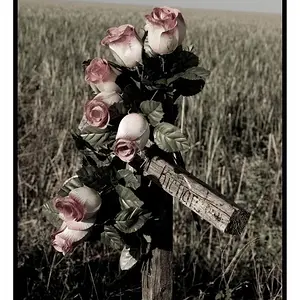
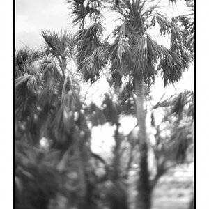
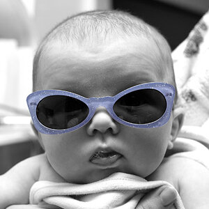
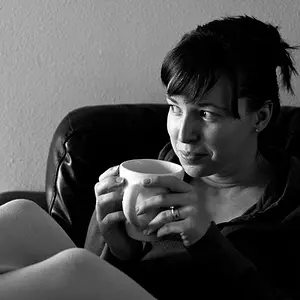
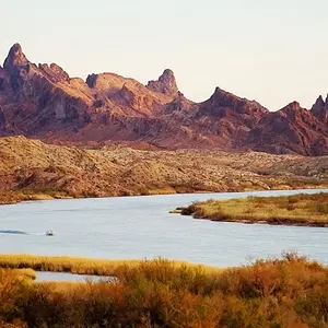
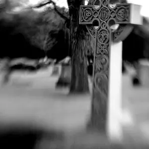
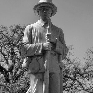
I'm trying imitate the effect achieved in the photos found on this site:
Paris in Four Months |Paris in Four Months
I've been playing with the exposure on my camera and get pretty bright photos through that, but not as bright as I'd like them to be like that photographer's photos. Any photo editing suggestions?
Expose normally, then in software raise the exposure a good deal, then use either the curves tool to blow out at least the very highest highlights, or nearly blow them. Or use the curves tool to make the highlights very,very bright.
These are not over-exposed in-camera, these are fairly good, but normal exposures, but she's making SURE that the higher tonal values are pushed verrrrrrrrry far to the right.
There are a number of Lightroom pre-sets that can accomplish this. Exactly how the brightening is done depends on your software: for example, on older versions of Lighreoom, in the Recovery slider, you would use MINUS recovery, to make the highlights wayyy too bright, as opposed to using it to recover blown highlight detail. The curves tool is probably going to be the easiest for most people to use, along with the exposure slider.
This is sort of
a post-processing stage high-key effect used as a bludgeon...she just keeps HAMMERING away, frame after frame after blown frame with detail-free highlights, almost as if she's just become enamored of this effect rather recently. After about the tenth shot, it grew a bit tedious to me.
But that's kind of what happens these days when it's so so easy to ONE-CLICK or batch process huge batches of images using ACR or Lightroom or whatever...we become accustomed to a "look", and normalcy takes a vacation, and rather tedious and outlandish "normal" looks starts to be considered to be "okay" or even good. Again, this is I think, because our minds and brains can adapt rather easily AND, this is the big thing, we now have the ability to process an image and then BATCH process or "paste settings" en mass, and
since the batch processing approach took hold, we've seen more and more people who start relying on a go-to look or a go-to preset quite repeatedly.
The thing is, if you have much of a visual sense of style, seeing scenes that are in NO WAY high-key subject matter being "Paste Settings" processed looks rather newbish and trite. As Braineack mentioned without maybe being fully aware of exactly WHY, you cannot take dark-toned objects and scenes and slap on a "high key pre-set" or crank the top end of the curves skyward, and not have it end up looking like crap. It's like a singer singing wayyyyy out of key. But hey...we have Autotune these days!



![$14401226233_949d503916_o[1].webp](https://www.thephotoforum.com/data/attachments/64/64486-5a67f2632330717e72fffc7394bdc0d0.jpg?hash=vZdZ6Viuss "$14401226233_949d503916_o[1].webp")

![$13020372914_11418a6cf6_o[1].webp](https://www.thephotoforum.com/data/attachments/64/64491-dbc1474bcf51e6995eb2cafe356655da.jpg?hash=dPsRRl8_Dk "$13020372914_11418a6cf6_o[1].webp")
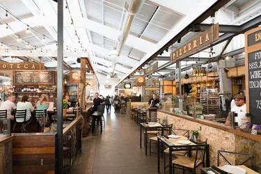
![$14014140792_fda23f4744_o[1].webp](https://www.thephotoforum.com/data/attachments/64/64484-17858d5c9dc7ed4b8d9609f1d3350c90.jpg?hash=VZbfDSnQQi "$14014140792_fda23f4744_o[1].webp")
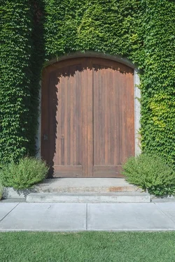
![$14014140792_fda23f4744_o[1]_fix.webp](https://www.thephotoforum.com/data/attachments/64/64488-74c2b767f648e23da789c1b46ed95743.jpg?hash=s32k7wfAUG "$14014140792_fda23f4744_o[1]_fix.webp")
![$14079013939_59cee162a4_o[1].webp](https://www.thephotoforum.com/data/attachments/64/64489-dd6bd0787d1658a3d0e4d01c31227ad2.jpg?hash=Dk38c9eaDj "$14079013939_59cee162a4_o[1].webp")
![$14079013939_59cee162a4_o[1]_fix.webp](https://www.thephotoforum.com/data/attachments/64/64490-1c9ce0e9bf0ab218be3b44cfb19345d7.jpg?hash=Xizspqwttd "$14079013939_59cee162a4_o[1]_fix.webp")


![[No title]](/data/xfmg/thumbnail/41/41931-485b5f9a9f3736e9ed9d96ecdf639921.jpg?1734176288)