I need some help with product photography

SoulfulRecover

TPF Supporters
Supporting Member
Joined
Jun 8, 2010
Messages
1,530
Reaction score
762
Location
Texas
Can others edit my Photos
Photos OK to edit
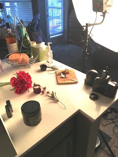
My wife started a business that sells hand made beauty products and I would like to shoot the photos for the social media posts. However, I have never done anything like this before so its a total guess on my part.

How am I doing and what can I do to improve???

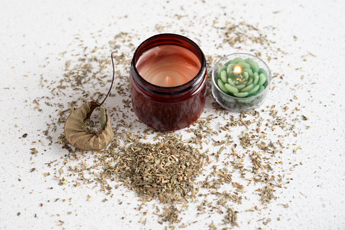
1. Invigorating morning facial scrub made with a coffee and Himalayan salt exfoliate and coffee essential oils


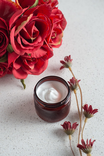
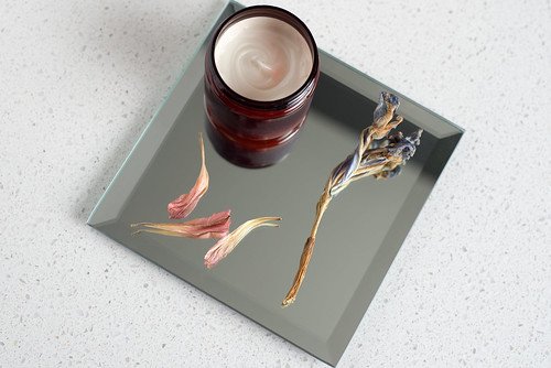
2. Relaxing night cream made with lavender, rose, and tea tree oils.


3. Nourishing body butter made with lavender and rose oils


4. Aromatic and incredibly relieving vapor chest rub made with eucalyptus and peppermint oils.


I very much dislike #4 but I was out of time (my kiddo was being fussy and the wife needed a break haha)

My light setup:

 
Last edited:
Yeah, #4 has too much stuff scattered about... The quality of the pictures is good, I'd think about what's being displayed. You're a good photographer, I doubt you'll have any trouble getting some nice photos so I'd look more at the arrangements.

Will there be labels on the jars eventually? they're colorful but plain. I'd think about maybe a long swirl of ribbon around and thru the jar and flowers, etc. (To tie it all together?? I know, but that's what came to mind!)

The first one's not bad but it needs something... maybe less small stuff actually. I don't know about that brown jar, it made me wonder what is it? unidentified brown cream/goo/whatever seems rather unappealing. Maybe on top of the wood a doily? or folded fabric kitchen towel/cloth napkin/table runner?

I like #2, I think a larger flower looks better than a bunch of little stuff. #3 needs some fresh flowers or make it dried flowers instead of ones that look like what falls off a growing plant that needs to be disposed of. Maybe try to find ideas on arranging jars with flowers, try looking at websites that sell jars and candles etc. like, I don't know, Pottery Barn or someplace.
 
So arrangement and styling needs to be improved.

For labels, I think she has some on order but I'm not 100% on that. I mentioned buying some burlap ribbon to tie around the jars and hang a little info card off of it
 
Yeah, just needs a little something. A bit of oomph.
 
Like Sharon said, you're undoubtedly going to get good photos because you're a good photographer. Keep working at it.

Take what I say with a grain of Himalayan salt.

  • For all of them:
    • The product itself needs better lighting, and it needs to be more prominent in the shot. There are often shadows going halfway across the cream, which I don't believe do it justice (and are distracting).
    • While this may just be me, I want to see the product, not the ingredients. But, if your wife's target audience is only interested in "all natural" products, I understand why you chose to focus on the ingredients. Still, the products need to be more prominent.
    • Agree with Sharon, they need clear labels of what they are. Right now, they're mystery creams.
  • For #1:
    • The product itself needs better lighting. I see everything else well, but the scrub is pretty dark. It looks rather unappealing to me.
    • I'd replace the ground coffee with beans. I didn't know what the coffee was at first.
    • I thought the salt was sugar, and I think the amount of salt with the spoon was making me think that. Any chance of getting larger crystals or displaying it differently?
    • Do the twine and flowers have anything to do with the product?
    • There is a dark spot at the upper right-hand corner.
    • There is a lot of negative space on either side with the awkward angle of the products.
  • For #2:
    • I like this one
    • The cream needs to be much more prominent.
  • For #3:
    • I agree with Sharon. The dried flowers aren't doing it for me.
    • The angle is a little awkward. Both the angled dish and the angle you're shooting the tub of cream. It looks too high up?
  • For #4:
    • The tub of cream looks like it has a lot less in it than the other tubs? It looks like it's sinking down into the tub.
    • The candle, dried leaf, and dried herbs(?) look out of place.
 
All #4 needs is some rolling papers. Nice start
 
I am not a product photographer, so these are first impressions.

I found myself getting distracted by the shadow areas, for example the leaf in #4 and top flower in #1 are almost totally in the shadow of the jar. I would try adding a reflector opposite your key light and seeing if you like that better. I also found that the corners of the platter just barely reaching the edge of the frame in #3 as well as the position of the jar were conveying a sense of tension, like the jar was about to fall down out of frame. I like #2 a lot, cropping this one will do the product justice.
 
I think these might have more of a product-centric impact if they were framed as square images. I think the amount of light-colored countertop surface seen outside of the product-and-props area is holding these back, and if they were framed as squares, you could possibly get a larger on-screen product size. Just a thought.

A bit of top-lighting might help to make the products in the brown jars look more color-accurate; as lit, I think some brown-hued light is coming in through the jars.

This type of work is where a 4x5 view camera and its camera movements could really help straighten up the jars, even with a downwardly angled camera, and it could have pulled complete DOF on shot #1 with a bit of forward lensboard tilt. But I think shape correction on the jars might be a bit more work than you want to do for simple product shots, plus there's the expenses of film, developing,and the effort of scanning.
 
How am I doing and what can I do to improve???
Looking down on the composition isn't working except for #2, and none of them are highlighting the product.

Yes, I know that people are taller than the table, so naturally looking down seems like the thing to do, but I just don't recall ever seeing a product ad where we're looking down on the product. Most of the ones that seem to work better are on the same level as the viewer.

O.K., maybe there is some connection between the product and the materials included in the composition, but if that's important, then you should arrange them more artistically. #2 is artistic, but the connection of the flowers to the product is missing.

And dump the shadows, as they are distracting.
 
For all of them:
  • The product itself needs better lighting, and it needs to be more prominent in the shot. There are often shadows going halfway across the cream, which I don't believe do it justice (and are distracting).
  • While this may just be me, I want to see the product, not the ingredients. But, if your wife's target audience is only interested in "all natural" products, I understand why you chose to focus on the ingredients. Still, the products need to be more prominent.
  • Agree with Sharon, they need clear labels of what they are. Right now, they're mystery creams.

This is all good advice.

I'm feeling like a longer focal length would be the first place to start in making the jar of product more prominent.

Go go! You're definitely off to a great start!

-Pete
 
When we (a corporation here with me and some CEOs) had a business partnership with a skin care company that sold products from these type of containers, research showed that people buy on more than just the type of picture you have.

you definitely need labels there. It helps create/burn an impression of the product into the potential customers mind. The less plain it is the better, just make sure it's not tacky. But I understand the prices of a single color labels versus color/multi color is quite different, plus various fonts.

The top shots to show the product's creaminess in the container is a good idea, but it would be better if the image was lower and with a container label, and then product in a very small flat bowl/plate showing it's "creaminess". then you can have other things around it related to the product.

But don't forget the customer (a) needs to know the name of the product, size and shape of the container which they'll use memory of to find it later one (not just a headline); (b) showing the product in a nicely presented on a very small flat bowl/plate (just large enough to have a bit of the cream like it was a bit of ice cream on a cone) shows the product off much better than if it's in a container.

All the other contents do help create a really good image of it being "natural."
Having a model shot of someone rubbing the cream on their "perfect model" face in the (various poses for the various products) background helps the selling image too depending upon if you want to get that elaborate for a composite shot.

But be careful of getting too many objects in the image and creating clutter taking away from the product. Look around the internet of high end products for these type of images concepts. Watch out for bright colors distracting the customer eye away from the main product to a secondary object in the image.

You'll probably end up with 3 or more lights (or reflectors) sooner or later to deal with the shadows.

Truthfully, you're way ahead of the game if you've ever looked through Pinterest.
 
Thank you all for the help. This weekend I'll probably end up doing more photos
 
Really nice, though I'm not a fan of labels on photos, can recommend some oils for your wife - I love using this stuff at my own sessions and parties just for inspiration and to create the mood. Also, I think the best photos are those with fewer objects... You can't always put everything you have on the table, you should group them. Overall, it looks pretty nice, keep up the good work!
 
Last edited:

Most reactions

New Topics

Back
Top