What's new

Icons

smenkhare

No longer a newbie, moving up!
Joined
May 27, 2007
Messages
184
Reaction score
49
Location
Sydney
Can others edit my Photos
Photos OK to edit
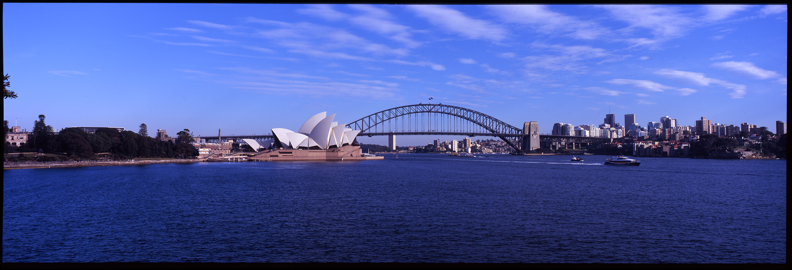
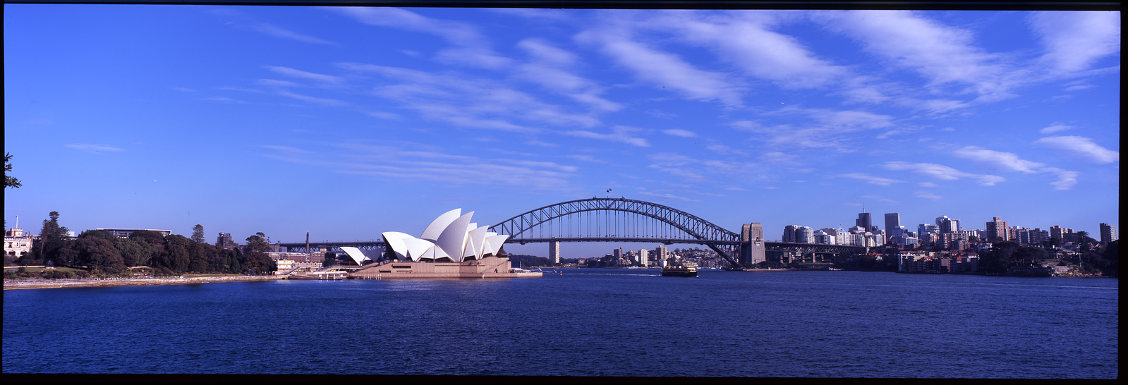
Two slightly different shots. Not sure which I prefer

06-X3.jpg

071-X3.jpg
 
I like the second one much better, I think the colors are better and a little softer. The first one compared looks too agressive to me.
 
The second one is better- the composition is improved as are the colors. The only thing I don't like better about it is the distant airplanes or birds on the left and right sides, but you could clone those out easier than slapping a shrimp on the barbie.

 
I agree with Eclectix about the composition and colours.

In most cases, placing the horizon in the middle of the image is a no no, as it discourages your eye from moving around the image. In contrast, following the 'rule of thirds' and placing the horizon in the top or bottom third, creates a more dynamic image for your eyes to explore. Certainly there are exceptions to this rule, but more often then not following the rule of thirds will create a more appealing image than centering the horizon.

In addition, I really like the clouds in this scene and of course the second image has more of them to enjoy. One small issue I have is with the bit of tree sneaking into the left side of the image.

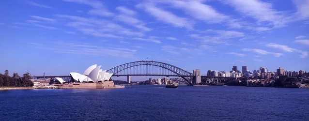
I suggest a slight crop from either side of the image to bring more attention to the Opera House, Harbour Bridge and city skyline, while still maintaining the nice panoramic feeling..

$smenkhare crop suggestion.webp

I've also added a slight vignette to pull the eye toward the middle of the image.
 

Create an account or login to comment

You must be a member in order to leave a comment

Create account

Create an account on our community. It's easy!

Log in

Already have an account? Log in here.

New Topics

Back
Top Bottom