1. Photo is tonally flat with few blacks, no whites, all gray. On the whole, it is over-exposed and most of the details are washed out as a result. I can't tell if it's that lack of detail that's making the photo seem soft or the focus is actually soft, but the image definitely seems a bit soft to me. The horizon line is tilting to the left. There's some foliage sticking up from the bottom-center of the pic that's a wee-bit distracting. Also, the tree (which IS an interesting subject) is placed smack dab in the middle of the frame. It's an interesting tree and I LOVE that you're looking at it knowing that there's a cool photograph in there somewhere. When I look at this tree, I notice that the branches and leaves and shape almost form an arrow pointing to the left. With that in mind, I'd have placed the tree further to the right of the frame so that the "arrow" is pointing into the negative space to the left. Does that make sense?
2. Very cool looking spider! Again, here you're looking at something interesting knowing that there's a neat photo in there somewhere. That kind of "eye for photography" is the foundation upon which you can build if you want to pursue this, and I think you SHOULD! The spider is a pretty small subject. The lens is at 55mm so I'm assuming that you're shooting with the 18-55mm kit lens and you were zoomed in as close as you could get. I wish that you could have gotten in a little tighter to make the subject (the spider) fill more of the frame. The broken web and the exotic spider make a REALLY cool composition in my book and I love the shallow depth of field blurring the background like that. I wish that the lines of the web were sharper throughout, though. Compositionally, I would have placed the spider in the lower left of the frame, that clump of whatever above him in the upper left of the frame and let the broken web spill out into the negative space to the right.
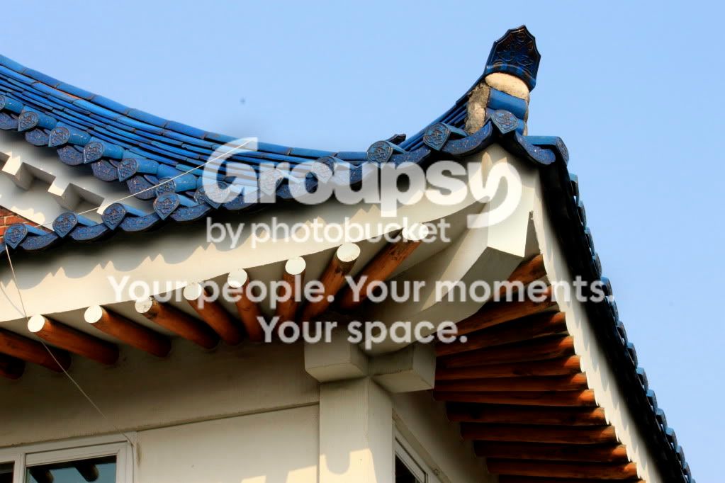
3. Again, you're looking at cool things here! As bigtwinky noted, this image is about lines and shapes and repetition and it's awesome that you're seeing these things and trying to capture them. For this, I might have taken a few steps to the left to get the line of the roof on the right to be vertical line on the right third of the photo. I might have angled the camera up a little more so to put the corner of the roof right on the intersection of the upper-third and the right-third. I would have tried to have the edge of the roof that runs horizontally be level, as well. Also, you have a dust spot on your sensor.
4. It looks like you're trying to capture how the water spouts and the lilies repeat and mirror each other. Very nice! This could benefit from a tighter crop to eliminate everything above the far edge of the fountain/pond thing. Also, if you had taken a few steps to the left, you could have gotten more of the top lily into the frame so that it isn't crowded/cut-off by the right edge of the frame.
5. The image looks a little soft, but I LOVE the depth of field. The depth of field is deep enough to capture the entire flower, but shallow enough to blur that background out nicely. The background is fantastic, by the way! Compositionally, the flower is in the middle and that's a little... boring... You see how the flower is leaning slightly towards the left? Because of that lean, you could have placed the flower so that the stem is on the line of the right third and let the flower lean into the negative space on the left.
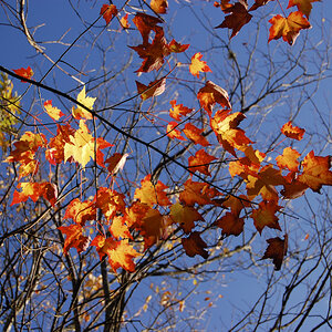
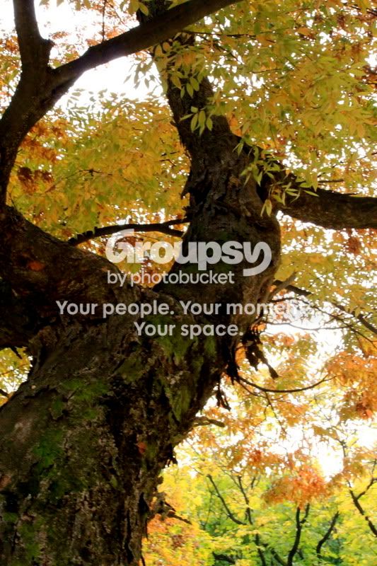
6. Here once more, what your eye is drawn to is WONDERFUL and way passed where most beginners are. You have the trunk as a strong diagonal running lower-left to upper-right. You have the fork at the top creating a perpendicular diagonal to the trunk. You have the other limbs making interesting shapes and creating lines for the eye to follow around the image. And you have an over-exposed sky that unfortunately blows out and washes out much of the color and detail of the leaves. This looks like it was shot mid-day-ish when the sun was still a bit harsh and overhead. The color and details of the leaves would have made this pic stand out so much more. The blown out sky could have been mitigated by shooting earlier in the morning or later in the evening when the sun wasn't so harsh and directly overhead. Also, the focus seems a little soft.
7. Very cute subject! Again, you're looking at the right things! I love the blurred background to draw focus to the baby's face. There are two ways I might have framed this shot and the different ways of framing it completely alter what the photo is about. You could have aimed the camera a little more to the right which would have taken the father completely out of the frame. This would have made the baby's face fill the left half of the frame and left that blurred out background as negative space filling the right half. You see how her head is leaning to the right and her eyes are looking slightly off to the right? Framing the shot this way would have had the baby leaning into and looking towards the negative space and would have been a strong, interesting composition. The other way to frame the image could have been to pan the camera to the left to have captured more of the father's head. This would have made the photo be more about their relationship. I think I like the first option better.
So... yeah... that's what I think. Take it with a grain of salt and keep shooting! Read up on composition and exposure because you're seeing very cool things, you just need to work on how you go about capturing them.


 I'd appreciate some honest feedback and tips. Oh, I don't have much as far as editing software yet so these have only been touched up a tad.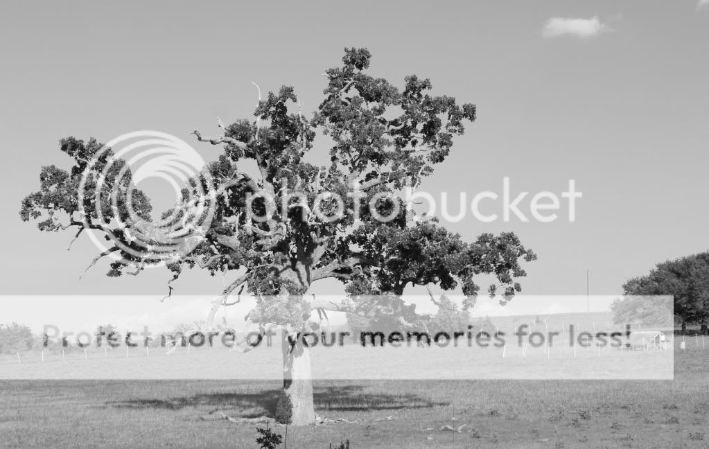






![[No title]](/data/xfmg/thumbnail/32/32167-524b76a903731ff48d48682c9f9b0978.jpg?1734161046)



![[No title]](/data/xfmg/thumbnail/32/32164-d68fa2de02f9bef524bbd68aac2f12e4.jpg?1734161046)
![[No title]](/data/xfmg/thumbnail/42/42328-c1143adda9734f7d05ce4361e79c27a7.jpg?1734176824)
![[No title]](/data/xfmg/thumbnail/34/34142-948c6bafdf60862125009004d5a06e46.jpg?1734164712)
![[No title]](/data/xfmg/thumbnail/42/42329-331b54ea6493a8cdd21d8e624fe97e85.jpg?1734176827)