I appreciate that you have an eye for angled shots, but my advice would be to tone it down a bit.
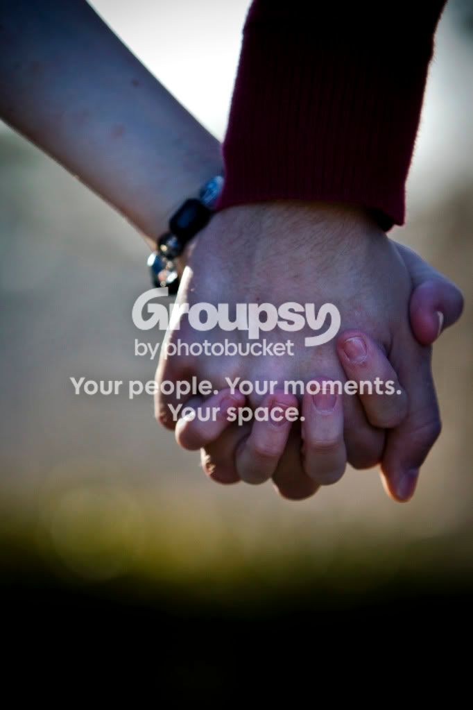
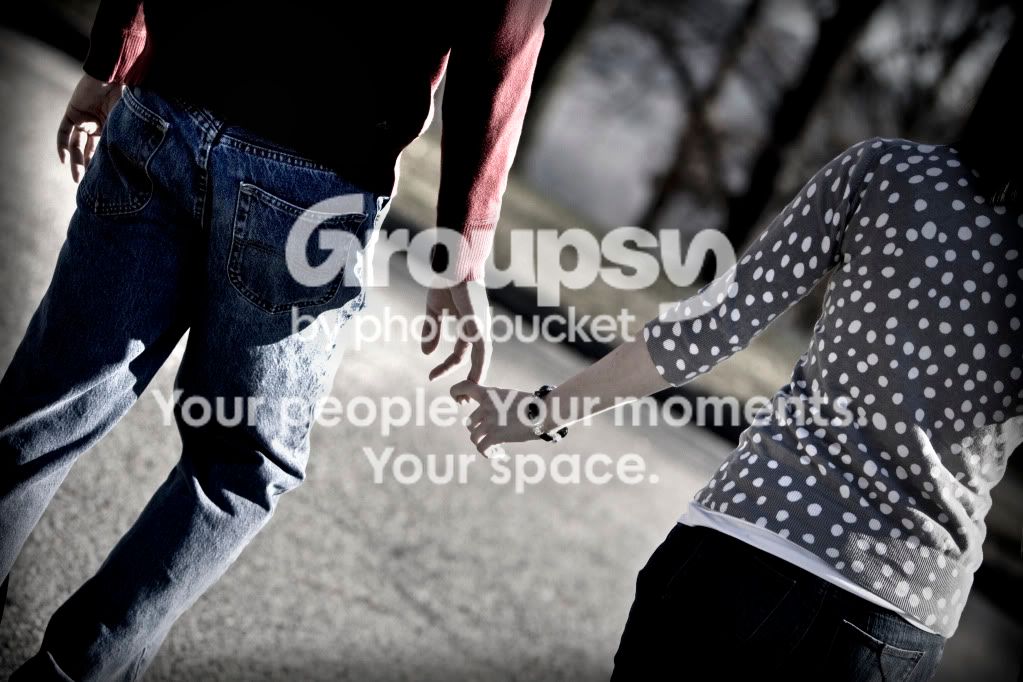
1. I don't like how close it is. All of the detail in their hands is distracting to me.
2. It's kind of a desaturated polaroid look. I actually like the look, as well as the idea of a vignette, but I would have to play around with the post-processing to really get a feel for what you could pull out of that image. I would be interested in seeing this photo without the angle.
3. I would rather have either completely black and white, or desaturated and ran through a cooling filter for the blue tint on the entire photo....rather than selective desaturation. And maybe sharpen it just a bit?
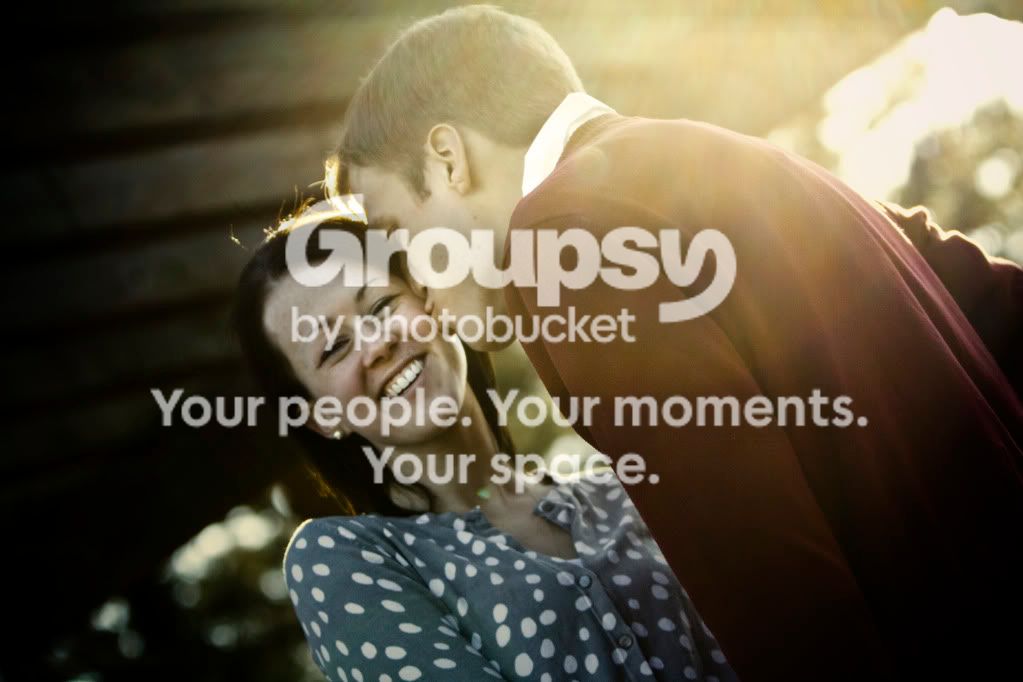
4. Zoom in. Too much contrast.
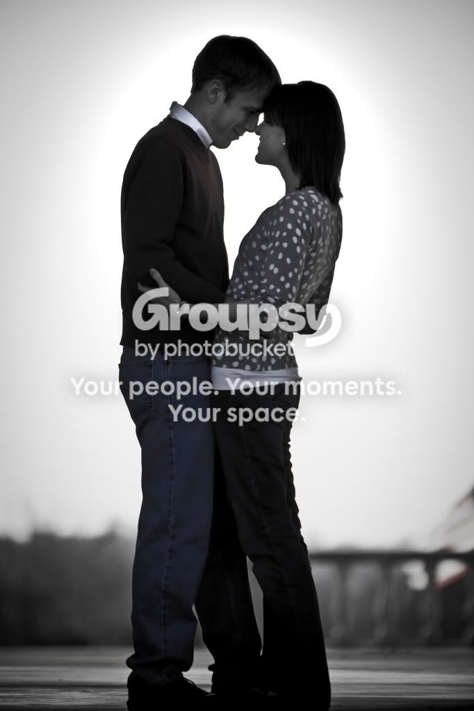
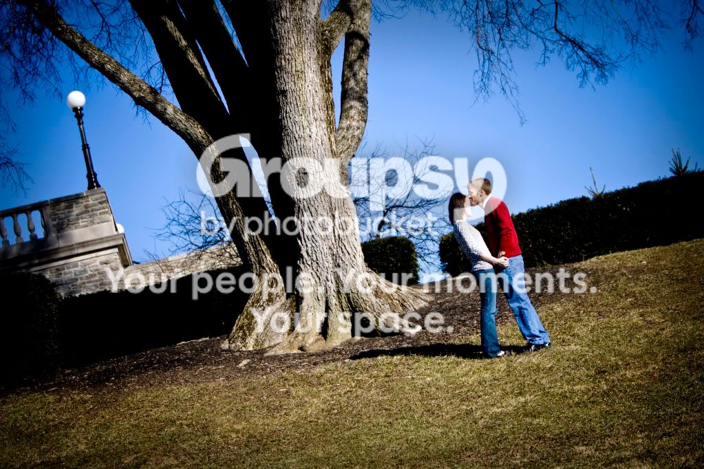
5. I think your other photos bring the two together, but this one makes it seem like they're separating. I think that this should be your hand holding picture, rather than #1. I like this at an angle, but I don't know if I like THAT much of an angle. I'd like to see this photo without the angle as well...and maybe zoomed out so that you could see their whole bodies. ...but those are all separate shots.
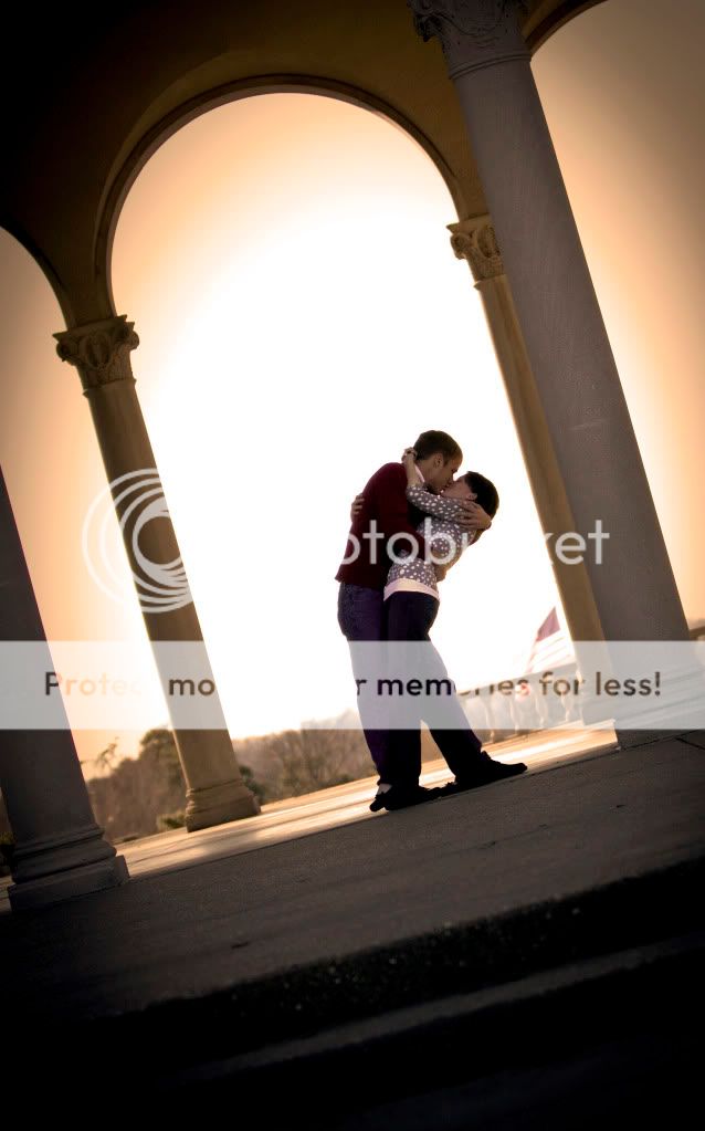
6. Again, I'd like to see this one straight instead of angled. I agree with Ruben that it should be more centered between the front 2 columns, rather than the back ones.
I'm very picky. Sorry if that sounded harsh at all. We all have different eyes for photography and that's what makes us unique. Keep being creative and inventive and seeking the advice of others, but make sure that you create the photos that you want, not what we want. Overall good job. Thanks for sharing!

 .
.