What's new

Intertwine

unpopular

Been spending a lot of time on here!
Joined
May 17, 2011
Messages
9,504
Reaction score
2,004
Location
Montana
CC Welcome and appreciated

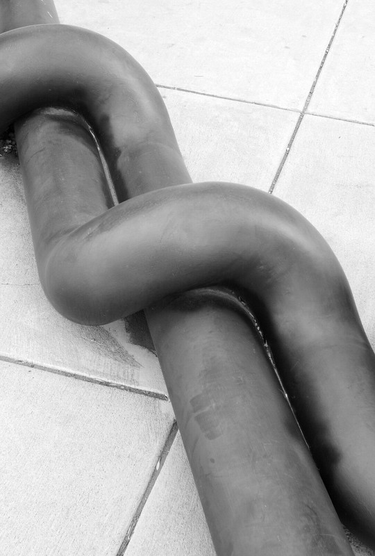
8295705202_a9b67fe473_b.jpg
 
Interesting subject and composition. The only problem is that this image leaves me confused and wandering "what the heck am I looking at".
 
Mating exhaust pipes!
 
With a slightly different crop you could call this The Lovers.

It's pretty nice, but not great. Are we supposed to be interested in the textures and scuffs on the.. pipes? The image feels to me like it's got to be cleaner to be pure abstract, and grittier to be an "abstract from life" or whatever you want to call it. Basically it should either be MORE or LESS connected with reality. I think you could go either way in post with relatively subtle curves adjustments, just to emphasize or de-emphasize the larger shapes versus the smaller surface details.

It also feels kind of flat, to me. The shapes honestly feel dramatic, they DO look like intertwined lovers, there's a very organic and almost ecstatic sense one could get off this, if you pushed the overall contrast up. Flattening it out goes.. somewhere else, and not somewhere I am feeling anything much. For whatever that's worth.

 
I frequent the place between the abstract and absolute. I can understand why people are not comfortable with it, but I find it interesting conceptually.

As for "flatness" (long tonal range, actually - all the tones are there), well, that's just how I roll.
 
Yes, conceptually it *is* interesting; but it needs to be interesting in ACTUALITY, in a real-world sense, for many people to even begin to enjoy it. Amolitor gave a very well-reasoned commentary on his feelings about this photo.I agree with the majority of what he wrote. I'll just say this: if you want to not bore me, then SNAP IT UP. It has interesting diagonals, from the titles, and from the pipes. Buuut...tonally, it is very boring. Dull. It looks underexposed and underdeveloped, so to speak.
 
I frequent the place between the abstract and absolute. I can understand why people are not comfortable with it, but I find it interesting conceptually.

As for "flatness" (long tonal range, actually - all the tones are there), well, that's just how I roll.

I think it's a fine photo, very good in fact and yes all the tones are there but I would consider redistributing them, shift the weight in the other direction so the pipes are darker and blacker.

Joe
 
Nice. I might lighten the floor a bit in the lower left and clone a few spots, but perhaps that would be defeating your attempt to make it more realistic? Just a thought ...
 
I think the shapes of the pipes have definite visual appeal, and I can appreciate why you wanted to capture them. But putting those shapes on that particular floor is a mistake, IMO. My eyes went from the shapes (ooo! Nice!) immediately to the floor (oh...no magic here, it's a kitchen floor)....kind of destroyed the visual impact. I completely agree with Amolitor about contrast. Having good tonal range is not the same as having contrast. But you've got a good idea here. :)
 

Create an account or login to comment

You must be a member in order to leave a comment

Create account

Create an account on our community. It's easy!

Log in

Already have an account? Log in here.

New Topics

Back
Top Bottom