Irish Landscape - Your best C&C please

kric2schaam626

TPF Noob!
Joined
Jul 5, 2009
Messages
361
Reaction score
17
Location
Fox Cities, WI
Can others edit my Photos
Photos OK to edit
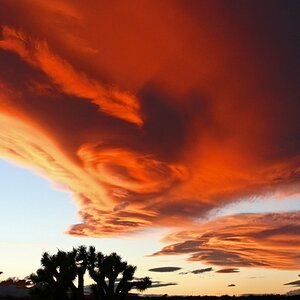
We stopped at a viewpoint so I could take this picture. What do you think? :)

DSC_09071.jpg
 
it's great while the sky is a little too bright.You may use a C-PL filter~
P.S. i got the same tamron lens~
 
IMO = In My Opinion

The reason they say the composition needs work is because there's no real subject. The landscape by itself, while nice, is a bit bland.

You did good with the exposure, just try to find something interesting to be the subject of the shot.:thumbup:
 
The subject in the photograph is some superb scenery, but I agree with the other posters that the composition could've been improved in this shot.

In my opinion, there are three or four qualities that seem to distract from making this landscape as impactful in a photograph as it must have been in person.

First, this is one of those situations where the "suggestion of thirds" would've proven handy. As another poster suggested, the photo lacks a distinctive subject within the frame and it's partly due to the fact that neither the foreground or sky are particularly emphasized in this composition. It could've gone either way... more sky or more foreground... either could potentially be expanded to fill more of the frame and it probably would've made for a more interesting shot (I would lean towards more foreground).

Depth is another problem... partially related to the previous problem. There aren't really any leading lines that accentuate the vast depth in this shot. Sometimes such lines present themselves naturally with little work from the photographer, but other times they can require an extra bit of searching while composing a shot. In this case, the whole photo kind of has a very "far away" feel to it.

The fence posts do add a sense of perspective and proportion, but they do so at the expense of the overall composition, I think. The fence posts probably should've either been kept out of the shot, like Dieselboy suggested, or made a more integral subject. Perhaps it could've been used to create some extra depth in the shot. As it stands, the fence doesn't feel like an intentional portion of the photograph... more like an obstruction that was simply difficult to keep out of the frame... a distraction in the photograph that simply managed to creep in.

The exposure in the shot worked out well... nicely balanced between sky and foreground. Maybe the foreground is just a tiny bit underexposed... just fine for some, but I personally might have bumped up the green luminance just a tad bit in post (or maybe a light, vertical brightness gradient).

A nice photo, indeed... but, your next shot could be even better.
 
I think it was a great starting point. Just needed to start applying some of those rules you keep hearing about. Rule of thirds. Don't put your horizon smack in the middle. Move it more to the top if the land is more interesting, or to the bottom if the shore is more interesting.

Here's my take on how this image should have been shot. First, I cropped the sky way down to bring the rule of thirds back in play for the horizon. Then cropped off the right edge with the roadway, just leaving enough (the fence posts in this case) to give depth to the frame. Then it was a matter of making selective color, lighting, and contrast adjustment. Here's what I came up with to recompose the shot. Again, just my quick and dirty 5 min vision, and working with a very small file(I'm sure if you had the RAW file you could do much better). Your opinions may vary. :D

DSC_09071.jpg
 
Fantastic C&C by JG_Coleman, and a great edit from a very small on-screen sized file from crimbfighter. The edit really made the image come alive! Great job you two!
 
Fantastic C&C by JG_Coleman, and a great edit from a very small on-screen sized file from crimbfighter. The edit really made the image come alive! Great job you two!

Thankyou :D I always look forward to your comments, Derrel. They either contain a wealth of knowledge that answers every question I had and 5 others I didn't even know I had yet. Or positive critiques that are helpful and encouraging. But never giving negative critiques in a disparaging way. That, in my opinion, has gone by the way side from too many folks... Keep it up!
 
I love vast landscapes. I don't see why people say it needs work and bad composition and stuff like that... I do like the pp a little but it doesn't make it a million times better as the first one
 
The fence should have been more prominent in the photo. Closer, so we can see texture in the wood. It creates a nice foreground and gives the picture depth.
 
I think it was a great starting point. Just needed to start applying some of those rules you keep hearing about. Rule of thirds. Don't put your horizon smack in the middle. Move it more to the top if the land is more interesting, or to the bottom if the shore is more interesting.

Here's my take on how this image should have been shot. First, I cropped the sky way down to bring the rule of thirds back in play for the horizon. Then cropped off the right edge with the roadway, just leaving enough (the fence posts in this case) to give depth to the frame. Then it was a matter of making selective color, lighting, and contrast adjustment. Here's what I came up with to recompose the shot. Again, just my quick and dirty 5 min vision, and working with a very small file(I'm sure if you had the RAW file you could do much better). Your opinions may vary. :D

DSC_09071.jpg

Thanks for your advice and I love your edit!

The only thing is that all these pictures are from the same trip so I haven't posted any pictures with chance of improvement. Coming soon though :)
 

Most reactions

Back
Top