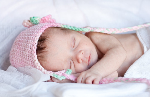
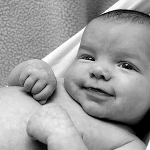
Is this better or am I still off the mark (exposure).
I tried to up my contrast too since I feel like my photos lack that.
I kind of feel like its dark and I am having a tough time finding the right balance. Untitled by Dani41780, on Flickr
Actually I personally find the tones a bit cool. Since babies turn blue uber easily I tend to like newborn shoots to appear a bit warmer (not jaundiced warm though heh). A touch warmer would be awesome. With newborns I also 'overexpose' the skin mostly to help smooth out the milia (which is also adorable but it helps to soften it a bit). I think the exposure here is pretty much spot on
I'd say a bit. I typically look in the shadows to see what colour tone there is in an image. See on her belly it's a bit cyan? Just a touch - not by much
Yep, looks pinkish. If you think about how Photoshop takes the values of Hue (think of the colors of the rainbow; red, orange, yellow, green, cyan, etc.) and assigns numbers to them -- red is zero. The entire range is zero to 360 in a circle so that zero and 360 are both pure red at the top of the circle. As you move from zero to the right around the circle the numbers count up from zero and you're heading toward orange and yellow. As you move from 360 to the left around the circle the numbers count down and you're heading toward magenta and blue. Human skin tones are much more consistent that you would think and in the sRGB color space will have Hue values right around twenty through the mid twenties. Babies maybe a little redder (upper teens) and a Banana Boat tan maybe a little oranger (low thirties). Here's your photo with the whites neutralized and when I check the skin tone on her left check I read 18 -- spot on. Adorable baby.