What's new

Is this overprocessed?

Xbethx

TPF Noob!
Joined
Nov 28, 2012
Messages
22
Reaction score
1
Location
Kentucky
Can others edit my Photos
Photos OK to edit
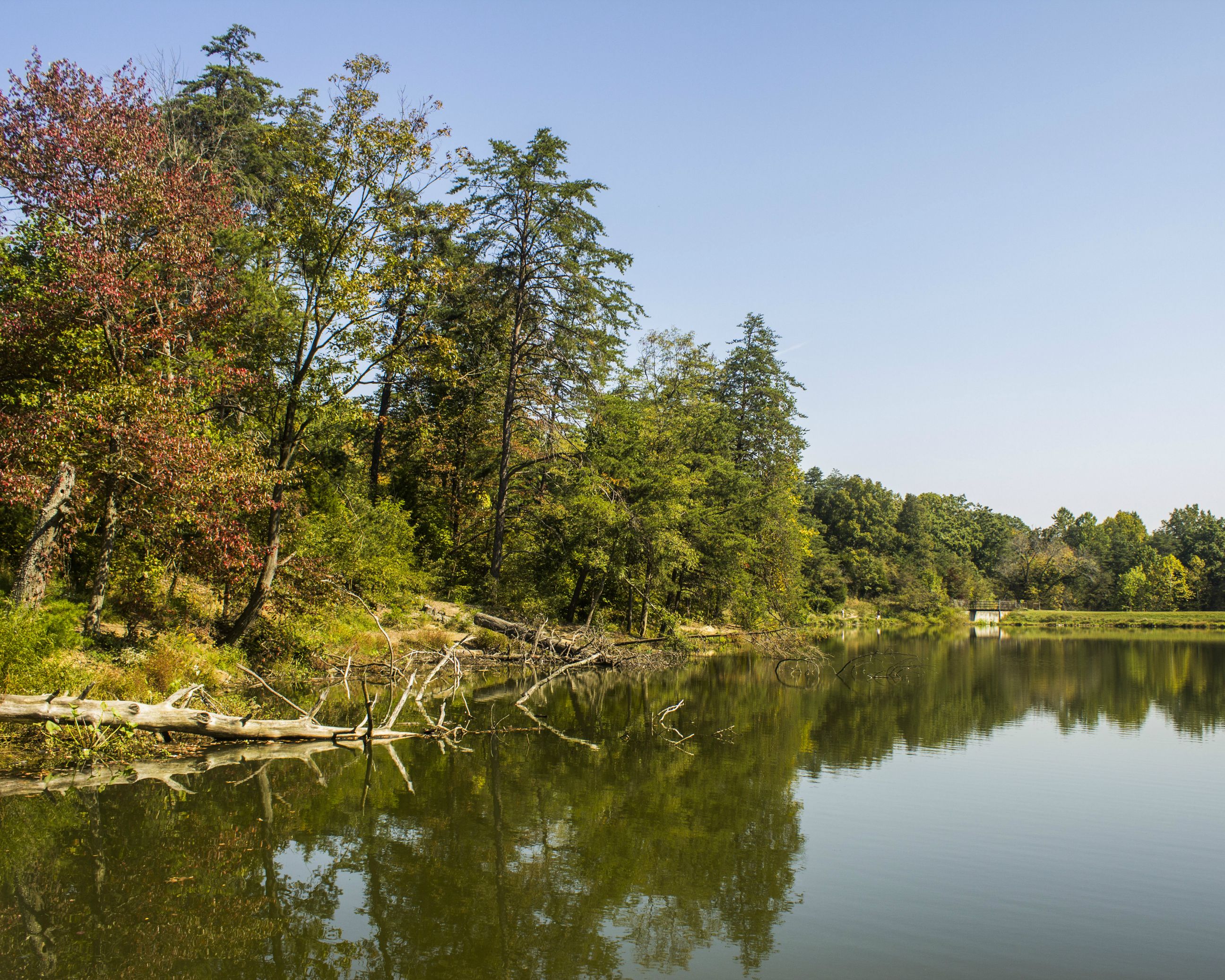
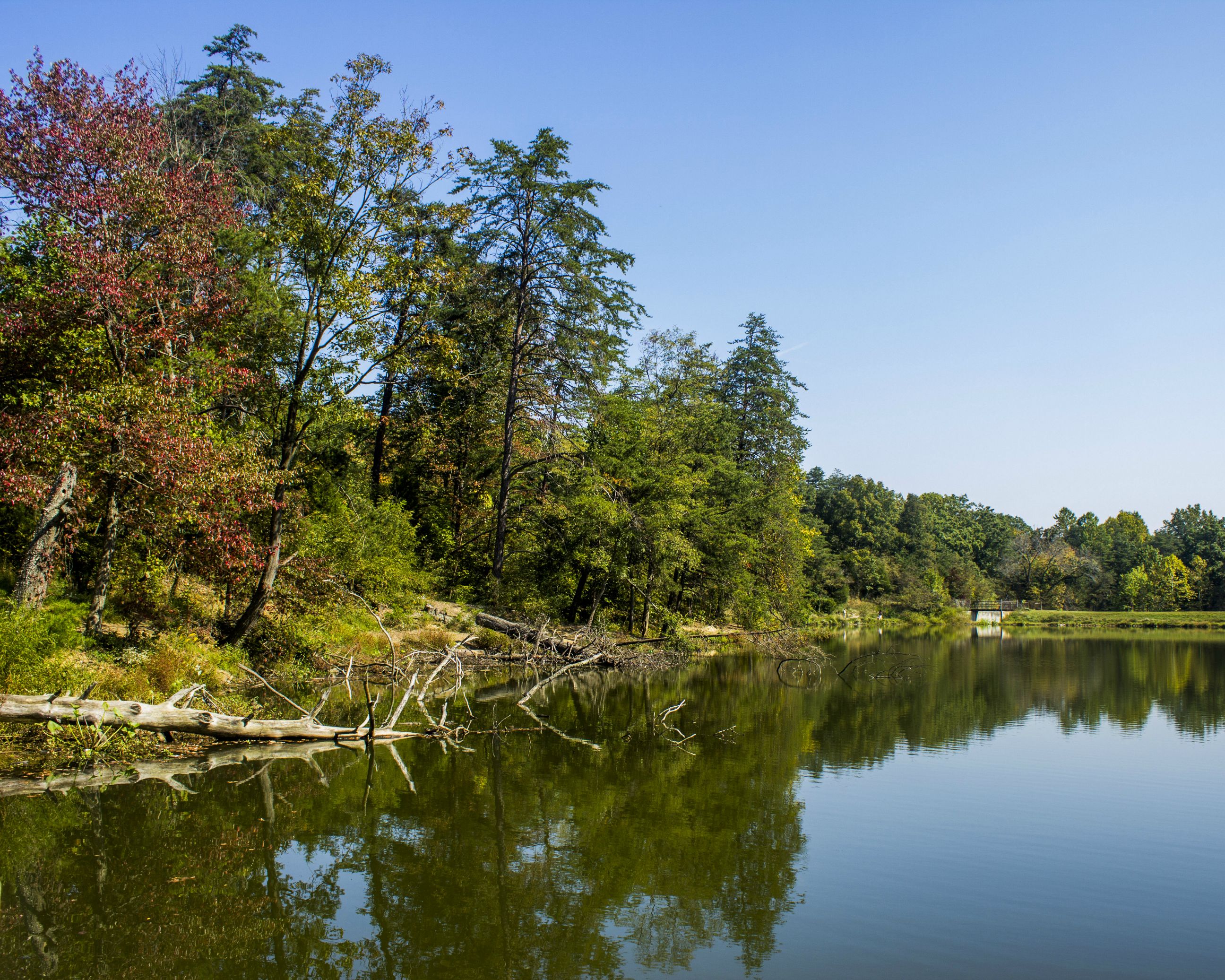
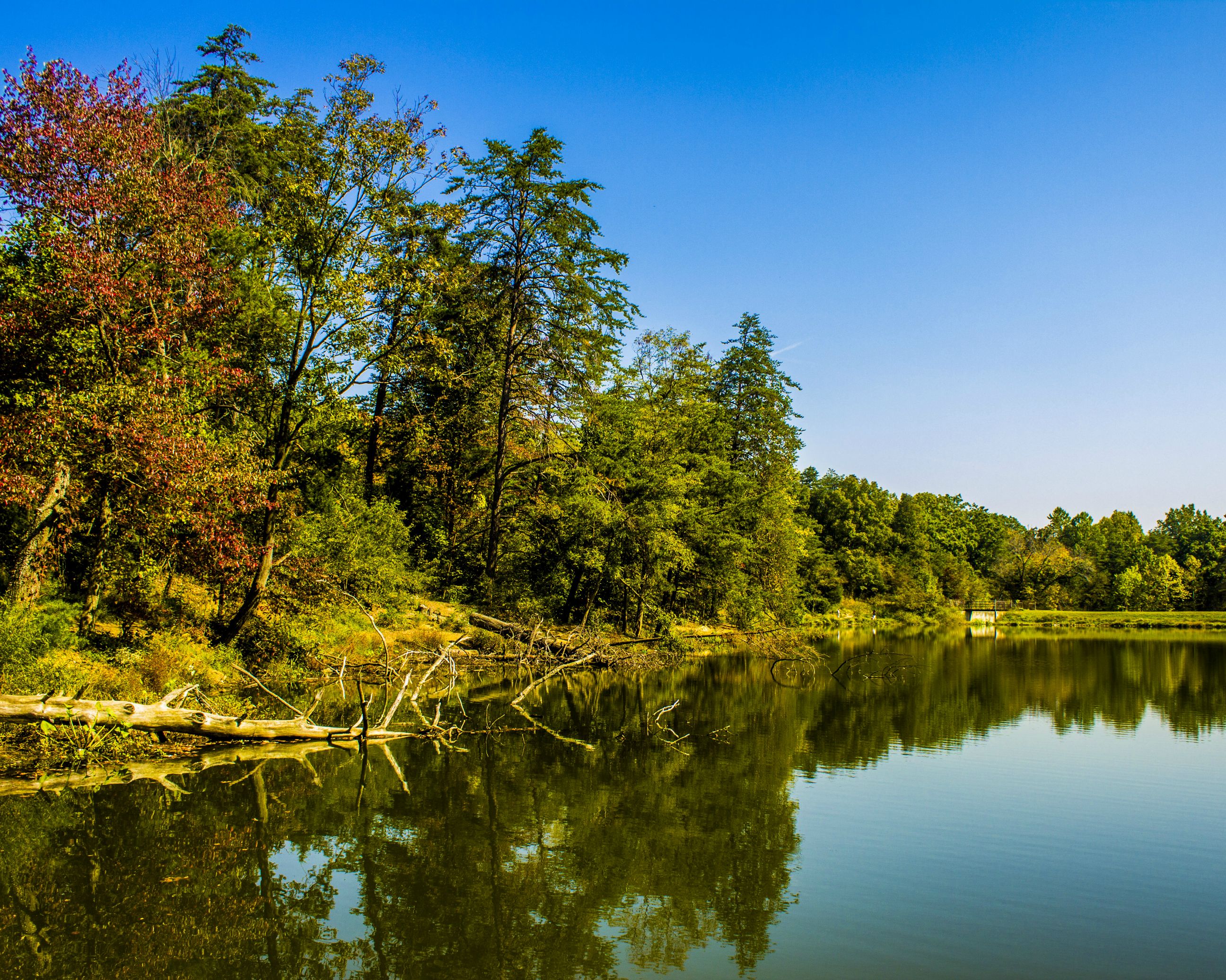
This is the final edit of a picture i took at a lake today. I think i like it but i wasn't sure if i did too much processing.
MP3YHvs.jpg


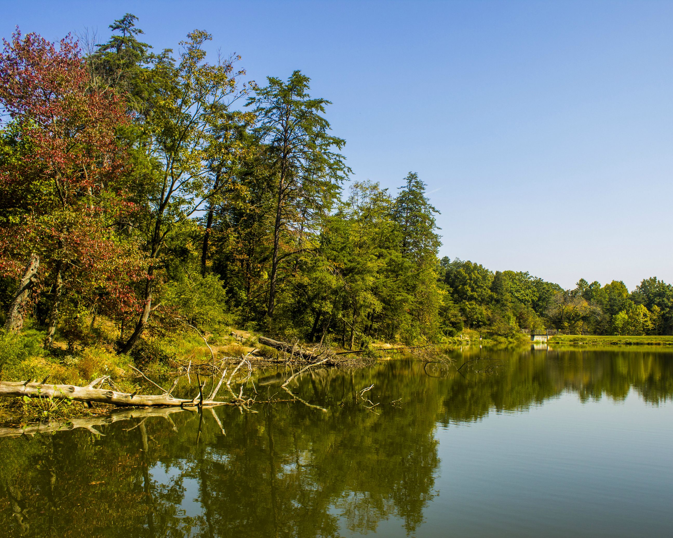
Here are a few other edits of the same picture
P7Fv6OK.jpg


pbzIgTa.jpg


Which one do u think is better?
Any other critique you would have on this shot or any other processing i could do to make it better would be appreciated also

Thanks
Beth
 
The first seems way oversaturated to me. This is to some extent a matter of taste, but I don't see how it helps this. All of them seem a little yellow. I prefer the last one, since it is more natural.

The image strikes me as being a little unbalanced. I don't think anything past the last tall tree just right of center really adds anything. You'll get different opinions from different folks on this, but this is my take on it.
 
I think all of them are very yellow. Way in the back, there's a concrete bridge. If I use the concrete as a neutral reference, I get a more natural looking image.

I don't know what you saw in this scene, to make you want to photograph it. It's peaceful but there is no real anchor. If there were more deciduous trees, fewer conifers, and it was a week or two later, there might be some good colour. When driving, I wear blue-blocker sunglasses, which unlike the grey Ray Bans cause colours to pop. The down side of that is that what looks wonderful through my sunglasses, looks ordinary when I take off the glasses and hold a camera instead.

Sometimes a scene like this is improved with a CP filter. The challenge is to get the deeper colour from leaves while not killing the reflection by water.
 
Sometimes it just needs a different crop.

pbzIgTa - Version 2.webp
 
I like the third edit as well. The first two are dialed up just a bit too much. The sky is good in the second one, but the greens are still a bit too yellow and garish.

As for the comp, I kind of like the sweeping curve of the shoreline and the leading lines from left to right created by the trees and their reflections. I think what would have completed it for me was being able to see the tops of the taller trees in their reflections so you have a complete line on top and on bottom of the frame. The way it is now, the bottom line starts a little too late and that's what makes it feel a little unbalanced for me.
 
In the first one the log (the fallen tree to the left) is too green and too similar in color to the leaves. I like everything else about the first photo.
 
Last edited:
Thanks for the feedback.

I was just out with the camera photographing the lake, trying different compositions. It wasnt until i started editing the images that i kinda fell in love with the way the colors popped in this one.

As for the yellow, i changed the white balance up a bit and i think this looks better
aRU7law.jpg
 
In the first one the log (the fallen tree to the left) is too green and too similar in color to the leaves. I like everything else about the first photo.
You were right about the log, i didnt notice that
 

Create an account or login to comment

You must be a member in order to leave a comment

Create account

Create an account on our community. It's easy!

Log in

Already have an account? Log in here.

Back
Top Bottom